I've been working with a large number of musicials and creative
music companies over the past two years. One which just launched an
app is Image-Line
with their awesome FL Studio Groove for Windows 8. A question I
see time and again from these companies is related to the Windows
Store app experience, and how something like a hub-based main
screen fits in to music apps. I've explained it over skype and
email, but this is something which really needs to be shown.
NOTE: Please keep in mind I'm not a user experience expert. Take
the ideas you see here and adapt them based upon your own
considered design approach and understanding of the experiences
you're trying to create. For further information, refer to the
guidance at http://design.windows.com.
Windows 8.1 and Visual Studio 2013 have further standardized on
the idea of a main page for the app with a hub control on it. The
"two rows of boxes" approach from Windows 8 was simply not flexible
enough to create all the experiences you wanted to create.
The problem
Synthesizer and sequencer apps tend to be complex, and require a
lot of domain knowledge before you can become productive using
them. Many users ask for tutorials as part of the app package.
These apps also tend to support in-app purchases, new project
templates, and much more. In short, there's a fairly large amount
of information, updated post-sale, which must be presented to the
user in order to make the user's experience as good as
possible.
For example, when I load up Cubase 7 on my Windows 8.1 desktop,
this is what I see:
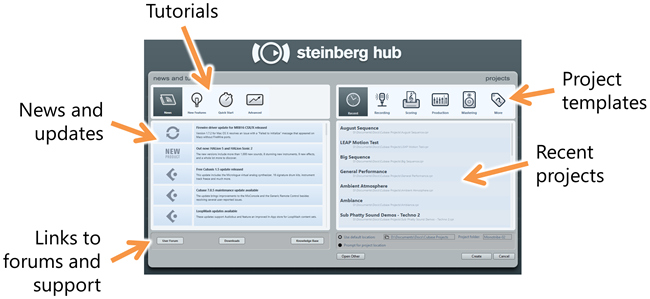
Similarly, when I load up FL Studio Groove, I see this:
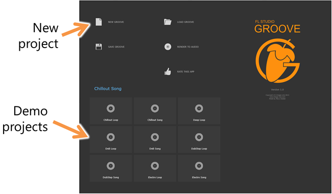
In this 1.0 release, this doesn't do quite as much as a full
hub, but Image-Line may add more here, including links to
tutorials, content, etc. It also includes some functions which are
more app-bar appropriate like "save groove" and "render to
audio".
Here's Music Maker Jam on my desktop PC. As one of the early
Windows 8 apps, it follows the earlier grouped GridView style of
hub. Unlike the others here, you can see it also has a large
section for in-app purchases of content.
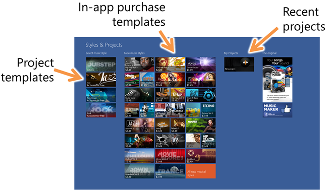
So far, it seems, based on the above examples and my own
experience, that a main page for a creative music app likely needs
to include:
- Recent projects and example projects
- Templates for creating new projects
- Links to (or inline) tutorials and support
- In-app purchases for add-on content (project templates,
patches, grooves, samples, more)
- Possible up-sell to larger product suites (like the desktop
app)
- Possible ad-support (on the main page only, not on the
performance surfaces)
In some cases, apps may be suites with a large number of
synthesizers or effects available. Although I don't address that
specifically here, you can easily represent them with a hub design
(and appropriate navigation) as well.
A possible main page approach
Given the requirements, a hub or main page might look something
like this:
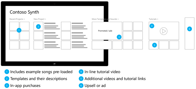
This main page includes a hub with the recent and example songs,
templates for creating new projects, in-app purchases, tutorials,
and either an upsell or ad spot at the far right. As a hub for a
synthesizer/sequencer or other creative music app, it could
certainly work. There are a couple issues with this design,
however:
- Presumably you want to get the promoted templates/content in
front of the user during every session, without scrolling. In this
case, that content is barely visible.
- It's a bunch of boxes.
The hub design popularized by the Bing apps, and formalized in
the Windows 8.1 templates provides some other options. By default,
the template looks like this
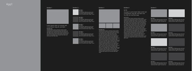
The big gray box on the left is for the hero image. The section
on the right are entirely up to the designer. As built, there's no
parallax scrolling or other similar features, but I've seen apps
built with those features while still leveraging this control and
template.
Let's say that having the promoted or sale item on screen is
sufficient for in-app purchase support. We could then use the hero
image for the in-app purchase promo image, and still show the
remaining content on-screen. The resulting wireframe might look
something like this:
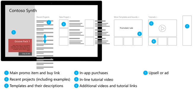
Although still predominately "a bunch of boxes", I've modified
two main areas to get to this example: the promotion and the recent
projects. In some apps, it makes sense, as long as it doesn't
impede horizontal panning, to have a small section of the hub
scroll vertically. In this case, I use that capability to support
showing a larger number of recent projects in less horizontal
space. In most cases, a user will be interested only in the last
two or three, so they would rarely need to scroll down. However, if
they want to get to the 20th most recent, they can quickly find it
here as well. Just don't overdo the vertical scrolling in something
that is predominately a horizontal panning experience.
The second piece is the promotional section. I've trimmed down
the in-app purchase hub section and also elevated the positioning
of the promoted item. Through the use of an attractive hero image
related to the app and to the item being promoted, it is more
likely to catch the customer's eye. Additionally, since it's an
attractive image, it feels more like an enhancement to the app
rather than an ad.
Branding
In all of the above wireframes, I used simple wireframe
branding. In practice, you may want the app name to be an
appropriate logo with the name. You'll want to use fonts and colors
appropriate to your app and your brand. The wireframes are not the
final product here, so don't assume the app has to be as dry
looking as that. In short, your app's hub design doesn't
need to be a bunch of boxes as long as it is
intuitive.
Navigation
Along with the main page with the hub, I recommend including
navigation which reflects this design. If you notice above, the
"New Project", "More templates and sounds" and "Tutorials" hub
sections all have the ">" glyph, which indicates they navigate
to another page when the header is clicked.
In most cases, those links will go to secondary hubs. That is,
pages which are not the detail information, but are instead made up
of more lists or groups. For example, the In-App Purchase Hub might
be quite complex with a large number of pages for categories,
previews, details, etc. The Tutorials page may have step-by-step
instructions as well as pages with full-screen video.
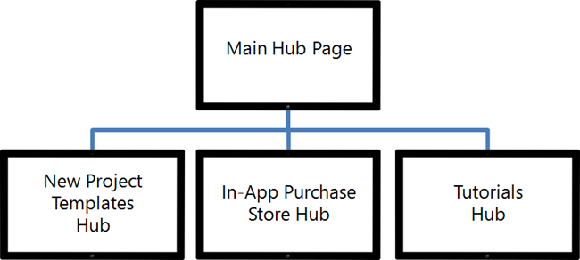
Of course, those are not the only pages in the app. You'll have
performance pages, settings, and all the other pages which support
the main scenario for the app.
The top app bar (the "nav bar") should reflect this navigation
as well, allowing a user to get to the home page as well as to each
of these hubs pages.

(If you're looking for an example of an effective top nav bar,
Bing News is a great example.)
That's a lot of work, isn't it?
After looking at all of this, you may be thinking "holy crap
there are a lot of pages and navigation to implement in DirectX".
Don't despair - we've made this really simple for you to
accomplish. The hub design is one of the reasons that XAML is
available in C++, and why it works so well in compositing with
DirectX. You can focus on the main use cases for your app, and
build that all in DirectX, using the lowest latency and highest
performance techniques for touch, visuals, and sound generation,
and then design the hub, app bars, nav bars, and navigation all
using XAML and C++.
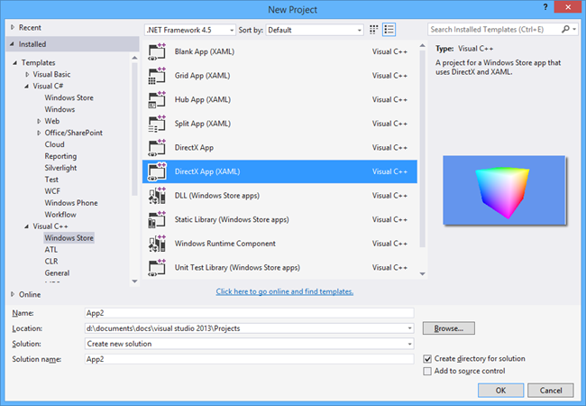
You can create a new DirectX App (XAML) project, and use the Hub
control from within the XAML pages in that app. The pages which are
the performance surfaces may include XAML for the app bar and nav
bar, but otherwise are all DirectX.
Final Thoughts
Many of my app builder friends in the music industry come from
an iOS background, where the hub is not a formalized concept. This
post was written to help communicate how a hub design fits into a
Windows Store app, and both increases visibility of in-app
purchases and help content, but also makes the app friendly and
easy to use. Not only that, but you can easily adapt the UI for
varying amounts of information and varying sizes of display without
a lot of complex DirectX layout logic. The formalized hub is a
concept brand new to many developers and designers outside of
Windows, but it's one of the most useful patterns we've put forth
on our platform. I encourage you to see how you can make your
experience better by implementing it in your own creative apps.
References
