Welcome to Pete Brown's 10rem.net

First time here? If you are a developer or are interested in Microsoft tools and technology, please consider subscribing to the latest posts.

You may also be interested in my blog archives, the articles section, or some of my lab projects such as the C64 emulator written in Silverlight.

(hide this)

Disney Fairies: The evolution of hub screen box layout in Windows Store apps

Pete Brown - 07 March 2013

A large number of apps in the Windows Store follow the "bunch of boxes in a GridView" approach to the hub screen.

This can work in some cases, but I encourage developers and designers to move beyond that look, and consider either evolutions of it, or completely different approaches.

Boxes 1.0

For many, the basic box layout is a very workable layout. Here's one of my essential apps: YouTube+ (viewed on my desktop).

image

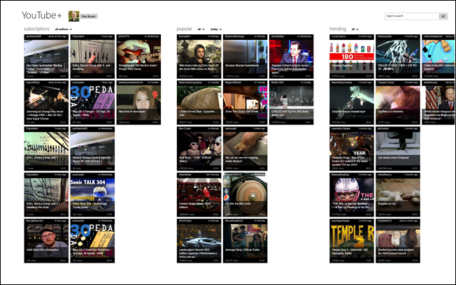
The UI us very conservative but very functional. I don't think anyone would disagree with me if I said it wasn't "beautiful" or particularly creative, but as a third-party app that can't necessarily use first-party branding, it works.

As an aside, I love the snapped view for the YouTube+ app. It's very workable, especially if you use it mostly for listening, as I do.

Boxes 2.0

Some, such as the Xbox games, improve on the stock templates by having a more varied layout. For example:

image

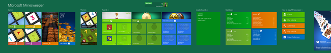
Many of the Xbox games follow this style. It's a great way to show all the game styles, your achievements, and more. It requires more effort to create this type of layout, as each of the groups contains a different layout with different data. This is truly a hub screen.

Boxes 3.0

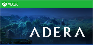
Here's another example, from Adera. Though almost identical in concept to the earlier Xbox games like Minesweeper, the hub screen is more complex, requiring support for different chapters, and in-app purchases. I usually play Adera on my Surface, but here's what it looks like on my desktop. The background is textured, so wouldn't look correct assembled into a single image.

image image image

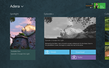
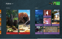
The colors are darker, fitting the Adera theme. The use of in-game images also really helps make the layout more appealing. Note how we're still using boxes, but the overall interface is more stylized and, to my eyes, more beautiful.

Boxes 4.0

That brings me to the game I installed yesterday. The latest game to come through is Disney Fairies Hidden Treasures. As the father of a 4 year old girl and a 7 year old boy, both of whom love the Disney Fairy cartoons and franchise, I immediately purchased it. When I ran it, I was pleasantly surprised by the hub screen. Here, take a look:

image image

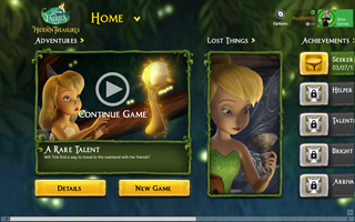
This is a game which, I assume, is primarily targeted to young children, typically girls. The gameplay is simple enough that young kids will certainly enjoy it. As part of that targeting (and overall branding), the design team has taken the boxes hub to the next level. Check out the styling of the hub screen in this close-up:

image

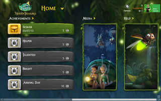
Yes, there's adornment around those boxes. However, it completely works as it's minimal and appropriate both to the brand and to the game itself. The layout follows well-known Windows design patterns, but takes it to the next level.

image

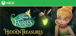
You can see how the branding was brought forward from the game tile.

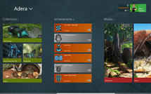
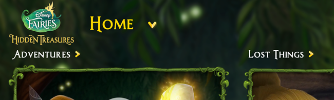
Now look at the same general section from Adera. You can make out the same elements, but in a less stylized fashion. A stock font is used, and the game itself doesn't have any real branding at the top. Note also the use of color in the Fairies navigation chevrons as compared to Adera. You can see how the use of color (and shading in that case) helps those stand out. Adera does use some background styling which, in this case, makes all the difference in helping set the mood for the game.

image

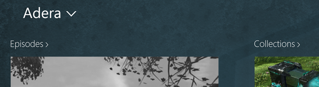
It would be nice if they used the Adera branding at the top to better tie in with their tile:

image

And now, a similar concept from Minesweeper. This is one of the very early games, and it follows a conservative Windows style. There's no texture in the background, and the fonts and branding are all stock. Of course, this is Minesweeper, not something that you'd expect to be heavily stylized or branded.

image

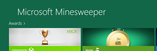
Do you see the progression between the three?

Some take-aways

I wouldn't expect everyone to have Disney-class design support for their apps. However, there are some things we can take away here.

1. Branding is very important. Bring your brand forward in the game, and be consistent in its use. Matching the branding used on your tile is a good idea.

2. Using a custom font as part of your branding can really work. It needs to integrate with your branding and with the app as a whole, but it doesn't need to be limited to Segoe UI.

3. You don't need to limit yourself to box layout. If you do, however, you can use additional design elements to help that layout pop. Keep in mind that the content is the most important, so be careful that the adornment is not the focus.

4. Sometimes, a background texture can help change the UI from something boring to something very interesting. You need to use good design sense when doing this, and not slap any old darkened stock photo in the background.

Oh, and unofficial take-away number 5: if you have younger children who like Disney Fairies, pick up Disney Fairies Hidden Treasures. It's a great game for them.

     
posted by Pete Brown on Thursday, March 7, 2013
filed under:      

12 comments for “Disney Fairies: The evolution of hub screen box layout in Windows Store apps”

  1. Timsays:
    Great post and very helpful. It is seeing the examples you've shown (and the progression in design) that will really help more app developers think outside the box. My own efforts look quite bland compared to the Disney apps - they look fantastic.
  2. noematasays:
    How does one create non-rectangular clipping region within WinRT XAML? You can do virtually anything through DirectX, hence avoiding the boxed in look is readily possible, but what are the facilities to do likewise without resorting to DirectX and using vectors only?

    Please show us a WinRT XAML approach. This is easy in Silverlight and WPF. No obvious options in WinRT.
  3. noematasays:
    The container area in the examples you provide require UI composition. Painting a shape with an image brush to form a non-rectangular region is not in the same league. So here's a challenge for you then, show us a WinRT example that does the equivalent of UI composition and retains vector scalability. Show us how to escape the BOX.

    I would settle for a DirectX module that did the heavy lifting as long as it could be integrated into standard XAML semantics.

    In Silverlight and WPF we have this:

    <Rectangle Width="300" Height="200"
    Stroke="Red"
    StrokeThickness="4"
    Fill="Green">
    <Rectangle.Clip>
    <EllipseGeometry
    RadiusX="150"
    RadiusY="100"
    Center="150,100"/>
    </Rectangle.Clip>
    </Rectangle>

    This is a very easy mechanism to facilitate fully scalable UI composition. It's surprising that this was left out of WinRT XAML!! I don't see a painless equivalent option. Show us the way... or avoid commentary that suggests we could do better than the WinRT XAML box. The nice example you provide is a major undertaking as a DIrectX solution. Doable for a design house with years of DirectX code to leverage. Not so easy for a garage developer.
  4. Petesays:
    @noemata

    The point of this post was not to admonish developers, but instead to let developers know that it's ok. Many designers and developers think that the templates are prescriptive guidance and are the bounds of what is allowed.

    And yes, I'm working with others to produce examples showing how to be creative here.

    As to clipping being useful for different scenarios: I hear you, and the feedback has been shared with the product teams.

    That said, as useful as clipping is (I'm not debating that), I don't see how it's essential here. If you were applying clipping to the entire container, including text, that would get ugly.

    Also, be sure to check out the new design inspiration examples at http://design.windows.com

    Finally, the hub pages in the games shown here are all XAML (with C++). DirectX doesn't come into play until the actual game screen :)

    Pete
  5. noematasays:
    Thanks a bunch for the clarifications. I think the underpinnings of WinRT are very impressive indeed. Having DirectX compositing with XAML and all of the other DirectX coolness such as top tier audio support will eventually prove themselves as key advantages. Having native language support is also a major new addition. The revised toolchain associated with Visual Studio 2012 is fantastic and has no competition.

    I do worry that WinRT has been hurt by some of its XAML limitations when compared to Silverlight and WPF. The rather abrupt silence on Silverlight and the quiet removal of Prism from Microsoft's developer roadmap had a chilling effect for those committed to XAML development given HTML5 was so heavily emphasized.

    It's ok so say that WinRT is not ready for LOB. But that does require giving some love back to Silverlight and WPF (don't let them die on the vine). Close the XAML gap and provide a high speed data path between WinRT and the desktop and we will see WinRT applications capable of some heavy lifting.

    We have yet to see an AniMoog or PDF Expert or MS Office suite clone on WinRT as we see on the iPad. Most intriguingly, where are the killer WinRT apps from Microsoft? Show us the way.
  6. jamessays:
    It is also the responsibility of Microsoft to provide different UI templates thru VS Studio. All the templates in VS Studio looks the same with this big squares scrolling left to right...and in full screen (aaarrgh). After a while...any person would just hate looking at a Metro app
  7. Petesays:
    @noemata

    Keep in mind that you don't necessarily *need* all of those apps on WinRT right away. We have the desktop side and, on x86/64, all of the apps which go with it. That's something the iPad doesn't have at all.

    Where many iOS fans still need their separate Mac for the heavy lifting, we've come up with a model which allows you to have it all, if you want, or focus just on mobility if you prefer.

    Prism for WPF is quite mature. Prism on WinRT doesn't make a lot of sense, as the composite model just doesn't fit. Patterns and Practices (the group which created Prism) is still looking into which parts fit and where.

    No AniMoog yet, but synth, dj, producer, and sequencer apps are part of my responsibility. I'm working on it :)

    Pete
  8. noematasays:
    Precisely, we do have the desktop. This is what's simply brilliant about Microsoft's approach and seems totally under appreciated by both Media and users at large. It is a decisively superior approach. However, Microsoft needs to realize that it's legacy is supported by folks that both like and prefer to build monster applications. It is more critical then ever not to dilute the importance of the desktop. That is where the real money is for most developers. App development reduces us to publishing software as though we are trying to create a hit single. It's a business model that may eventually loose steam (quite likely at $2 per sale). You become the victim of your own success quickly at that price point.

    WinRT absolutely needs something like Silverlight's Local Connection facility for it to become integrated into mainstream corporate LOB solutions. It is baffling that you remark that Prism does not make sense on WinRT. This is part of the schism that we have to cope with as outsiders. Look over your own (Microsoft's) road maps prior to the release of WinRT and you will see that it was initially promised for WinRT. It is so essential to some that many parts of it have been finessed already with efforts external to WinRT. Just look up "Windows.UI.Interactivity" to see all the places this fine bit of work shows up; something Microsoft should have provided day one.

    WinRT has some very cool features. The differences between it and Silverlight/WPF/WP7 XAML do not need to be eliminated, but we do need to find that wedge solution that allows us to have a common core. Perhaps throw some serious money at Caliburn.Micro. The desktop needs to be propped up more than ever. It needs that "Modern UI" star dust. WPF performance should not be left to languish. Lastly, a Local Connection like facility with perhaps the ability to run a WinRT app in a window would erase much of the need to have significant parity between XAML on the desktop and WinRT.

    Thank you for listening.

  9. noematasays:
    So here ware are many months later from these original postings. Windows 10 is around the corner. Will we have non-rectangular clipping with Windows 10? Will WPF finally acquire DirectX compositing features? Will we have rtMidi support? Will there be a high speed way to talk to the desktop from WinRT that is analogous to Silverlight's LocalMessageSender/Receiver feature?

    Without rtMidi, the IOS will remain the first choice for music apps. Music apps on IOS are becoming astonishingly good and set the platform apart. WinRT has to have the same capabilities.

    Without non-rectangular clipping there is no easy way of creating richer looking XAML apps. Compared to IOS, WinRT will continue to look excessively simple (dull).

    Without improvements to WPF the desktop continues be become progressively less viable which in tern hurts everything else.

    Without a local messaging API, WinRT LOB is a non-starter. I have tried to get sideloading keys for WinRT. I concluded that getting them is impossible after several failed attempts. So there still is no good way to integrate WinRT with the desktop. Having a local messaging system obviates the need for sideloading or other painful approaches to connect with the desktop. Please address these points.

Comment on this Post

Remember me