Many developers ask me how to get more visibility for their apps
in the Windows Store. Most do not realize, that even on the public
web, visibility is almost never organic. It's the result of hard
work on the part of all involved. In this first post I'll provide
some observations as to things that I personally think help
increase app visibility, specifically, app quality. In part 2, I'll
cover the listing and promotion side of the equation.
DISCLAIMER: I'm not a marketing person, and I do not have inside
knowledge of the Windows Store ranking and sorting algorithms.
Additionally, I do not have metrics which empirically prove any of
these techniques work. This is just advice based on my own
observations, primarily targeted to people who are new to
publishing apps in an online store. This is not a replacement for
the Develop Great Apps content on our dev
center.
The single most important thing you can do to increase the
visibility of your app is to start with a great app. Full stop.
All other things equal, a great app will do better than a
mediocre app or a terrible app. Here are some suggestions
for things which can help tip the scale from "meh" to "yeah!"
Don't create throwaways
Back when I used to work for Scott Hanselman, one recurring
piece of advice he'd give to the team was "Don't create
throwaways". He was talking about blog posts then, but the same
thing applies to apps. Throwaway apps can ruin your reputation with
customers and also with the Windows Store. The Windows Store is not
a great place to post things like little test projects or homework
apps. You can do those easily and share them with your testers
using documented side-load capabilities.
Each and every app you put in the Windows Store should
be an app you're proud of. It should be something you
wouldn't hesitate to show your friends, family, and your
colleagues. It should be useful and engaging. In fact, the number
one requirement in the
Windows 8 app certification requirements is "Windows Store apps
provide value to the customer". Put another way: Your app needs to
be worth the download time and storage space, or else it's going to
get a bad review.

Apps don't need to be perfect, or masterpieces, but they need to
be apps that will raise your overall reputation. If you thought of,
designed, and coded the app in an evening, chances are you can do
even better if you take a few more days :)
Don't be tempted to put a rough draft out into the wild. As the
old saying goes, you only get one chance to make a first
impression. This is as true for apps as it is for dating.
Go beyond the stock templates
I do a lot with music both in the app world and with hardware
synthesizers. A common complaint is when a synthesizer
preset gets used by many different artists as-is, without any
substantive customization or modification. It becomes the
only thing you hear in the song. Some get so over-used, even when
slightly modified (M1 Piano,
DX7 E. Piano 1 (and
this) and slap bass, D-50
Fantasia, JP-8000
supersaw (which I still like, but that's besides the point), Alpha Juno
"Hoover" etc.) that others start to rebel against them. The
recommendation is to start with stock patches, but to customize
them, or just create new ones from scratch. Otherwise you'll sound
pedestrian, dated, and maybe even like a copycat. Presets are in
synthesizers just to give you an idea of what the machine is
capable of, sound designers didn't expect to hear them on actual
records.
The built in templates in Visual Studio are a great
starting point for structuring your app. However, like the
synthesizer presets, they were never meant to be used exactly
as-is. They are a starting point to help you get from zero
to working in a very short period of time.
Here's a screen shot of one of the built-in templates running on
my 30" screen.
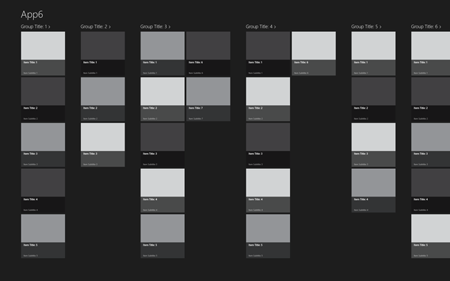
Notice how each square is the same 250px with a text overlay at
the bottom. There's nothing there to mix it up. It's a starting
point - a preset. It's deliberately grayscale so that you don't
fixate on existing colors while you flesh out your ideas.
The Windows design aesthetic doesn't limit you to a gray app
with a bunch of 250px squares with a text overlay at the bottom.
Think, erm, outside the 250px box.
Once you've proven that the functionality of your app works,
then you can get creative with the UI. Customize it with
appropriate branding and logos. Change the sizes of tiles, if you
decide to stick with a tile layout at all.
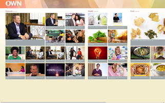
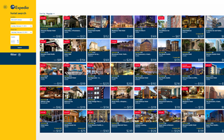
Here are some apps which use simple box layouts, but do it in a
good way that is different from the stock templates. Some vary the
sizes of the boxes, some simply alter the layout of the main
screen. Both use branding and colors. This is a very conservative
approach which looks good, but relies on amazing content to carry
the app. Keep in mind that you're seeing these all on my huge
screen.
I've seen an increasing number of apps in the store which use
rectangles and even the labels as shown in the stock templates, but
mix it up enough to be different and interesting. For example, most
of the Xbox games on Windows have a hub screen which is not quite
as conservative as the previous two, but still rooted in the same
design principles. Note the use of boxes which span more than one
row or column. Note the use of color. This is a simple design which
any developer could pull off.

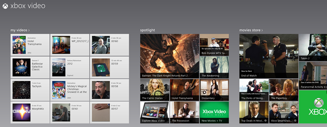
Xbox video takes a similar approach.
Top Gear News from the BBC is another app which sticks with a
general box layout, but is far from being a template app. This is a
portal-type app where the content is highlighted in the app but
hosted on the web site.
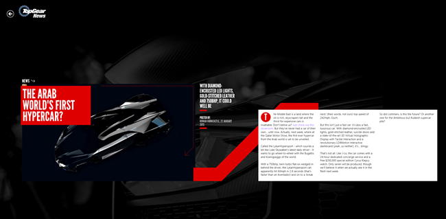
(Please note that none of the above three are optimized for a
high resolution, low DPI screen like mine. More on that later):
(The built-ion News app is another great app with a variation on
the box layout. No screen shot today, however, as it doesn't feel
right to post that with the headline story being about the college
shootings.)
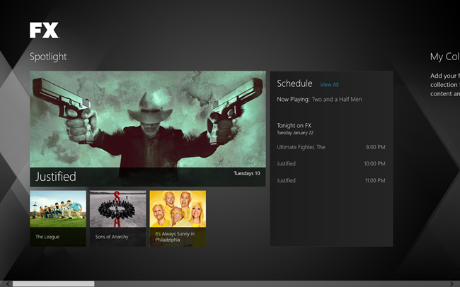
How about some other interesting boxes? The FX app leans towards
the boxes side of the design aesthetic, but manages to have an
engaging and very attractive UI, again, without sticking to a pure
template layout. The app also scales well to different
resolutions.
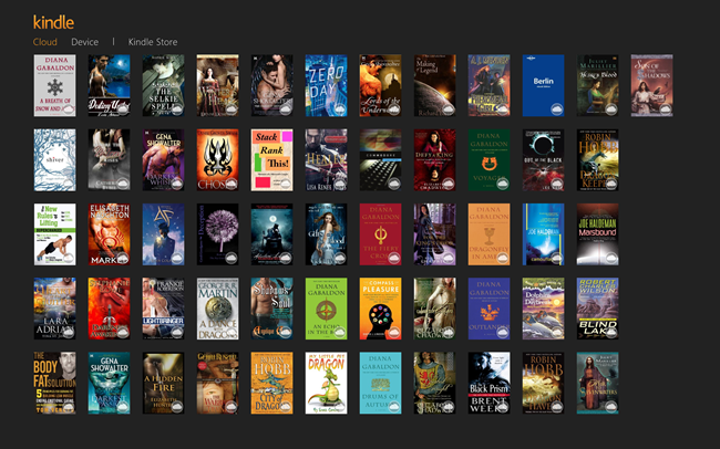
My wife and I share a Kindle account (we set it up before Kindle
supported sharing). Here's what the Kindle app hub page looks like
when you're signed in (I don't read books on this PC. I use my
Surface for that). It's not the same type of boxes we've seen
before, but it is appropriate to this app's audience. Notice also
the use of branding logos and colors on the top left.
Enough with the boxes
Then you have other apps which eschew the boxes and go their own
way (you can thank me for that, later). There's nothing in the
design aesthetic which mandates the use of boxes in your layout.
Grids are recommended, but we don't have any commandments you
absolutely must follow when laying out your content. As long as
you're consistent in modes of interaction and with system-provided
tools (app bar, charms, navigation), and the app is attractive and
usable from mouse, touch and keyboard, you should feel free to
experiment with design that is appropriate to the brand, domain,
and audience. An example of this is Nook. Notice that Nook also
takes advantage of the extra space on my huge screen.
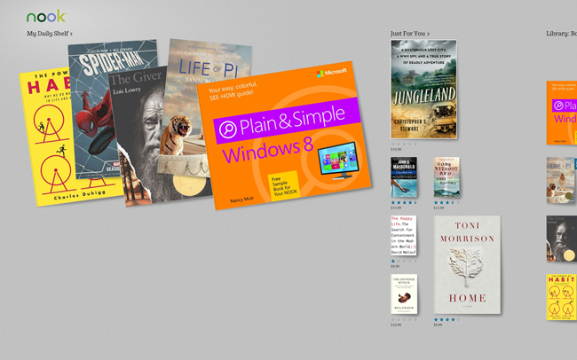
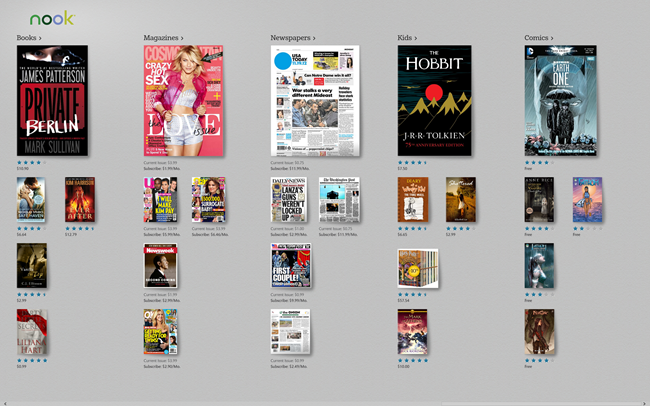
They don't look like boxes, but we're still on a grid layout. We
still have side scrolling. How about a couple apps which move even
further away from the boxed layout design:
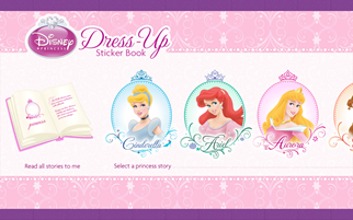
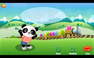
(Did I mention I have a four year old daughter? The dress-up
app isn't mine. Honest!)
The Disney app still uses side scrolling and has obvious touch
points. It just works well. The Lola math game has no such box
layout, but has obvious places where the user would interact with
the screen and works well with touch and mouse. My 4yo girl picked
it up without any problems at all.
You can see that although most of these use the hub page
boxes-style layout, none of them look exactly like one of the
built-in templates. Each has changes in color, styling,
branding, and most importantly, layout which works for that
specific app.
Several of them (and many other apps) do, however, fall down a
bit when it comes to targeting people with giant screens like mine.
Let's look at that.
Be resolution and DPI aware
When you write apps for Windows 8, you're writing apps
for PCs. Apps need to work on everything from 1024x768 all
the way up to low DPI 30" screens at 2560x1600, and smaller high
DPI screens running at similar resolutions. Much of the DPI work is
taken care of for you automatically by the runtime, and scaling to
different resolutions is easy.
High DPI
High DPI screens are ones where there's a high resolution but
small physical size. On these types of screens, Windows
typically installs at a higher DPI setting where one pixel in your
app is multiple physical pixels on screen. The additional
pixels are used by vector graphics and fonts to make edges smoother
and crisper. But when it comes to bitmapped graphics, you need to
provide different DPI versions in order to maintain crispness in
the display. Luckily, this is REALLY easy to do by simply naming
your images following the scale naming convention. Visual Studio even has support for this for the
logo graphics.
High Resolution
Higher resolution, low DPI screens take a little more thought on
your part. You generally have two choices:
- Show more content on the screen
- Make everything bigger
I've seen both done successfully. The second ("make everything
bigger") works well only when you have high resolution bitmap
graphics or you are using all vector content. In XAML, you can use
a ViewBox to make this happen for you. The former ("show more
content") works well only if you have sufficient content to fill
the screen. The stock itemscontrols (ListView, GridView) typically
work well in this scenario.
Unfortunately, many apps take a third option: just center
everything in an area optimized for 1366x768. On a large screen,
this looks terrible. I won't pick on specific apps here as I'd
rather work constructively with those app authors to see how they
can make better use of screen space.
While you're there making your app scale nicely, you can
use the same code and layout to make sure you support Portrait,
Landscape, Snapped, and Filled views. The default
templates provide a great way to structure these notifications and
layout changes. Endeavor to make each view as functional as
possible.
Testing DPI and Resolution
We don't all have access to giant screens, or high DPI screens,
so we need to use the built-in tools. The Simulator in Visual
Studio lets you run your app at different resolutions and DPIs just
to verify that elements are laying out as you'd expect.
Support different processors
My desktop machine is a water-cooled overclocked processor with
6 cores and 12 logical processors and 12gb memory. I have a 16gb
quad core laptop as well. My son has an older netbook with
something like 2 or 3gb. My wife has a core i5 machine with 4gb
memory. I also have two surfaces, each with ARM processors running
Windows RT. All of those Windows 8 PCs are just in a single
house.
The power of the Windows ecosystem is choice. There are
currently over 1,700 systems certified for Windows 8. Now, before
you think "holy crap that's a huge test matrix" consider that this
is no different from what PC manufacturers have had to test for in
the past, except we've made the API more uniform and have made the
OS version matrix far smaller.
I'd encourage developers with serious apps to test on:
- A developer class desktop or laptop with high resolution
display. This should have discrete NVIDIA or AMD graphics, also
preferably an SSD. No touch.
- A typical laptop with integrated graphics and a spinning rust
hard drive, touch optional but a good idea.
- Possibly an older (2-3 years) laptop without touch.
- A Surface or other Windows RT device with touch.
That, to me, provides a decent look at performance at a CPU
level. Now, if you're a game development house, you likely have a
much larger matrix, covering different makes of video cards with
different capabilities, for example. Again, we've made that easier
in Windows 8 and Windows RT, but you'll still want to continue that
practice.
But what's the independent developer to do? For you, I
suggest testing on your development PC and a Windows RT
device. Consider it a good excuse to get a lightweight and
low power tablet (I know I love mine). For other performance
testing, invite some friends with different laptops and side-load
the app on to their machines for testing. Make a party out of it
(but realize you'll get the most, umm, useful feedback before the
party gets too far along). It's easy to do and you'll get great
feedback not only on performance, but your friends will be blunt
with their assessment of your app as well.
Many developers ask me "if I'm targeting ARM, do I really need a
Surface to test?" Yes, I consider a Windows RT device, such
as a Surface, essential for testing anything but the most basic of
apps. We've done a ton of work to unify the development
model across all of Windows 8 and Windows RT, but at the end of the
day, ARM is a completely different architecture from x86/64. I've
worked with developers who discovered race conditions in their apps
that were masked on x86 but which showed up on ARM, for example.
Plus, for many developers, it would be their only touch device, and
you really do want to understand how your app performs on a true
touch device.
If you can't pick up a Surface (or other Windows RT device)
yourself, you could solicit the help of local or international
friends who could test on their own Surface. The Internet is a
wonderful thing.
Don't be an island: support searching
Most apps have data which can be searched. Sometimes that data
is external, on the web. Sometimes that data is just files stored
on the file system. Sometimes that data is structured and stored in
a database. In all cases, these apps should support the search
contract.
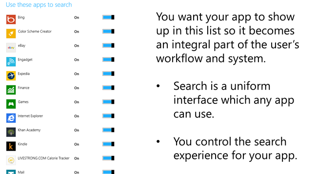
Adding search contract support is quite easy, and you can use it
to replace any built-in search you were going to include in your
app anyway.
You can learn more about searching on MSDN, and also in my book
Windows 8 XAML in
Action.
Use the built-in file pickers
The days of all the user's data existing on their local machine
are, if not already long gone, well on their way out. These days, a
file might exist locally, or on a server, or on a social network,
or cloud storage. Or maybe, just maybe, the file doesn't exist in a
physical form at all! WinRT provides an easy way for apps to
integrate with file pickers both as consumers and as owners of
content. You could, for example, provide a file picker interface
for your app which pulls data from a database and assembles a file
on-demand.
Back to the music scenarios: imagine that you want to load a
sample or loop into your app. Another app could serve as a file
picker, but only for content you purchase. You could then easily
use that purchased content in your music creation app.
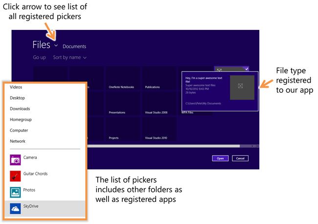
(figure from Windows 8 XAML in Action)
By integrating with file pickers as a consumer, your app doesn't
need to know where the files came from, or how they got there. It
simply simply needs to work with the StorageItem class and the file
picker interfaces. These are your new OpenFileDialog and
SaveFileDialog, so get to know them well.
You can learn more about the File Open and File Save pickers on
MSDN (and, as with most of these topics, also in my book).
Sharing is as important now as it was in Kindergarten
One of the first things you're taught in Kindergarten is to
share with others. Why? Because it forces interaction with others
and helps take a bunch of loners and turn them into a
classroom.
An app that can share to other apps will gain visibility through
that share. For example, if your app can share photos it creates
with other apps, there's a better chance those photos will show up
on social networks like Twitter and Facebook.
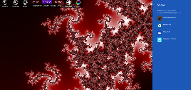
An app that can be the target of sharing will be indispensible
to users. For example, if your app can take shared music files and
post them to SoundCloud or MySpace or BandCamp, or shared videos
and post them to Vimeo or YouTube, the user will come to rely on
your app for those operations. Your app becomes an integral
part of the system, adding value to every other app in Windows, and
serving as an important gateway to outside services.
There are a number of different formats which can be shared,
from simple URLs and text to whole files and HTML markup. Support
as many of these as makes sense in your app.
You can learn more about sharing on MSDN.
Draw your user in
Let's assume for a moment that you were able to get the user to
download and install your app (the topic for the next post).
Once installed, a good app keeps the user coming back for
more. It does this by keeping content fresh, if it is a
content app, or by just being an indispensible part of the user's
workflow.
The Start Screen Tile
An attractive tile is important to getting the user to use your
app. It needs to be obvious and clear. It should also be
attractive, and not look like it was a last-minute design asset
thrown together in Paint. :)

Content apps and games can both take advantage of live tiles on
the Windows Start screen. Content apps can show slideshows of the
content, working under the assumption that it is the content that
is the draw, not the app itself. Games can, similarly, entice users
to continue playing by showing progress so far, how many steps to
the next level, etc.
Make use of the available layouts in the tile template catalog and pick one which is
appropriate for your app. That page also has excellent guidance for
when to use each type of tile.
The Hub Page
If your app has a number of different options, different
categories of content, or has multiple projects the user may be
working in, a hub page may make sense. A hub page is the first page
the user sees - it provides an overview of what has been done so
far, and what remains to be done, as well as what new content is
available and more. The minesweeper screenshot near the start of
this post is an example of a hub page. It lets you switch themes,
see your achievements, and more.
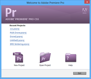
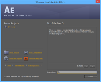
Many productivity apps on the desktop include a dialog which is
displayed when you first start the app. For example, when I open
Cubase 7, I get this dialog:
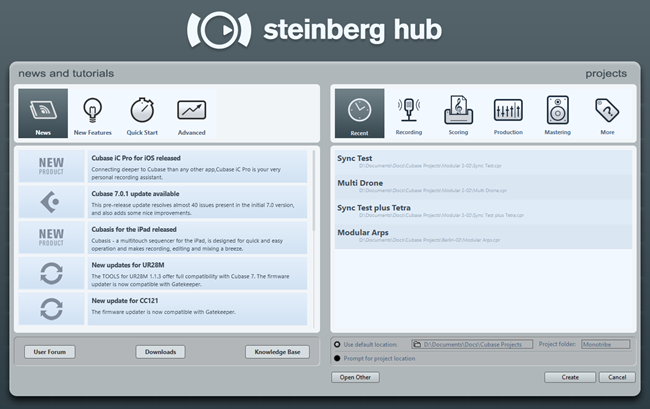
Formatted another way, this type of hub would be perfect for the
hub screen of a Windows 8 app.
Similarly, when I open Premiere Pro and After Effects, I get
these screens:
And, of course, you're all familiar with the hub screen we see
almost every day:
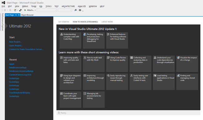
If your app is complex enough to warrant it, or simply needs a
nice landing spot for the user before throwing them into the task,
consider putting a hub page. It will help you with discoverability
of features for your app, as well as make it easy for a new user to
navigate your UI.
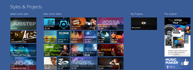
Music Maker Jam uses its hub page for selling content packs as
well as for loading existing projects and even a little advertising
on the side.
One of my favorite uses of a hub screen is in the episode-based
game Adera, shown here in a screen shot from my Surface. Notice how
it has the main tasks right there, but then additional engaging
information to the right, including achievements and collections.
Each group lets you drill down to see more episodes, items, and
more.
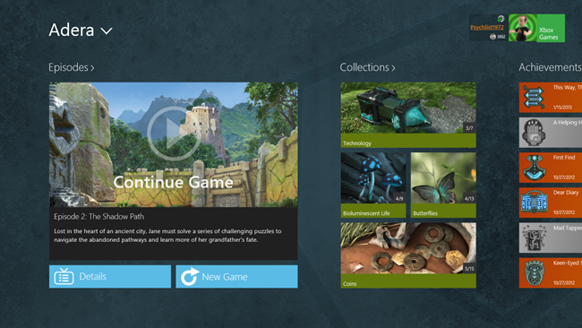
A good tile can attract the user's attention, and a good
hub screen can engage them them moment they launch your
app.
Test, Test, Test
Finally, I can't say this enough: test your app. Test it on your
own machines, and then, if you don't have a formal testing group,
send side load versions to your friends to test. At a minimum, you
want to test on all processor architectures you support (x86 32, 64
and ARM). If your app makes use of peripherals like sound cards,
web cams, microphones, or others, you'll want to test using a
variety of those devices as well.
Trust me, you don't want your app to earn one of these
stickers:
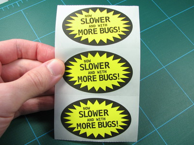
Just because an App seems smaller than an Application, don't
test it any less.
In the next post, I'll provide some ideas for promoting your app
and for getting your user to get past the first hurdle: the initial
download.
