Welcome to Pete Brown's 10rem.net

First time here? If you are a developer or are interested in Microsoft tools and technology, please consider subscribing to the latest posts.

You may also be interested in my blog archives, the articles section, or some of my lab projects such as the C64 emulator written in Silverlight.

(hide this)

Windows Forms to XAML: Do I really need a Designer for Silverlight or WPF Applications?

Pete Brown - 19 November 2010

I've made it a personal goal this coming year to help Windows Forms developers (who want to move) move to Silverlight and/or WPF.

A common sticking point for development shops planning to adopt Silverlight or WPF after years of work in something like Windows Forms, is that they feel they need a design professional on-team in order to build the same quality apps they've been used to building. After looking at some of the amazing consumer and ISV experiences being developed in Silverlight and WPF, I can certainly see why folks might get this impression.

The blank slate you get when first developing WPF or Silverlight applications can be intimidating. Suddenly, the sky's the limit. It's like you've worked with a single pencil your whole life, and have been suddenly delivered a huge box of crayons. Rather than just pick the black crayon and continue to draw much like you did with the pencil (with some obvious adjustments to account for the differences between a waxy crayon and a hard pencil), you feel like you really must use the whole set you've been given just to keep up with the Joneses.

Original: http://www.flickr.com/photos/31081559@N04/3275001259/

At that point, many of us lock up and say simply "I can't do this. I don't know where to start" or "I've seen some awesome drawings using all these crayons, and I know I'm not yet good with colors". It's a crisis of self-confidence, and it gets in the way of learning something new. In many cases, the developers simply say that in order to use this new box of crayons, they must have an artist working with them. Otherwise, they're just going to stick with their pencil so as not to embarrass themselves with their color selection and technique.

While most any project in any technology (ASP.NET, Windows Forms, WPF, whatever) will benefit from good user experience designers and graphics designers, they are certainly not a requirement when you want to build the same comfortable battleship gray type apps (or ghost white) you're building in Windows Forms today.

Here's a representative business application in-development. Nothing special here: a treeview, a menu, status bar, a couple headers, a few fields and a datagrid. Very few companies would use a design professional when creating this (not saying that's ok, just typical) in Windows Forms. Those same companies or project teams wouldn't need a design professional to create this in WPF or Silverlight. In fact, throw a couple icons in there and a toolbar, and this looks very much like the Windows Forms 1.1 apps I built near the start of the decade.

image

There are no fancy carousels, no rotating widgets, no special effects. In fact, there are very few animations to begin with. Sure, once you learn the platform and some good UX patterns, you can augment your application with nice transitions and subtle animations, but it's not a requirement to get in the door. In fact, it's never really a requirement unless you get to a point where you want to make it so. It's your (and your customer's) choice.

Editor Support and Expression Blend

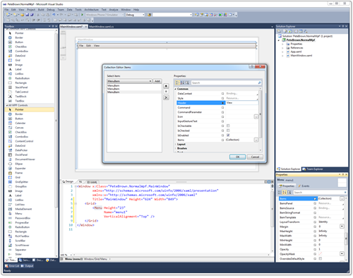
Another related concern is that developers think they have to use Expression Blend to do any UI work. Here's a screen shot of the VS2010 design surface, with a typical menu being built using the design tools. The XAML is shown at the bottom, but I've been using the design surface in this example. Not only is it productive, it's a great way to learn XAML syntax.
image

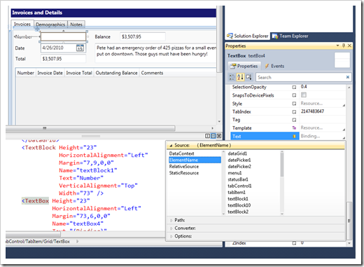
While I do enjoy working in Expression Blend, it isn't something you have to use when building these types of applications. The VS2010 editor's design surface combined with the ability to directly edit XAML is sufficient for all the Windows Forms equivalent design work you'll have to do. It will even help you with binding syntax, both in the XAML editor and, as shown here, on the design surface.
image

So, if you were able to design your Windows Forms apps using just the editor, you should feel comfortable that you'll be able to do the same with WPF or Silverlight in Visual Studio 2010. The property names will be a little different, and the concepts will take some adjusting to (I'm working on helping with all that), but the tooling is definitely there for you.

Now. If you want to take that application and create a truly differentiated user experience, then yes, you'll want design professionals working with you from the very start of the project, and you'll want someone working in Blend. The difference here is that WPF and Silverlight actually provide a good platform for you to work with those professionals while creating that experience whereas Windows Forms was not designed with that in mind.

(hint, install the Silverlight 4 tools to get some enhancements to the shared WPF and Silverlight editor)

Conclusion

Don't feel that just because it's Silverlight or WPF, you have to be super creative in your application design. In fact, your first couple projects should be conservative, using user experience patterns you've honed during years of Windows Forms experience.

If you're getting away without designers today, and don't need to create a truly differentiated or premium experience, then you don't need designers on your team when you move to WPF or Silverlight. The WPF editor is good enough for business application developers to do the vast majority of their UI layout work, dropping into the XAML editor from time to time only when it is the faster approach for you.

                 
posted by Pete Brown on Friday, November 19, 2010
filed under:                  

22 comments for “Windows Forms to XAML: Do I really need a Designer for Silverlight or WPF Applications?”

  1. leovernazzasays:
    Hi Pete,

    I fully agree with you; but in the end I guess it's related to the potential unlocked by being able to style/template anything. As you said, most people don't need that, the cool thing about Silverlight/WPF is that in case you need it, you have it.

    But yes, we have seen this issue a lot with our customers, and that's why we created our ClearStyle technology (more information here: www.componentone.com/SuperProducts/StudioSilverlight/ClearStyle/), getting "a little away from the style-less approach".... but not really.

    I guess most developers only need to deal with a few color properties in order to get what they need, and we wanted to show that that's also possible in Silverlight. Just keep the simple stuff, simple.

    Regards
  2. Winstonsays:
    Hi Pete,

    Good post, however this is where the notion of designers get to me when you speak in terms of WPF and Silverlight.

    One of the goals for these two technologies is being able to scale up when DPI's increase and Resolutions increase, etc.

    However designers were built to allow the users to drag and move and align things till they represented what they saw on screen, however the caveat is, most of the markup emitted is usually, in the cotnext of Grid, are margin-offsets, or in Canvas's, Top and Left, properties set, to achieve this apparent absolute pixel positioning.

    That worked in the WinForms days, but I don't find it works in the context of WPF and Silverlight, it really ruins the experience of it all.

    I tend to hand code most of my layouts, to keep it clean, however time over time, I have all these other developers who end up taking over the code, and just completely depend on the designer to drag things around, suddenly, all the buttons etc are everywhere and margin offsets are all in place.

    I personally use the designer only to achieve rapid prototyping. I have witnissed people whom started off with the designer, then made it all perfect by dragging and aligning it, and then realised when they started toggling the visibility of elements or changed font sizes, or whatever, it all broke.

    Just my two cents towards designers.
  3. Iansays:
    Why is it that every talk I have seen on WPF/Siverlight starts of with Expression Blend and animations etc? The message being given by MVP and Microsoft staff is very clear that project without deigner are not "fit" to be using WPF!
  4. Francescosays:
    Excellent post, i just begin a few weeks ago with silverlight and i thought that i need to create a spectacular user experience. But now i know that i need to keep the important things simple. Can you tell me where i can find UX Patterns to work with Silverlight?
  5. Spammesays:
    I've made so much web and html that for me is more natural to write clean xaml than using the editor.
    What I didn't like in ASP:NET was the totally absence of control on the generated html, just drag and drop control on the page like windows forms, somebody would have said that was really cool, for me was horrible! The worst ever generated html, no perhaps front page was worst, in any case if you want to be really professional you must have the control of the generated html.
    And xaml for me is the same, I type it and I use the editor only to see the result, and sometimes you are 10 times faster by typing it than use the editor, and if you don't believe me, try to change a container from a grid to a stack panel and back to a grid again, by typing in few minutes you are done, if you use the editor after 10 minutes perhaps you are done.
  6. Petesays:
    @Ian

    For those of us who have been in Silverlight and WPF for a while, those are the fun parts of the demo. Many of us were attracted to Sl/WPF *because* of the possibilities.

    That said, I'm working on a set of content that targets Windows Forms devs and eliminates much of the other "stuff" you usually see in SL/WPF talks. While business applications can absolutely make use of subtle animation and transitions, they are not a requirement when you want to create a winforms-style app that simply uses the great binding and other facilities of WPF/Sl

    Pete
  7. Petesays:
    @Franceso

    One really good site is Quince http://quince.infragistics.com/ (click the Quince logo at the top, then choose "All Patterns"

    @Spamme

    I also do a ton of work directly in XAML. What drove that is I was always an early adopter of SL/WPF, and rarely had a working design surface (or compatible version of Blend) to use in those CTPs and Betas. The XAML editor in 2010 is really good if you prefer to mess with XAML directly.

    @leovernazza

    I agree that you'll eventually want to take advantage of those things as you become more proficient with Silverlight and WPF. I just don't want to see templating/styling etc. keep new developers away.

    If you let the design surface do its work in VS2010, you'll find it does a decent job. Margin offsets are exactly what you want for a scalable UI -- as long as you drag things into the correct grid rows/columns. If you're used to XAML editing directly, it can seem cumbersome sometimes. However, if you're a Windows Forms person, used to a design surface, it's really a great way to work with UI.

    Pete

  8. Vladimirsays:
    And theres this thing where MS itself is making different applications that look, well, different. Visual Studio 2010, Office 2010, Expression Studio... all core applications that do not follow single style (no matter about the underlying technology being used). And, from one point of view, this is great: it proves that Windows offers to developers 'do what your heart desires', but leads to 'fear' for some people switching to WPF about what styling to go for; if they follow suit and choose some default, would they be making the right choice - will their application have it for the consumer; if they choose their own style, they do need a professional designer. And then, shiny UI doesn't mean a good one. If we would have controls with Win7 look'n'feel, with the animations and stuff, a lot of people would be making great user experiences, with few tweaks here and there... though, I might be missing the point :)
  9. Tomsays:
    Reading the comments, I had to look back at the article to see if you were talking about designers (those guys and gals who [insert stereotype here]) or designers (those temperamental margin-offset-spewing code machines). Guess it's a combination. I love how this term is overloaded.

    I agree with you that a design professional is not needed for typical applications. In fact, they can be more trouble than they're worth. Things can get dicey real quick once you start going all design-crazy trying to deliver that "ultimate UX that pops". One of the big victims in all that is consistency of UI. One of the biggest strengths of the Windows platform, which most other platforms painfully lack, is that apps tend to have consistent UIs. When a user learns how to do something in one app, they can apply that knowledge to every other app. It pretty much nukes the learning curve.

    From what I can tell, "design professionals" tend to throw out that consistency by significantly changing how things look (and even work sometimes). Why throw away that huge advantage in the name of vanquishing the perceived boredom of "battleship gray"? Some sort of middle ground would be better. One that retains consistency with the platform, and doesn't waste the user's time with novel but inefficient controls (e.g. carousel, coverflow) or painfully slow transitions. Even a transition of a quarter of a second, used in the wrong way, could end up wasting tons of the user's time. We see this with Windows itself, sadly. How much user time has been wasted waiting for windows to go through their minimize or restore animations? (Yes, I know you can turn that off, although not without also turning off other good-looking but less time-wasting transitions.) But I suppose a GOOD designer understands and practices all this though, eh?

    I'll make one brief suggestion about design surfaces. Avoid Blend at your own peril. If you don't test your app in Blend from the start, you could easily accumulate a number of extremely difficult to debug problems that prevent your app from loading or working properly in Blend later on - even if it works fine in the VS2010 designer. I spent hours trying to solve just one or two issues like this, raised the white flag, and am dreading going back to it later. I'm not talking about simple things like making sure your code doesn't crash at design time. I'm talking about nasty things like hey, this critical resource is defined, but somehow Blend doesn't think so and won't load anything that refers to it.
  10. Rod Macsays:
    Having done loads of stuff in HTML and CSS, I consider my design skills as 'not bad for a developer'. In trying to move over to XAML, I must confess to me it is so complex, I perceive it to be more an entire way to code the full .NET object model (thus pointlessly duplicating VB or C# .NET coding) than a user friendly design language where I can tweak the UI to make it look pleasing. I really have to ask what XAML buys here. As a WinForms and ASP.NET designer or developer, I would be just as happy with isolated C# files. I can't imagine designers are playing around with raw XAML.
  11. Vic Kliensays:
    @Winston:
    I agree that many SL/WPF apps and samples I see are unfortunately oriented towards fixed layouts. As the host browser's font size and window size change, they do not adapt, and elements start overlapping or getting cut off at the sides. See for example John Papa's MVVM sample from PDC 2010.

    One of the things I like most about SL/WPF is the richness of the layout elements. They make adaptive, liquid layouts possible. Unfortunately, the Blend and VS designers default to positioning child elements by using fixed margin offsets during drag-and-drop placement. When I see big, non-uniform and/or negative margin values in an existing XAML file (which is most of the time) I hold my nose (these are "XAML code-smells").

    Mostly I hand code XAML in the VS XAML editor. Or I start with some drag-and-drop, then do a lot of hand tuning in the XAML editor to allow a more adaptive layout.

    Vic
  12. Joel Cochran, Expression Blend MVPsays:
    I was an early WPF adopter, coming from a WinForms background. Personally I could never stand to code XAML by hand, so I invested time in learning Blend. Even though I am a developer, it is my go to tool for design work. My contention has always been that you do not need a designer to do this stuff, which is a good thing because my company could never afford one.

    @Rod Mac - I feel the same way: I'm not bad for a developer. I can create nice UI, way better than what we used to do in WinForms, and I can do it faster. And I can make the "nice" stuff completely reusable between applications. And you are absolutely right: designers are not playing around with raw XAML, they are using Blend. "Real" or Professional designers can even use Adobe products and import their files into Blend.

    @Vic Klien - WPF and Silverlight are completely capable of handling those resizing issues, but many people probably developers <tic>, use fixed layout because it presents much less hassle. I think this is because when designing UI screens they are more focused on the controls than the containers: I've actually created a method of layout called "Container Driven Design", which I'm beginning to teach.

    @Tom - I'd be curious to hear more about your issues.
  13. Tomsays:
    Hi Joel,

    I'm totally with you on focusing on the containers. I think XAML (or the layout system really) practically forces you to focus on containers and dynamic layout by its very design. However, design surfaces can shield you from this if you don't take the time to learn how the layout system works and how to make the designer use it properly. Then you can end up with a nasty mess that doesn't resize. *cue nightmares of VB*

    Anyway, here are two examples of the kinds of Blend problems I was talking about:

    1) Type "Blend does" into Google. The first suggestion is "blend does not exist in the namespace", with the first result nailing the problem and solution:

    http://stackoverflow.com/questions/1821493/expression-blend-getting-error-xxx-does-not-exist-in-the-namespace-xxx-but

    It's easily solved, but good luck figuring that one out on your own!

    2) Type "Blend can" into Google. The first suggestion is "blend cannot find resource named", again with the first result nailing the problem (2nd bullet in 1st answer):

    http://stackoverflow.com/questions/2665988/mvvm-light-blend-designer-view-error-cannot-find-resource-named-locator

    Blend can't find global resources (like styles) when you try to use them in a UserControl that's inside of a Window or another UserControl. I mean, who would want to do that, right? :) This bug has been known by the Blend team since at least as far back as March 31st, 2009 and you can find a lot of comments about it on the web. There don't seem to be any good solutions or workarounds, though.

    So, even though Google and Stack Overflow came to the rescue in these two cases, I think it still helps a lot to test your app early and often with Blend if you ever intend to have your application work with it. Better to tackle Blend bugs one at a time soon after triggering each one, rather than hitting them all at once weeks or months later. Although, if the bugs were to actually get fixed, you might get lucky with the latter approach...

    I'm not wanting to hate on Blend here. The point about testing early and often also applies to the VS2010 designer (Cider) and all other environments you want your application to work in, similar to testing on different operating systems. Avoiding a particular environment will inevitably accumulate debt that will need to be repaid should someone decide to support that environment later on.
  14. Mark Stevenssays:
    For me the barrier is not a designer but the conversion process itself. Like many developers out there we do not use a designer for our WinForms business application and would not necessarily see the need for a designer for the equivalent WPF so this is not a blocker for us.

    The main thing stopping us using WPF is that we do not have any time to convert the WinForm application to WPF and we are not aware of any conversion tools. I am sure that this will be the case for many software houses. We have the skills and we have the tools thanks to our MSDN subscription. What we are lacking is the time and / or the people needed to convert the code base.

    Regards,
    Mark
  15. Rod Macsays:
    I'd like to make one further point expanding on my earlier post 'I would be just as happy with isolated C# files'. I would actually be happier with VS or Blend generated C# over XAML because if I want to create dynamically rendered controls, I'd be doing that in C# and VS or Blend generated C# would be a great place to start (something I've done in ASP.NET and WinForms.

    Finally, does anyone have any thoughts on obfuscating XAML vs. C#?
  16. Petesays:
    XAML was created specifically because code is hard to round-trip, especially if you modify it. Unlike Windows Forms, you can hand-edit the XAML and still be able to use the design surfaces. While many of us do like to hand-edit XAML, it was designed to be toolable first and foremost.

    As for obfuscation, I've never been a fan of it (I believe it adds a false sense of security), so I have no opinion there.

    Maybe I'll do a post on dynamically generating controls. It's easier than you may think :)

    Pete
  17. Rod Macsays:
    I've modified C# code in the 'Windows Form Designer generated code' region. Yes, it's not suported, and sometimes you get a bloody nose and lose stuff but it works on the whole. It would surely be as easy to round trip a (separate for the UI) C# file in VS versus a XAML one if MS put a mind to such a thing?

    Nobody's a fan of obfuscation. It's one extra pain step. Nobody would suggest machine code could not be reverse engineered but I'll wager it's a darn site more secure than unobfuscated IL. Take a read of Hollis's .NET deployment. On the plus side for XAML, have just read DeepSea seem to have an offering worth consideration.

    Adding dynamically generated controls - surely you'd want to do this in C#? And doesn't it therefore make sense to have all the UI in C#?!

    Apologies for remaining 'XAML unconvinced'!


    ' 'code is hard to round-trip' - woud
  18. Petesays:
    @Rod

    Code is harder to parse. Plus, you have to have a parser for each language. With WPF/Silverlight, you only need a XAML parser/editor, not one which also understands VB, Cobol, IronRuby etc. Less code means less bugs and less effort.

    You can do the whole UI from code if you want. However, if you're going to use the designer anyway, what difference does it make what it's generating behind the scenes? Turn off the XAML view and pretend it is generating code ;)

    Pete
  19. Vic Kliensays:
    @Joel: "I've actually created a method of layout called 'Container Driven Design', which I'm beginning to teach."

    I would be interested to hear more about that. Maybe you could write a blog article on it?

    Vic
  20. Rogier van der Heesays:
    I have developed both business only WinForms applications for data entry and administation purposes as well as 100% custom interfaces for igntion tuning for cars with gauges and such and simulation applications in the defense and air traffic domains. Until a few years ago I used Java Swing for that, but moved to (mostly) WinForms to (a bit) WPF. I am now working a first big project in Silverlight, using Blend and Visual Studio.

    I like to design my GUI's such that they are properly resizable and scalable. Having used the GroupLayout in Netbeans in Java and the WinForms designer with docking and attaching, the visual designer of 2008 for WPF just sucked big time in my view. 2010 is a lot better, but still the main problem I have is that it is just such a different beast than the WinForms designer.

    It has a totally new concept of layout with a (very) steep learning curve, while the WinForms designer was simple and intuitive. WPF just fails miserably in getting the simple things done easy in 2010. Coming from 8 years+ GUI development in XView (yes, abondend by Sun in 1995), Motif, Swing, WinForms, it took me 4 hours (!) in WPF to get a draggable splitter between two panels working. How hard could it be? Well hard, very hard. And why is there no visual menu designer in 2010, for example? XAML is nice but, WTF I'm now more or less programming in XML?!? I think a visual designer should be sufficient to do 95% of the GUI constructing and the other 5% for special customization. WPF is now more at the 70-30 level right now, I think.

    I do not want to rant too much here, WPF is beautifully designed and very very powerful and flexible. It is the future and Blend is really coming along nicely. After a few months of Silverlight development, I'm getting the hang of it and getting really fond of it. But I can understand why a lot of people are sticking to WinForms.

    Also, I have been working with the MVVM pattern and again this also has a very steep learning curve and the tooling in the designer/language is still inmature in my POV. There is just too much plumbing needed to get the pattern working, writing INotifyPropertyChanged and ViewModels too much by hand. Also, there is a lack of example projects with large, fat domain models. It is just a writing on the wall that there are so much incarnations of the pattern with various frameworks with names such as "Simple MVVM" or "MVVM Light".

    If you have a very fat domain model, chances are big you are copying a lot of properties to (complex, composite) ViewModels a lot, and for what reason? Just to satisfy your internal "Separation of Concerns" drive? Or to unit test everything? In the end if I show a MessageBox with an event listener in the code behind or with a view model, the customer only sees a popup when he clicks on a button. The event listener is faster to code.

    In the blog-o-sphere I'm missing a healthy discussion about the tradeoffs of using frameworks, and all the dependency injection, SoC, MVVM jizz compared to Gettings Things Done Fast (tm). My customers are paying me because I create beautiful applications for them for a reasonable cost.

    If Microsoft wants WPF to break through, it needs to explain more why I'm getting my job done faster with more fun than in a WinForms world.

Comment on this Post

Remember me