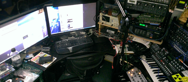
Like many of you, I spend the majority of my day on a desktop PC.
My PC happens to have two 30" displays, neither of which is touch,
and a Logitech Touch Pad that has some basic gesture recognition.
It's a giant water-cooled, overclocked beast that I built in 2010
(and upgraded video since then) and which still beats many new PCs
sold today. This particular PC has been upgraded from Windows 7 to
Windows 8 Consumer Preview to Windows 8 RTM to Windows 8.1 Preview,
so it has been around the block a bit. I don't plan to pave it
until the 8.1 release later this year. It's sitting behind the
displays in this photo, so I never see it and generally never touch
the PC itself.
In the course of regular usage, I've found a bunch of desktop
features which make huge difference in the usability of Windows
8.1, but which aren't talked about a lot. So here are the little
things that matter. This isn't a rah-rah post, just things that *I*
personally found useful as a long-time user of Windows (since
Windows 3.0, in case anyone is counting).
(As an aside, yes, the desk is a disaster. Now that I've removed the need for a room full of
servers, I have plans for my new home office in the works, but
I have to finish some other house projects before I can do
that).
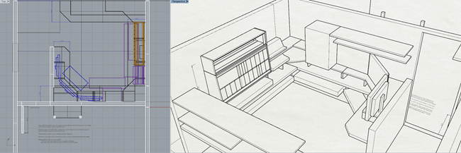
Yeah, that's a third 30" display in there :). I don't have room
for one in my current office, but I've planned for room in the
next.
Variable sized splits/Windows
On my desktop, I don't use Windows Store apps anywhere near as
often as I do on my Surface. At most, I'll have Twitter open or
something. However, I decided to give the new Windows 8.1 Xbox
music app a spin, having finally uninstalled my Zune software the
other day (the Zune may not have been a commercially successful
piece of hardware, but the client was always top notch, and much
better than the older Windows 8 Xbox music app). Being able to have
a usable desktop on any screen, and not being stuck with the
snapped and filled view states, is a big improvement for
usability.

On my desktop, I'm still primarily a floating-windows guy, but
the new window layout flexibility makes it more likely I'll
incorporate modern apps into my normal use.
As an aside, the new Xbox music app is great. It's what got me
to uninstall the old Zune software, although I'll still miss the
pink patterned background.
Start Screen and Windows Store apps open at the same time
One thing that I distinctly disliked in Windows 8 was that the
start screen would take over any other modern app on the display.
Windows Store apps could only be on one screen, and that screen was
also where the start menu showed up.
In 8.1, I can have Windows Store apps open on one display
(Twitter and Xbox Music, in this case), plus some of my desktop if
that's appropriate. The start screen doesn't overtake that display,
it shows up on the screen I'm on (or always on my primary if I
select that option in the Navigation properties).

This makes it far less jarring, and puts me back in control over
what shows up and where.
Start Screen with desktop wallpaper
Behind the Start screen, you may have noticed that I have my
normal desktop wallpaper. Here's a better view so you can see the
whole thing:


The display with the Start page on it gets a darkened background
to make sure the tiles show up well, but other than that, it's my
same background. It just feels right now, like an overlay, not
something completely separate. (the dividing line between the two
displays shown in the image isn't noticeable when you have two
physical displays with a bezel between them).
I can't overstate how important this is for making the
context switch between apps and start page more natural.
The in-box animated start backgrounds are cute, but having the
start tiles hover over my desktop background makes everything feel
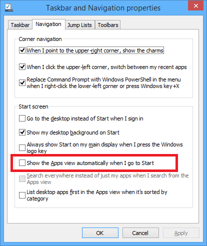
much more integrated. To get to this, right-click your taskbar and
select "Properties". "Navigation" tab in has the option.
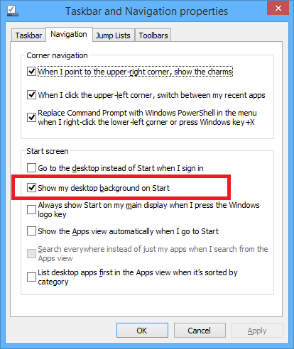
You may see in that same dialog the option to go to the desktop
instead of Start when you sign in. That's a non-issue for me, but
some of you may like that.
Charms Show up near your mouse cursor
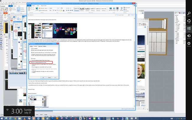
I stumbled across this one day. On mouse-based systems, when you
invoke the charms using the mouse in the upper right or lower right
corners, the charms bar shows up near the mouse cursor rather than
in the center. This is great because the charms bar is narrow, and
mouse movement is typically elliptical in nature (I always have
problems with getting to the far right of a wide list of preview
windows on the task bar for that reason).
Mouse at top right:
Mouse at bottom right:
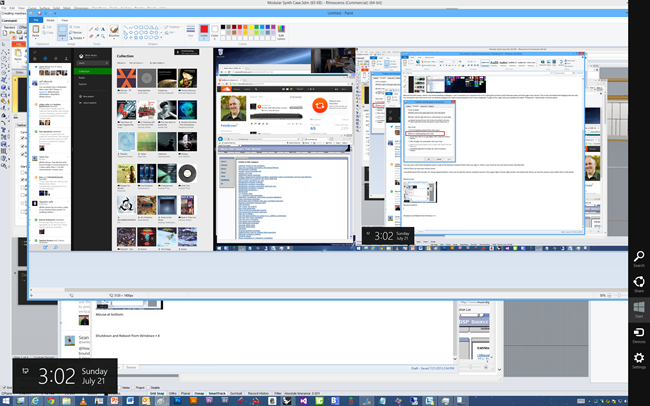
Having the charms appear closer to the mouse is one of those
no-brainer things.
Shutdown and Reboot from Windows + X
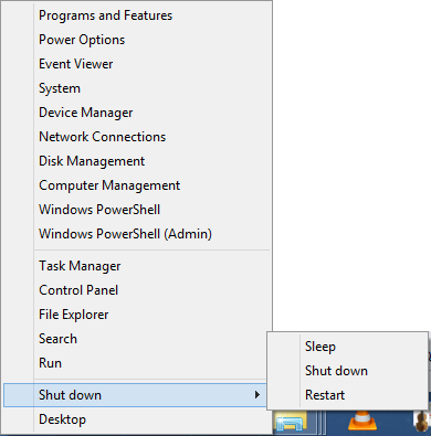
The Windows + X menu (also available by right-clicking the start
button) had a ton of useful stuff in Windows 8. In Windows 8.1,
this has been improved further. One very useful option added is the
shutdown menu. Most laptop users turn off their tablet by closing
the lid. Most tablet users hit the power/sleep button. As a desktop
user, I reboot rarely, but when I do, I do it from the menu - not a
power button.
New apps aren't on the start screen by default
Most desktop apps install a main icon or three, and then a
boatload of other start menu icons for samples, online help, and
other crap that I don't want on my start screen. In Windows 8, all
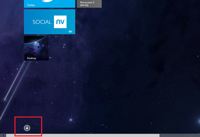
that stuff went to the start screen by default. In 8.1, those
things all go to the full apps list (available by hovering down
near the bottom left of the start screen and then clicking the down
arrow) but you install icons to the start screen manually. I like
this approach as it puts me in control over my start screen.
To see newly installed stuff, just change the sort order to "by
date installed". You'll see some items marked as "new".
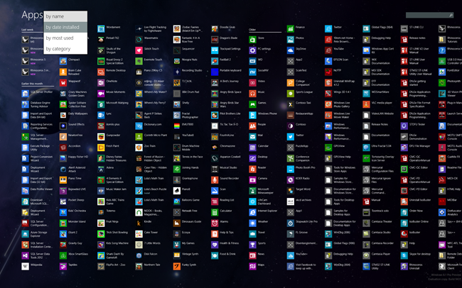
That screen is just a giant list though, so outside of the most
recently installed, I don't find it useful because there's just so
much stuff. The other sorts (Name and category, in particular) are
useful. You can see an example of an install that put a zillion
icons here (the Access Virus TI software and all of its orange
icons). Glad that doesn't show up on my Start screen by
default.
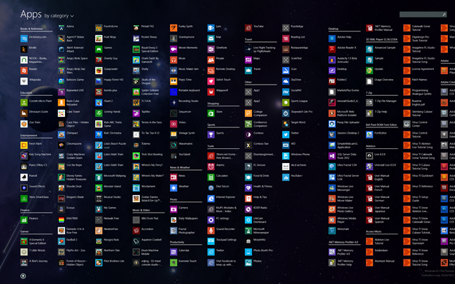
The alpha sort gives you alphabetical for Windows Store apps,
and then names (also alpha sorted) for desktop apps.
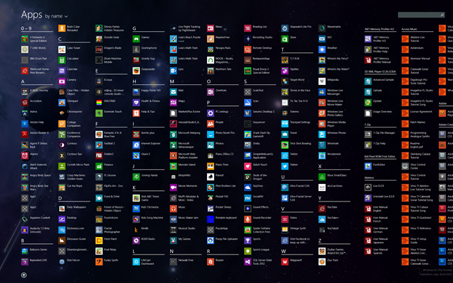
Some people may prefer this as their start screen. I don't
personally, but for those who do, there's an option to go directly
to this apps screen rather than the start page. Right-click the
task bar and go to the "Navigation" tab.
Taskbar on all displays
You may have noticed in the screen shots above that my taskbar
is visible on both of my displays. This is enabled by default, but
you can modify it from the same settings dialog as most of the
other options mentioned here.
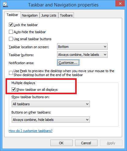
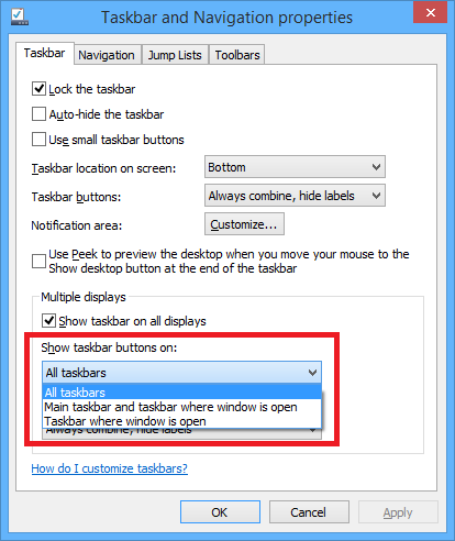
One thing that you appreciate is that you can have the taskbar
show apps only for the screen it's on. This is particularly useful
if you have more than just a couple screens.
Windows + X -> Run
In Windows 7, I very rarely went to any icons or groups in the
start menu. Instead, I would just click start and then type in the
name of the app I wanted to run. That same thing works in Windows 8
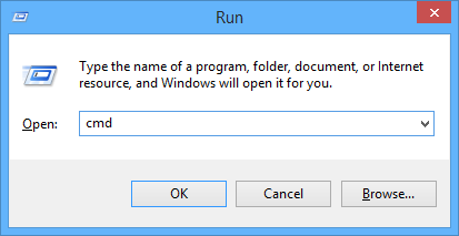
(and 8.1) from the start screen. If you want something even
smaller, simply do Windows + X, R to get the "Run" dialog.
(Or, as been helpfully pointed out in the comments, Windows + R
will do the trick as it has in previous versions of Windows.)
Performance and fixes
Much of the rest here is difficult to quantify. I use some
pretty heavy duty software (Cubase 7, Premiere Pro, Rhino 3d, and
much more). I've found 8.1 to be both faster and more stable than
Windows 8. For example, I had some audio issues in Cubase 7 in
Windows 8 which have gone away with Windows 8.1. That alone makes
me happy I upgraded.
Others
There are lots of other improvements that I use on other
devices. For example, the per-display DPI is great on my laptop. On
my desktop, since my displays are matched (and running at 100% DPI
scaling) and I don't use a projector, it doesn't have any impact.
On my Surface Pro, it makes a big difference as the DPI on my
Surface is not what I want to use on a projector or an external
screen.
Another thing I'm really looking forward to is the 3d printing
(and more) API. More on that in the future :)
Interesting in creating Windows store apps?
Interested in coding for Windows? Check out my book Windows Store
App Development: C# and XAML. For purchasers of the book, I'll
have a free update chapter for the 8.1 changes later this
summer/fall.
Also available on Amazon.
