Before joining Microsoft, I was a consultant, primarily building
desktop applications using a variety of MS technologies. During my
last couple years there, Silverlight was a large part of that both
for full apps and as parts of larger web sites. Prior to that, it
was WPF, Windows Forms, VB, HTML and even SharePoint.
tl;dr: The point of this long post is not to
show you examples of good design or pick apart existing designs.
I'm not really qualified to do that. However, I can point out the
need for design and give you some small amount of ammunition when
presenting this to your own management. Visual and UX Design
matters, even for internal apps, often far more than architecture
or the other things we focus on. You'll be more efficient with a
designer on-team, who you can iterate with. The world is evolving
and we need to keep up. Go hire one now.
tl;dr the tl;dr: Hire a UX/Interaction
designer.
The company I worked at wouldn't hire a UX/Visual
designer. Why? Because they felt they could never
sell the benefit of good UX and visual design to
customers, and couldn't keep a designer busy 100% of the
time. The problem was, without a portfolio of well-designed UI and
sites, it became self-fulfilling. I had contended that if they
hired one, they'd be amazed at just how busy that person would end
up being. Quite frankly, they just didn't see the value.
It got to the point that when I walked into my management's
office, they'd be like "You're not going to tell us to hire a
designer again, are you?"
You may even be thinking the same thing, this
post may see like Déjà vu if you've followed my blog for a few
years :) I took a more conservative approach to the problem in that
2010 post. Basically saying the same types of things Scott Hanselman recently pointed out in his
Skip Intro post: don't over do it, and don't use
things just because they're there. In that post, I argued that if
you want to just keep making the same old battleship gray
applications, you don't *need* a designer. However, I still think
you can benefit from one in your projects regardless. So, I'm going
to backtrack a little bit and deliver a more absolute form of the
message: yes, you need a designer. Whether it is HTML/JS/CSS, or
XAML/C#/VB, or something else, you should have design talent on
staff.
For a bit, we toyed around with the idea of partnering with an
outside firm. The problem was, there was too much of a "hand off"
approach to the design. Without having the design talent on-staff,
you couldn't iterate during the project. The design was passed in
at the beginning and then slowly destroyed by the developers (or
people like me who had good UX but horrible Graphics design skills)
over time.

I likened it to other disciplines, like partnering with a firm
just to design the database. Sure, design it all up-front and then
make the project live with that throughout the rest of the
lifecycle. No one found that to be a sane idea, but still couldn't
see the parallel with UX and Graphics design.
Now, in their defense, the company primarily worked on
large-scale transaction processing systems. However, the business
had slowly evolved to include more commercial work, and more
intranet and internet sites for these same customers. Also, in
their defense, our customers felt the same way. They wanted really
great UX and graphics, but somehow felt those things simply fell
from the sky. They didn't want to pay for designers on projects
either. They were still stuck in the team makeup and ideas
that worked for mainframe applications and, as in most cases,
haven't moved on.
One thing the enterprise development community in general has
been slower to adopt is the idea that you really do need visual and
UX design talent on staff. Application success or failure
rarely comes from architecture, or reuse, or whether or not you use
stored procedures or which ORM you use. Those are things
we do to meet other, more internal, goals, most of which users
don't care about in the least, many of which offer more perceived
benefit than actual real project benefit. As Scott mentioned in
another post, users don't care if you use Web Sockets. Sure,
if you really botch the architecture, the app may be unusable, but
beyond that, your investment is better spent elsewhere.

Knowing Your Limits
Yesterday, Scott Hanselman blogged about the emerging trend
to throw a dog's breakfast of features into HTML5/CSS3/JS
sites. He and I chatted about it for a little, and felt I
should write something up here as well. Go read his post as
well.
It's natural for developers to push the boundaries when
a new technology comes out. That's how we learn. That's
fine for demo sites in developer echo chambers and compos, but don't do it in front of
actual users. It's too easy to have your app look and
perform like a Pirate's idea of wealth: all money and no style.
Scott has links to a few examples of that in his post. There are a
couple other good ones in the comments.
How did we get to this point? Why do so many still not even
realize we're here?
Modern Development
First, a little history:



I don't wear a suit to work. In fact, I work from home, so what
I wear barely counts as clothing some days. I also don't sit in
front of a highly non-ergonomic greenscreen device, trying to
remember arcane codes (ok, well I do when I'm messing around with
microcontrollers or old computers). Why? Because the world has
moved on from that. Gradually over the years, more and more UX
thought has been given to applications.
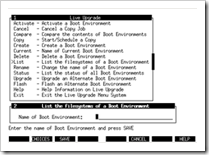
- When applications were just command-line affairs, the only UX
you really had to worry about was how hard the transaction codes
were to remember. Most of the UX was the huge three-ring binder
manual or the multiple volume boxed sets with textured cloth
covers. Users often spent as much time in that as interacting with
the screen, especially during their first X months.
Graphics were Escher prints you hung on the wall.
Computers were supposed to be hard, for some
unknown reason. Engineering ruled the experience, and we didn't
know any better.
- When they became full-screen character mode applications
(Curses, anyone? No? How about the windowing libraries for DOS TurboC/C++ apps?
IBM 3270? No? Pah. Youngsters.) there was more UX to worry about,
but the layout and workflow choices were still so limited as to
make it easier for a dev with a good eye to come up with something
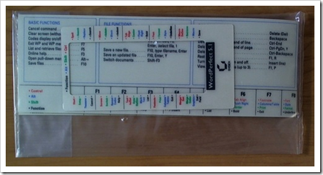
decent. Graphics were things scientists used for data
visualization. Design was for companies making physical products customers had
to hold in their hands. An entire industry was built around
plastic-coated cardboard keyboard templates to help you remember
all the keyboard shortcuts required to navigate important
applications, especially for DOS. I blame WordPerfect.
- When apps became battleship gray forms over data (white 2d
forms first), UX consisted mainly of making sure you had a
decent tab order and "fit as much as possible" on a single
screen. Navigation often resembled those character mode
applications we were upgrading/scraping/rewriting because our users
didn't know any better, and we didn't know how to show them
something else and prove it would be more efficient and/or easier.
Things started to go south here. Graphics were for games
and maybe 16x16 16 color icons. Animation was for music videos.
-
- Early on, apps were even just black and white instead of gray.
But when the gray "3d" chiseled look started coming into vogue late
in Win 3.11's lifetime (there was a special common controls library
just for it), developers went nuts and had apps that looked like
Mayan pyramids. Borders within borders within borders. Uuuuugly.
And I did it too. It was new. It was exciting, and it was
abused.
- When the web started making inroads into application
development, UX became further complicated. First, the workflow
options for early web apps really blew. Many apps had two
buttons "Submit" and "Reset" and a big form above them.
Validation and all other processing mostly took place server-side.
Sometimes, we got clever, and sent all the data through an iframe
to avoid a full page refresh. We made excuses because that's how
all the other apps were working, and we didn't take much
inspiration from branded experiences. However, at least they often
looked nicer than those battleship gray apps. That made a real
impression on people. Hmm. Graphics. Colors. Whitespace. Animation
was for dancing hamsters or Pixar.
- And then the proliferation of consumer-oriented smart phones
and tablets with great UX, driven in no small part by Apple,
really brought UX and visual design to the front.
It's not because the platform had a great API or something (I've
never worked on it, but I hear the platform, from a programming and
design standpoint is … interesting), but because it attracted a lot
of designer types. It's no accident that companies like Apple and
Microsoft chose design firms to create the first showcase
prototypes of their new UI technologies. Now, even inside the
enterprise, many customers expect this level of UX in their own
applications. Graphics, colors, whitespace, touch, animation,
easing and more all become important parts of the visual design,
and it's very easy to get it wrong unless you have a talent
for design.
-
- Your users now and in the future are ones brought up on this
crop of highly visual applications. What do you think they will
have for expectations?
But now we're stuck, because we have the tools to do whatever we
want, but haven't evolved the teams to effectively make use if
them.
We've had tools and platforms to build these types of apps for
some time. Flash has been around forever, Silverlight since 2007,
and finally, HTML5/CSS3 and its support in browsers is mostly
catching up to where FutureSplash was in 1996. The
capabilities are there, we just need to use them for
good.
It's not just for consumer-oriented apps, either. As companies
consolidate their development staff, expose more things outside the
firewall, or work to support a large number of internal users, the
line between consumer and enterprise development continues to
thin.
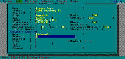
For grins, here are some apps I wrote in the 90s and early
2000-ish, where I happened to have saved some screen shots (I
really wished I had saved more, especially the dBase/FoxPro apps I
wrote for DOS and the VB3-6 and PowerBuilder ones for Windows
3.11). The first one was written for DOS entirely in Borland C++
(including the database) the others were, as I recall, .NET 1.0
beta versions of VB4 apps I wrote earlier. in the first one, I
mainly just had to worry about tab order. In the second, the users
were most comfortable with filling out an online version of the
paper form (in fact, they'd have the paper form in front of them
while doing this). The third was using the typical "Make it look
like Outlook" model of the time.
That version actually looked quite a bit better on a giant 15"
CRT, perched high enough up to count as neck-stretching exercise.
:)
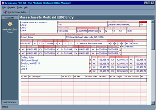
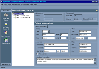
Like so many other developers, I simply copied prevalent design
trends of the time (how many devs have you talked to back in the
day who said they were trying to make their app look like Outlook
or Visual Studio/Visual Basic?). I got away with it, but you can
see that it doesn't 100% work. I force fit some things due
to the limited palette of visual design patterns at my
disposal. Bonus points: battleship gray.
Is it Customer-Facing?
I've heard many people say that they'll only invest in UX for
customer-facing stuff. But who is the customer?
It depends on how you define your customer. For many IT shops,
the customer works for the same company. For sales apps, many times
the field laptop/tablet application is seen by both a sales person
and the customer. Many of the same things you'd do in a consumer
application apply to these same customers, but because
they're forced to use your app, they don't get the same attention
to UX that external true consumer apps do.
Here's a list of some common types of applications being built
today, or in the near future. Tell me where UX doesn't matter?
Which is customer-facing?
- Call center apps inside an organization
- The departmental day-to-day work application at your
company
- Consumer touch-oriented apps on phones and tablets
- Consumer apps on the desktop
- Enterprise shrink-wrapped products for the desktop
- Your intranet site
- That forms-over-data application everyone in the company
uses
- Time and expense reporting systems
- Your one-off shell script to update a bunch of database
tables
Ok, so I through the shell script in there just to have
something where you could get away without UX. Of course, there's
often some design put in there too. Did you take a moment to set up
different command line arguments? UX, just no pretty graphics
:)
How many times have you heard "Sorry, the computer is really
slow today" when you talk to someone at a call center? Typically
this is because it takes forever to accomplish anything on their
crappy apps. Sometimes, of course, they have a 9600bps serial
connection from wherever they are to wherever the data is, but most
of the time it's just a crap UI that takes forever to help you, or
they've forgotten how to do a certain thing in the UI because it's
so non-intuitive. I've seen these apps up close. I've seen the
massive amount of training that people have to go through to learn
them. Some of the most horrendous UX I've ever seen was in an
in-house call center application to take outage reports at a power
company - one of their most critical ways to help customers. Are
they not worth better UX?
UX is important for all those applications.
The more the application gets used, the more good or bad UX
comes into play. It's not just about selling the
application and getting 5 stars, it's also about making others more
efficient and making their lives a little less hellish. Making them
feel good while using it is a nice bonus.
Most developers, let's not kid ourselves, are simply not
well-equipped to make good UX decisions. They're too embedded in
the software, and too aware of the underlying code and
architecture changes that a change in UX would require so
they push back, or don't even consider the things that really
should be done. Or they build the system back-to-front and the UI,
by necessity, resembles the data structures they used throughout
the app. Oh, and changing the UX of an application is one of those
things that becomes becomes far more expensive as you wait. UX is
the entire workflow of the application. It touches just about
everything.

What about graphics? In companies, "Designer" often encompasses
both UX and Visual/Graphics design. Often, good UX designers also
have a decent visual design background as well, just as developers
often have more than one related skill.
Just go Find Some Free Icons
That's something I heard over and over, and you probably hear it
too. "Go find some clipart" or "go find a free icon set". Ugh.
Invariably, the icon set would only have 1/3 of the required icons,
and the remaining ones would have to magically appear. I was able
to do that (Axialis Icon Designer saw a lot of me back then), not
anywhere near as well as the original designer, but well enough.
There were many other applications I saw which had different icons
from various sets, with incompatible styles, all mashed together on
the same toolbar.
The same thing applies to site themes, css, and more. "Just go
find a template" is almost as bad as "go find some free icons".
There are more choices today, but you still end up with those
toolbars (or pages, or whatever) where half the icons look good,
and the other half show some bad image with a three letter acronym
over it.
They all have splash screens though, and with clip art. Maybe
even from MS Word. :)

In some cases, the UI starts to resemble that PTA fund raising
newsletter sent home with your kid, or that office baby shower
announcement :)
When I did work on the graphics and visual design of
applications a decade or more ago, I had to do it while hiding in
the corner. I had a customer PM come over and tell me "don't let
anyone see you drawing pictures". Clearly the visual design and
icons and other elements "just appeared" from nowhere. The effort
was not respected, but the outcome was expected.
The problem here is not that developers don't know their limits
(most do), but that management doesn't see the UX/Graphics
Designer role as useful. It's not seen as a science, it's art. And
just like in public schools, it's art that gets cut
first.
An introduction to Interaction Design should be a required
subject for all Computer Science and MIS majors. Not because I
would expect them to learn to be great at it, but because they need
good solid exposure to it so they know something's possible, even
if they don't have the required skills/talent. They'll see there's
more science to it than they thought. In fact, Psychology
backgrounds often help in UX design. It helps that most Psychology
majors are otherwise unemployed :)
Like I said to Scott "The more freedom and power you have, the
more you need someone to tell you what
not to do." You need this person on
your team.
Who is On Your Team?
If you are on a team larger than two people, I bet you have a
project manager, a dedicated DBA/database designer (or someone who
doubles as DBA and database designer while also coding queries and
services and whatnot), a front-end programmer, a back-end
programmer, and maybe even a tester. Maybe you have an analyst or
two, although those seem to be getting scarce. Larger teams tend to
have more finely grained roles.

These are all seen as specialized skills. Not everyone is great
at designing databases. Not everyone is equally skilled at creating
good services and APIs. Not everyone can line up fields on a form.
With web apps, the division tends to be even stronger due to the
different languages and platforms in use in the different tiers or
sections of the application. Inside the development community we,
and our managers, understand these limitations and try to work
within them.
But most importantly, not everyone can take a problem and
visualize an appropriate workflow and user experience, low-cost
prototype it, test it with the users, and make the changes required
to make the best UX the project budget will support. It's a
specialized skill like any other.
And like any other part of a software project, you don't
want to just do it at the end. No lipstick on a pig. Get a designer
involved form the beginning, and include them in your iteration
plan. You'll be amazed at what you can accomplish.
How have your battles gone on this front? Have you been
able to convince management about the importance of
UX/Interaction/Visual design? If so, how did you go about it? What
worked? What didn't?
