One of the best improvements in WPF 4 was
fixing the text clarity issue once and for all. It may seem
trivial, but in a system that supports a vector-based scalable UI
as well as animation of text elements, it's not quite as easy to
solve it seems. Once we get
PC displays with DPI similar to that we have on hand-held
devices, snapped or unsnapped text will become a non-issue.
By necessity of its small download footprint and its
cross-platform nature, Silverlight couldn't take the same approach
used by WPF (which is tied 100% to Windows). However, the team has
added a more portable implementation of the code which helps
improve text clarity and is API-compatible with WPF.
Test your text rendering on the mac. This is one area where
Silverlight differs significantly between the two platforms. That's
due to ClearType being a Microsoft technology, and Mac users
generally not wanting pixel-snapped text.
On Windows, Silverlight defaults to ClearType unless you
specifically disable it through the TextOptions. On the Mac,
ClearType is not available and grayscale rendering is the only text
rendering option.
In the examples below, I set the options on each TextBlock
individually. However, in a real application, you'll typically set
the option at the root UserControl / Page and let the option flow
through to the rest of the elements on the page.
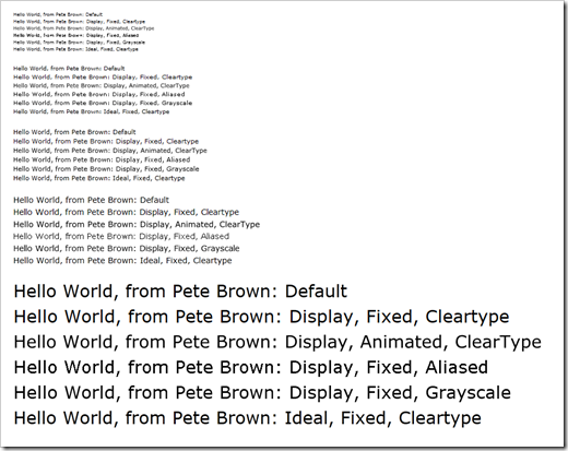
Here's a section of font sizes from 8 to 30, showing the results
of the different text options. Click the image to see it full-scale
(browser resizing will obscure the font smoothing, so be sure
you're seeing it at 100%)

The markup to generate one block of text is shown below
<StackPanel Margin="10">

    <StackPanel.Resources>

        <Style TargetType="TextBlock">

            <Setter Property="FontSize"

                    Value="8" />

        </Style>

    </StackPanel.Resources>

    <TextBlock Text="Hello World, from Pete Brown: Default " />

    <TextBlock Text="Hello World, from Pete Brown: Display, Fixed, Cleartype"

                TextOptions.TextFormattingMode="Display"

                TextOptions.TextHintingMode="Fixed"

                TextOptions.TextRenderingMode="ClearType" />

    <TextBlock Text="Hello World, from Pete Brown: Display, Animated, ClearType"

                TextOptions.TextFormattingMode="Display"

                TextOptions.TextHintingMode="Animated"

                TextOptions.TextRenderingMode="ClearType" />

    <TextBlock Text="Hello World, from Pete Brown: Display, Fixed, Aliased"

                TextOptions.TextFormattingMode="Display"

                TextOptions.TextHintingMode="Fixed"

                TextOptions.TextRenderingMode="Aliased" />

    <TextBlock Text="Hello World, from Pete Brown: Display, Fixed, Grayscale"

                TextOptions.TextFormattingMode="Display"

                TextOptions.TextHintingMode="Fixed"

                TextOptions.TextRenderingMode="Grayscale" />

    <TextBlock Text="Hello World, from Pete Brown: Ideal, Fixed, Cleartype"

                TextOptions.TextFormattingMode="Ideal"

                TextOptions.TextHintingMode="Fixed"

                TextOptions.TextRenderingMode="Cleartype" />

</StackPanel>
The options you choose will be specific to the problems you're
trying to solve. In general, if the default settings work for you,
then stick with that. If you know you're going to use text in a
specific way and wish to optimize for that usage or for the
typeface you're using, or contrast/overlay situation you have, you
can do that. You are in control.
