When you get ready to submit your app to the store, you'll run
it through the WACK (Windows App Certification Kit) tool.
That tool will report to you the most egregious errors, but it
doesn't catch everything you'll want to do to finalize your app. In
this post, I have a number of suggestions ranging from the most
simple to some more interesting system integration ideas.
Have you checked the policies and certification
requirements?
After running the WACK tool, you should manually check the Windows app certification requirements, as the
Store submission process will do both, but WACK won't catch
everything. For example, WACK won't catch apps that provide little
value, or which are duplicates of other submissions. These
certification requirements should be your minimum bar for producing
a great app.
Did you set the right store colors and logo?
You set your splash screen and app tile colors. You have a
normal and wide tile for the start screen. You've been seeing them
all throughout the development cycle. However, did you set
the store logo? It's easy to skip over this as it's in the
packaging tab in the appxmanifest, the last tab, separate from the
other logos.
By default, the icon is a white boxed X on a transparent
background. That's not what you want to see in the store.
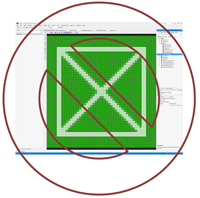
Update the StoreLogo.png file, or add a new one and set it on
the last tab of the appxmanifest:
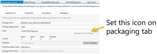
Be sure to update this logo. You don't want to have to resubmit
your app just to fix the ugly X.
Looks great on your tablet, but how does it look on big
displays?
The most popular devices for Windows 8 are initially likely to
be touch tablets and hybrids which naturally have relatively small
displays. If you want your app to see uptake in the world of
developers and other people with big high resolution but low DPI
desktop displays (I have two 30" displays, others have 24" or 27"
displays), you'll want to make sure your app looks good at all
resolutions. The world doesn't stop at 1366x768 or 1920x1080.
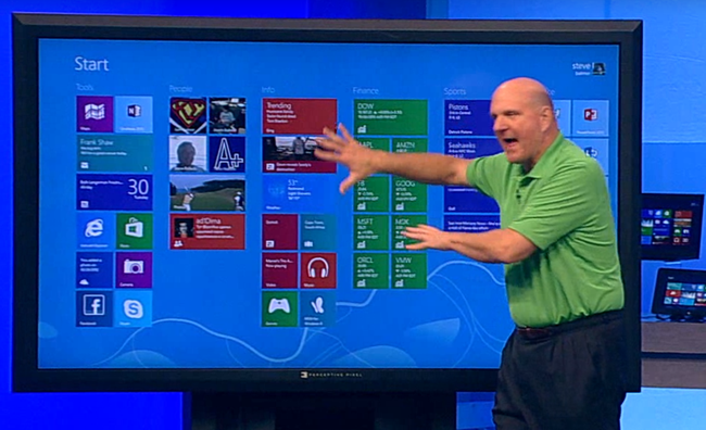
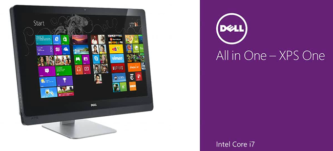
Not everyone has an 84" touch display available to them, but
many businesses eventually will. A much more common display will be
something like my 30" Dell at 2560x1600, or all-in-one PCs, like
the Dell 27" which runs at 2560x1440, or even my Lenovo W520 laptop
running at 1920x1080, but (by default) at 125% DPI.
This is really easy to test inside Visual Studio. You can use
the device pane (see next topic), or simply run your app in the
simulator.
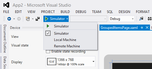
When you run in the simulator, you'll get to try out the app at
several different common resolutions and DPI settings.
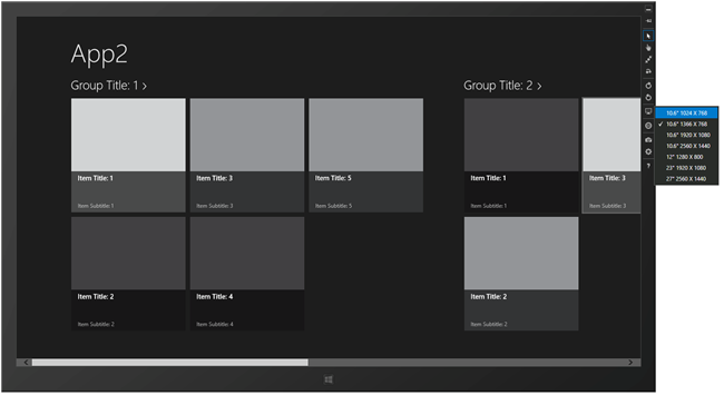
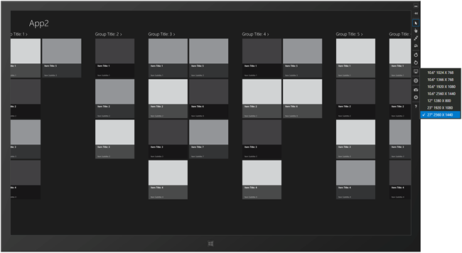
You want to make sure your content flows well and makes good use
of the available real-estate. As the owner of a large screen, apps
which have a lot of side scrolling but which don't expand to fill
the available vertical space make me sad.
Are you supporting snapped and filled state? Rotation?
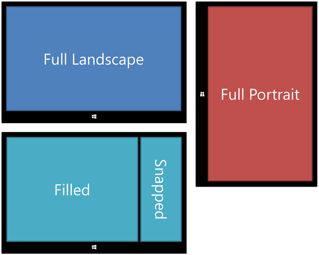
All apps in the Windows Store need to support a Snapped view
(the 320px view you get when you snap an app to the left or right),
a Filled View (the minimum 1024x768 view that remains when another
app is snapped), and the full view. This falls under store policy
3.6 "Your app must use the mechanisms provided by the system for
those features that have them". Apps should also support rotation.
Here's the set of states using an illustration I created for Windows 8 XAML
in Action.
This is also very easy to test inside Visual Studio, as long as
you follow the patterns used in the default templates.
Specifically, if you use the named Visual States for the different
views, you can use the device pane in Visual Studio to try them out
at design time. The device pane lets you switch between full,
filled, snapped, and portrait. Behind the scenes, it sets the
appropriate visual state and updates the view in the designer.
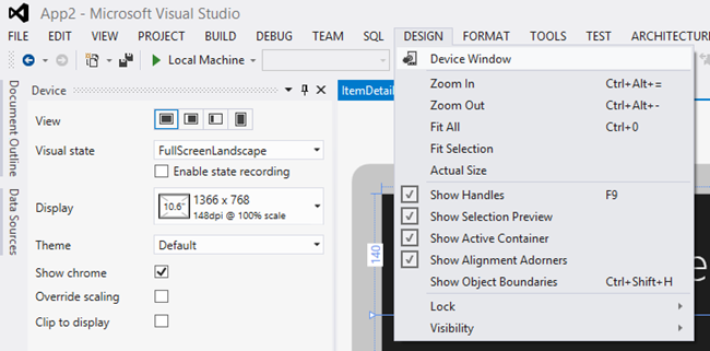
Note that the device pane also lets you change the display
resolution and DPI to make sure you look good on different types of
displays.
Do you support all three primary input types? Touch,
Mouse/Touchpad, Keyboard?
Store policy 3.5 states "Your app must fully support touch
input, and fully support keyboard and mouse input". This means you
cannot have hover or right-click as the only mechanisms by which
you can get to certain functionality. Similarly, requiring a pinch
gesture without providing an equivalent for mouse and keyboard
would also be a violation of this policy.
It's tempting to also make related assumptions. For example:
assuming that if the user has touch, they also have an
accelerometer. Sure, that's true for almost all tablets, but not
for touch desktops like the Dell XPS and Lenovo A720. Similarly,
assuming that keyboard is available if accelerometer is not
completely ignores kiosk-like scenarios.
Do you have data? Have you made it searchable? Do you share
it?
Most apps have data in the form of traditional data, contact
information, timelines, images, files, or more. Don't let your app
be an island, instead, let it provide value to other apps in the
system by making the data sharable. In fact, if your app because an
essential source of data (or a good place to send data), people
will use it again and again.
The Share Source and Share Target contracts are
both easy to implement and provide a lot of value.
While you're there, make that data searchable. Again, if the user
can search inside your app, they're more likely to use it. Don't
provide a separate and unrelated search feature inside your app.
Instead, integrate with the search charm.
How is your performance on ARM?
ARM processors are optimized for a balance of performance,
portability, and low power. When compared to the typical developer
workstation, ARM devices are going to have significantly less power
and memory. Additionally, although the operating system abstracts
away almost all of this, how the processor works internally is
different from how an Intel x86 compatible processor works. For
those reasons, you'll definitely want to test your apps on
ARM-based devices. You may find that you need to flatten your
visual trees a bit, or load fewer items in that ListView, or
perhaps make more aggressive use of virtualization in panels. When
working with DirectX, you'll need to make sure you're using the
correct level of DX supported on ARM devices.
Start testing on ARM-based devices early on and you'll avoid
headaches down the road.
Turn off unused capabilities
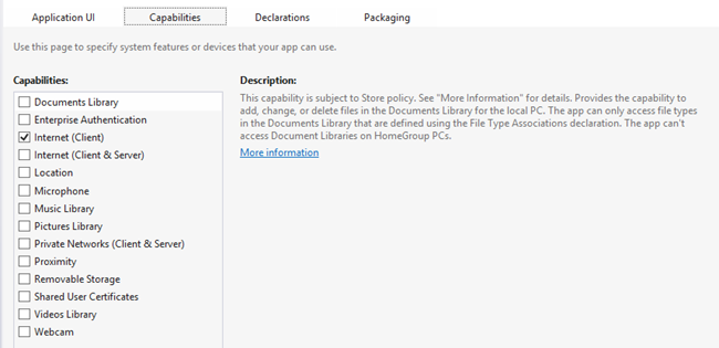
Declaring a capability but not using it can cause your app to be
rejected from the Windows Store. By default, all apps have Internet
capability checked. If you don't use the Internet in the app,
uncheck this. Same thing if you did some testing with, for example,
the webcam and later decided not to use it.
Final word: take testing seriously
Submitting your app can sometimes be a lengthy process,
especially in busy times such as around the launch of Windows 8.
You want to minimize the number of times your app is rejected.
Ideally, you want to submit once and then just start making money
(or gaining fame).
Just because Windows Store apps are typically simpler and
smaller than desktop apps doesn't mean you should pay less
attention to the details when putting them in front of the public.
In fact, due to the increased visibility offered by the store and
the user-centered ratings system, and the external review
mechanisms, you'll want to pay more attention than
ever.
Finally, don't forget that privacy policy.
