I like fonts. I like fonts that are visibly pleasing as well as
easy to read. While not as skilled or knowledgeable as some of my
designer friends, I'm a bit of a typography geek. For that reason,
I'm very excited about all the new OpenType support built into
Silverlight 5.
Note: While I happen to be using Silverlight here, these
features are also built
into WPF 4. Check them out!
Scott Hanselman wrote a
great post about using ligatures with the Gabriola font in
Microsoft Word. It's exciting to me to see much of this same
functionality included in the latest version of Silverlight. My
examples here all use the Gabriola font included with Windows
7.
Ligatures
Ligatures are the connections between letters. This requires an
awareness of the characters before and after a given character in
order to allow those connections.
Correction (thanks Damien!) Ligatures aren't actually
connections between letters in the literal sense - they are
specialized glyphs that contain more than one letter and are used
to substitute two individual glyphs in a specific sequence.
In traditional printing, the ligature would be together on the
same block. For example, a block may have "ft", "fi",
"fj", "ff", "fft" or "AE" or similar together.
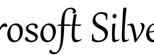
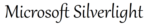
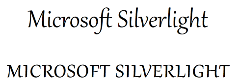
Here is the standard rendering of the text "Microsoft
Silverlight" using the Gabriola font. Pay special attention to the
f and t in Microsoft.
<Grid x:Name="LayoutRoot" Background="White">

    <TextBlock Text="Microsoft Silverlight"

                HorizontalAlignment="Center"

                FontSize="175"

                FontFamily="Gabriola"

                Typography.StandardLigatures="False"/>

</Grid>
Now, I turn on Typography.StandardLigatures using this bit of
XAML:
<Grid x:Name="LayoutRoot" Background="White">

    <TextBlock Text="Microsoft Silverlight"

                HorizontalAlignment="Center"

                FontSize="175"

                FontFamily="Gabriola"

                Typography.StandardLigatures="True"/>

</Grid>
And see this as the result. Again, pay attention to the f and t
in the first word
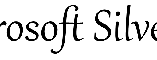
Note how the f and t are now linked on the cross, and the space
between the top of the t and the f have been increased to give the
t more breathing room. This representation, using default
Ligatures, is on by default in Silverlight 5.
In addition, if the OpenType font supports them, Silverlight
enables contextual ligatures, discretionary ligatures, and
historical ligatures through the ContextualLigatures,
DiscretionaryLigatures and HistoricalLigatures properties,
respectively. You use these the same way you use the
StandardLigatures property.
Historical ligatures are ones that were once standard, but are
no longer commonly used. If you're looking to make your app appear
classical (or maybe steampunk), and the font supports them,
historical ligatures can add real character.
Contextual ligatures are ones that the font designer believes
are appropriate for use with the font. Enabling both standard and
contextual ligatures will give you the complete set the font
designer felt were appropriate for normal use.
Discretionary ligatures are ones that the font designer included
for specific situations, and which may not apply to general use
throughout the entire body of your text.
Ligatures can help increase the readability and aesthetics of
your text. Another way to really fancy things up is to use
contextual alternates and stylistic sets.
Contextual Alternates and Stylistic Sets
Stylistic sets are almost like getting another set of typefaces
for free. They can subtly or greatly change the rendering of the
font based upon context and the style you select. Contextual
alternates are tweaks to the characters based opon their context.
They're not required for use with stylistic sets, but can be used
together.
Not all fonts include stylistic sets, but the designer may
include up to 20 alternates which include any subset of the font
characters.
You can play around with alternates and stylistic sets by
setting two properties: Typography.ContextualAlternates and the
Typography.StylisticSetN where "N" is a number from one to 20. Like
ligatures, this may be done completely from markup. This markup
shows the default set.
<Grid x:Name="LayoutRoot" Background="White">

    <TextBlock Text="Microsoft Silverlight"

                HorizontalAlignment="Center"

                FontSize="75"

                FontFamily="Gabriola"

                Typography.ContextualAlternates="True"

                Typography.StylisticSet1="True"/>

</Grid>
Here's what it looks like
Here are the other style sets from 1 through 7 (Gabriola
has 7 stylistic sets), as well as the XAML requires to produce it.
I even included "MENU" to show you get the same results as you do
in Microsoft Word, like in Scott's post. Pay particular attention
to the form of the M and the S capitals throughout as well as the
lowercase "g".
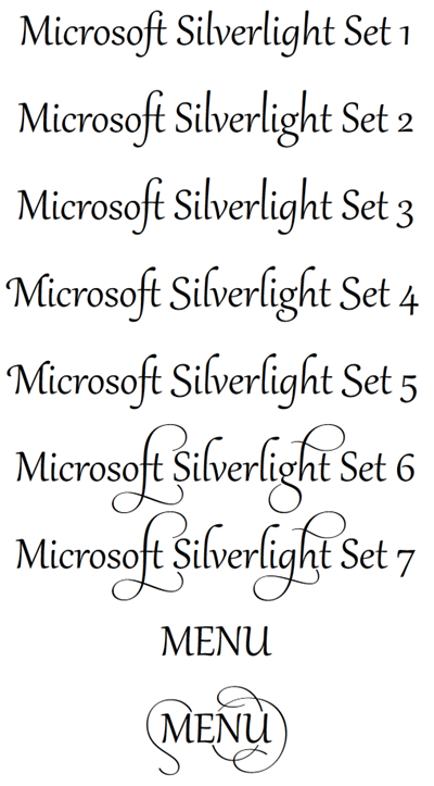
As promised, here's the XAML. It's pretty simple, as you can
see. I created an implicit style to keep from repeating the same
values throughout.
<Grid x:Name="LayoutRoot" Background="White">

    <Grid.Resources>

        <Style TargetType="TextBlock">

            <Setter Property="HorizontalAlignment"

                    Value="Center" />

            <Setter Property="FontSize"

                    Value="60" />

            <Setter Property="FontFamily"

                    Value="Gabriola" />

        </Style>

    </Grid.Resources>

    <StackPanel Orientation="Vertical">

        <TextBlock Text="Microsoft Silverlight Set 1"

                   Typography.ContextualAlternates="True"

                   Typography.StylisticSet1="True" />

        <TextBlock Text="Microsoft Silverlight Set 2"

                   Typography.ContextualAlternates="True"

                   Typography.StylisticSet2="True" />

        <TextBlock Text="Microsoft Silverlight Set 3"

                   Typography.ContextualAlternates="True"

                   Typography.StylisticSet3="True" />

        <TextBlock Text="Microsoft Silverlight Set 4"

                   Typography.ContextualAlternates="True"

                   Typography.StylisticSet4="True" />

        <TextBlock Text="Microsoft Silverlight Set 5"

                   Typography.ContextualAlternates="True"

                   Typography.StylisticSet5="True" />

        <TextBlock Text="Microsoft Silverlight Set 6"

                   Typography.ContextualAlternates="True"

                   Typography.StylisticSet6="True" />

        <TextBlock Text="Microsoft Silverlight Set 7"

                   Typography.ContextualAlternates="True"

                   Typography.StylisticSet7="True" />

        <TextBlock Text="MENU"

                   Typography.ContextualAlternates="True"

                   Typography.StylisticSet1="True" />

        <TextBlock Text="MENU"

                   Typography.ContextualAlternates="True"

                   Typography.StylisticSet7="True" />

    </StackPanel>

</Grid>
Font Capitals
Silverlight has built-in support for various capitalization
options including petite caps, small caps, titling and more. Of
course, these require support from the font itself. In the case of
Gabriola, here is the Normal and AllSmallCaps versions
<TextBlock Text="Microsoft Silverlight"

           Typography.Capitals="Normal" />

<TextBlock Text="Microsoft Silverlight"

           Typography.Capitals="AllSmallCaps" />
You can also alter the spacing of capitals using the
Typography.CapitalSpacing property.
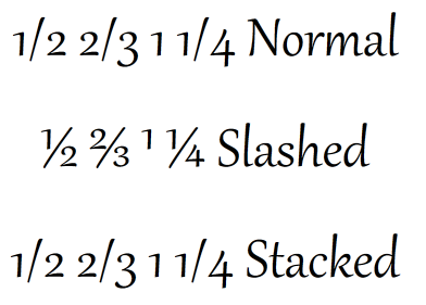
Fractions
Normal fractions without any help from the typeface, just look
ugly. Many of us simply rely on the substitution in Microsoft Word
for the common fractions like 1/2 and others. Silverlight uses the
Typogaphy.Fraction attached property to control how fractions
should appear. Here's how to use it and how it looks.
<TextBlock Text="1/2 2/3 1 1/4 Normal"

            Typography.Fraction="Normal" />

<TextBlock Text="1/2 2/3 1 1/4 Slashes"

            Typography.Fraction="Slashed" />

<TextBlock Text="1/2 2/3 1 1/4 Stacked"

            Typography.Fraction="Stacked" />
Note that "Stacked" doesn't make sense in this usage, that's for
the stacked representation of fractions.
Numbers
Speaking of numbers, I've always been fascinated with how
numbers are represented. There's so much variation out there. For
example, if the font supports it, you can enable or disable the
slash in the zero using the Typography.SlashedZero attached
property. You also can set the NumeralAlignment and
NumeralStyle
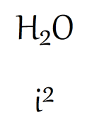
Variants
Variants affect sizing and basic representation of characters
when used in specific contexts. Examples include superscript and
subscript.
<TextBlock>

    <Run Text="H"

         Typography.Variants="Normal" />

    <Run Text="2"

         Typography.Variants="Subscript" />

    <Run Text="O"

         Typography.Variants="Normal" />

</TextBlock>


<TextBlock>

    <Run Text="i"

         Typography.Variants="Normal" />

    <Run Text="2"

         Typography.Variants="Superscript" />

</TextBlock>
The above use results in the expected subscript and superscript
variants:
More
There's a whole lot more built-in. Check out the Typography
class for the various options. There's also a lot of support that
is specific to eastern languages and Kanji. If you want to
double-check support, just create a Word document and type the same
thing there, and set the options to see what it produces.