At Microsoft we often talk about "consumer" applications and
"line of business" applications as separate classes of apps.
Sometimes, applications that intersect both worlds come along. A
few weeks ago, I was turned on by Scott Hanselman, to a
soon-to-be-launched Silverlight application named MarketsPlus Evolve.
My immediate impression was that this was an app with an attractive
UI with very crisp UX, showing that a lot of thought went into the
design.
Just want to jump into trying it?
http://www.marketsplus.com.au/evolve
use userid of "demo" and password of "demo".
Here are a few screenshots of parts that just jumped out at
me.
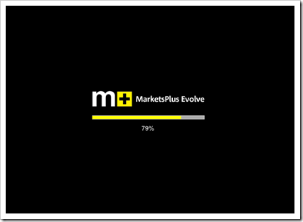
First, they have a nice pre-loader, without any spinning default
blue orbs animation. That is such an easy thing to include in your
own applications, but many folks leave them out. It makes an
impression, especially when it comes to consumer apps.
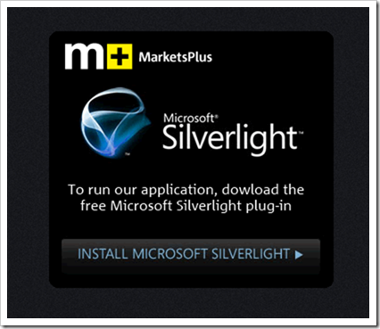
If you visit the app and don't have Silverlight installed, you
get a very simple, but effective, "Install Silverlight" prompt.
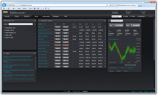
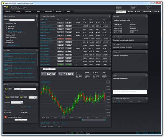
Once the app loads, you'll get a login screen. Login, and you
see the default workspace (this may be different on yours, I'm
using a demo account). Each of the panels is a nice movable window
pane, with intelligent tiling built-in. If you click the little "+"
button at the left of some of the single-column panes, they expand
to take up two columns.
You can also run the application in out-of-browser mode. It's
not an elevated permissions application, so there's no custom
window chrome, however, but it's still a nice looking app.
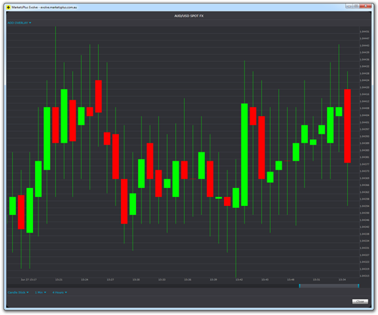
You can expand individual charts using the small "full page"
button to their top right. In this case, I expanded the candlestick
chart and modified the slider to change how much data it
displayed.
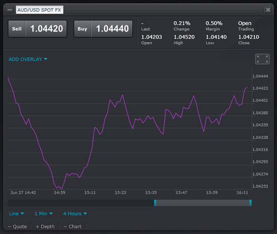
You can also change the chart type to be a line rather than a
candlestick. Here's a partial image from the main workspace
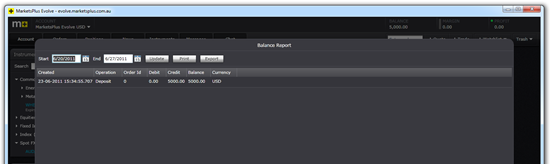
Reports are displayed using a child window that sits above the
other content. This is the balance report, selected using the small
"Reports" menu from the bottom right.
There are a number of things I like about the UX in this
application. You may or may not personally like the semi-gloss
charcoal color scheme, but the overall design is very appropriate
for many of the behind-the-firewall applications I've seen over the
years, and both you and your fellow developers may find it helps
inspire the design of their own business applications:
- Simple color scheme, with subtle textured gradient for
background. I like the dark scheme in this application, and also
like that it is very simple, without too many embellishments.
- Consistent styling throughout
- Workspace management of windows is crisp. The layout is
flexible, but without the overwhelming options a user may find
confusing (like docking). Instead, you just drag things around to
insert them into the right position in the columns.
As food for thought, there are some things I'd likely change if
I were designing this UI:
- I find the white (or near white) text to be a little too bright
against that background. I might tone it down just a little, but
couldn't say for sure without trying it. It's difficult to balance
"popping" the data without being too hard on the eyes
- I found myself wishing some panels could be expanded to three
columns. I'm likely an edge case in the consumer space, as I have a
30" display with this app on it.
- The bevel effect on the text on the buttons makes the text look
a little fuzzy in my eyes
- It would be nice to be able to expand the height of some of the
scrolling panes
- I'd offer a light color version as well, if this were for other
types of applications. For a market trading app, the dark colors
are pretty standard.
I can't convey the snappy animation in a bunch of screenshots on
a blog post, so go and try it out yourself
-- register for a trial account and give it a whirl. You can also
use the generic demo account: userid: demo, password: demo,
although I encourage you to register and try it out with your own
data.
Overall, this is one of the top Silverlight experiences I've
seen in this area. Not only is it a good app on its own, but I find
it can be great inspiration for our own consumer and LOB XAML
applications.
