Silverlight 5 has made some real improvements to the text stack,
including control over character spacing, and linked and
multi-column text. In this post, we'll look at a few of those
advancements.
Please note that this article and the attached sample code was
written using the Silverlight 5 Beta, available at MIX11 in April
2011, and updated for the Silverlight 5 RC.
Character Spacing
The new CharacterSpacing property for the RichTextBox, TextBlock
and Run elements provides control over the spacing of the letters
inside the run of text.
<StackPanel>

    <TextBlock FontSize="18">

        <Run CharacterSpacing="200"

                Text="This is a test with character spacing 200" />

    </TextBlock>

    <TextBlock FontSize="18">

        <Run CharacterSpacing="100"

                Text="This is a test with character spacing 100" />

    </TextBlock>

    <TextBlock FontSize="18">

        <Run CharacterSpacing="0"

                Text="This is a test with character spacing 0" />

    </TextBlock>

    <TextBlock FontSize="18">

        <Run CharacterSpacing="-100"

                Text="This is a test with character spacing -100" />

    </TextBlock>

    <TextBlock FontSize="18">

        <Run CharacterSpacing="-200"

                Text="This is a test with character spacing -200" />

    </TextBlock>


</StackPanel>
The results look like this:

The smaller the number, the more "squished" everything gets.
Linked and Multi-Column Text
One feature that has been requested in HTML and XAML since the
beginning of time (FlowDocuments not withstanding) is the ability
to have linked and multi-column text. This enables magazine and
newspaper-style layouts, and gives designers a lot more flexibility
with how to lay out the content in applications.
UPDATE 8/31/2011: Post-beta, this was changed
to use the read-only RichTextBlock rather than the editable
RichTextBox control. These controls also lack the
HorizontalScrollbarVisibility and VerticalScrollbarVisibility
properties and the BorderThickness property present in the
RichTextBox and RichTextBoxOverflow. I've updated the in-line
listing below as well as the downloadable source code.
The two controls of interest are the RichTextBlock and the
RichTextBlockOverflow. You use the RichTextBlock like you normally
would, but you link it to a chain of one or more
RichTextBlockOverflow elements via the OverflowContentTarget
property. (the text below is truncated so as not to fill the page
with lorem ipsum)
<RichTextBlock x:Name="FirstBox"

             OverflowContentTarget="{Binding ElementName=SecondBox}"

             HorizontalAlignment="Left"

             Width="277">

    <Paragraph>

    Lorem ipsum dolor sit amet, consectetur adipiscing elit. Sed ...

    </Paragraph>

    <Paragraph>

        Sed facilisis cursus ipsum, eget aliquet leo imperdiet sit amet. Aliquam ...

    </Paragraph>

    <Paragraph>

        Duis accumsan tristique nisi, non malesuada elit tempor ... fermentum mi euismod.

    </Paragraph>


</RichTextBlock>


<RichTextBlockOverflow x:Name="SecondBox"

                     HorizontalAlignment="Right"

                     Width="252"

                     Margin="0,154,0,0">


</RichTextBlockOverflow>
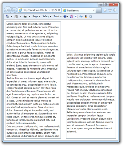
The result is cleanly flowing text. Here's the window resized to
be small, but just large enough to hold all the text.

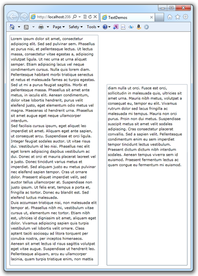
Here it is a little larger, so that the text flows into the
second column, but doesn't fill it

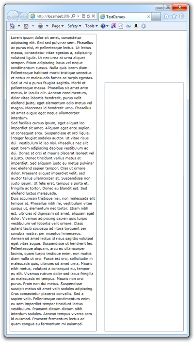
And here it is resized to be large enough so all the text fits
in the first column

You can have any number of RichTextBlockOverflow controls in the
chain, allowing you to link text so it flows in columns, around
images, into expanders, pretty much anything you'd like. In fact,
while rich text blocks are rectangular, you can get pretty clever
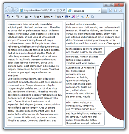
with flowing around images. Take this chain as an example:

Of course, the layout is pretty fiddly, and you'd have to get
the line spacing just right in order to avoid having the text look
obviously blocked up like this. However, it does let you do some
things that were nearly impossible in previous versions of
Silverlight. Just for grins, here's the XAML for the above, minus
the main RichTextBlock.
<Ellipse Margin="0,123,-184,23"

         Name="ellipse1"

         Stroke="Black"

         StrokeThickness="1"

         Fill="#FF904141"

         HorizontalAlignment="Right"

         Width="307" />

<RichTextBlockOverflow HorizontalAlignment="Right"

                     Margin="0,123,85,0"

                     Name="ThirdBox"

                     OverflowContentTarget="{Binding ElementName=FourthBox}"

                     Width="195"

                     Height="41"

                     VerticalAlignment="Top" />

<RichTextBlockOverflow HorizontalAlignment="Right"

                     Margin="0,162,112,0"

                     Name="FourthBox"

                     OverflowContentTarget="{Binding ElementName=FifthBox}"

                     Width="168"

                     Height="57"

                     VerticalAlignment="Top" />

<RichTextBoxOverflow HorizontalAlignment="Right"

                     Margin="0,217,129,124"

                     Name="FifthBox"

                     OverflowContentTarget="{Binding ElementName=SixthBox}"

                     Width="151" />

<RichTextBoxOverflow HorizontalAlignment="Right"

                     Margin="0,0,112,69"

                     Name="SixthBox"

                     OverflowContentTarget="{Binding ElementName=SeventhBox}"

                     Width="168"

                     Height="57"

                     VerticalAlignment="Bottom" />

<RichTextBoxOverflow HorizontalAlignment="Right"

                     Margin="0,0,85,0"

                     Name="SeventhBox"

                     Width="195"

                     Height="71"

                     VerticalAlignment="Bottom" />
I'm really looking forward to what text-savvy designers do with
this new feature. I've always loved the look of multi-column
smoothly-flowing text.
Silverlight has added a number of new text features that both
improve readability and increase capabilities. Text is so
ubiquitous that many of us over look it, or simply take it for
granted. However, magazines, books, newspapers and many online
sites all have significant investments in how they format and lay
out their text. I'm glad to see that Silverlight will be able to be
part of that.
Source code for the Silverlight 5 Beta version of this
application may be downloaded via the link below.
A video version of this tutorial will be on Silverlight.net
shortly.
