I've been tripped up on a problem in Shoebox Scan for several
weeks now. I'll pick it up for an hour or two on a Friday, get
nowhere, and put it down until later the next week. Today, I
finally figured out what the problem is. (Yes, I have been piddling
with this application since early this year. I'm pretty sure Scott has a
special ulcer just for me and Shoebox scan <g>)
Background
I rewrote Shoebox Scan so I could make the code follow modern WPF coding and
design practices. There were some areas of really tight coupling
between some of the UI elements and the backing store that were a
constant source of churn whenever I made a change. I won't say it
was a disaster, but it was a mess. The part of the code had to do
with the selection of regions in the image for purposes of rotating
and cropping.
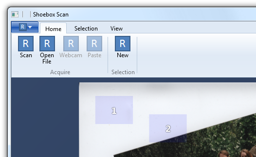
Here's a work-in-progress screenshot showing two selection
regions on a scanned image. The adorners are turned off for the
moment because I thought they were the problem. Without the
adorners, you can move the regions around. With the adorners, you
can move everything around, plus rotate and resize to select a
region from the image to save to a file.
Refactoring
So, I refactored it to use MVVM with binding in the UI. Rather
than have these other controls injecting everything via code, I was
able to move the UI into XAML. Rather than have code which added
and removed regions, I was able to use a plain old
ItemsControl to represent them on-screen, and a data template
to define the appearance. I'll probably retemplate a listbox or
derive my own control from Selector later.
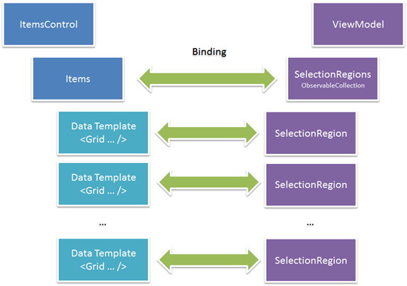
You wouldn't normally think of an ItemsControl in this context.
ItemsControls are usually thought of for lists of data in some
structured format. This is free form: each item can be a different
size, rotation and location.
Inside the data template, I bound the root grid of the
template to the Left, Top, Width, and Height of the
SelectionRegion.
The Problem
While the ItemsControl is actually perfectly suited to this, The
problem I ran into was that no matter what I did, I could not get
the regions to move from the top left. I could see that the
properties were correct in the viewmodel.
In the DataTemplate, I had set up a root Grid, and bound the
Canvas.Left and Canvas.Top properties to the appropriate properties
on the SelectionRegion model object. In the debugger, I verified
that the properties were being updated, that there were no binding
problems. I also did the usual replacement of the ItemsPanel with a
canvas set to stretch in both directions. Still no go. Despite the
frustration of seeing everything correct in the debugger, the
visuals weren't correct.
The Debugging (well, the last bit of it, anyway)
I cracked open Snoop and looked at the tree. It occurred to me
that the problem might be with the ContentPresenter's positioning
or sizing.
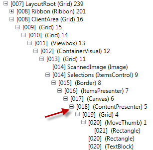
Sure enough, when I looked at the ActualHeight and ActualWidth,
I saw that the content presenter was sized to the individual item.
This seems obvious in retrospect, but it took a while to find
it.
The Solution
The solution, of course, was to set the
ItemContainerStyle and bind that to the Left, Top, Width and
Height. The resulting ItemsControl with the appropriate
templates, looks like this:
<ItemsControl x:Name="Selections"
              ItemsSource="{Binding Regions}"
              HorizontalAlignment="Stretch"
              VerticalAlignment="Stretch">
    <ItemsControl.ItemsPanel>
        <ItemsPanelTemplate>
            <Canvas HorizontalAlignment="Stretch"
                    VerticalAlignment="Stretch"/>
        </ItemsPanelTemplate>
    </ItemsControl.ItemsPanel>

    <ItemsControl.ItemContainerStyle>
        <Style TargetType="ContentPresenter">
            <Setter Property="Canvas.Left"
                    Value="{Binding CalculatedNormalLeft}" />
            <Setter Property="Canvas.Top"
                    Value="{Binding CalculatedNormalTop}" />
            <Setter Property="Width"
                    Value="{Binding Width}" />
            <Setter Property="Height"
                    Value="{Binding Height}" />
        </Style>
    </ItemsControl.ItemContainerStyle>

    <ItemsControl.ItemTemplate>
        <DataTemplate>
            <Grid HorizontalAlignment="Stretch"
                  VerticalAlignment="Stretch">

            <controls:MoveThumb Cursor="SizeAll"
                                Template="{StaticResource MoveThumbTemplate}" />

                <Rectangle Fill="Blue"
                           Opacity="0.1"
                           IsHitTestVisible="False"
                           Stretch="Fill" />

                <TextBlock Foreground="#ffffffff"
                           FontSize="24"
                           FontWeight="Bold"
                           FontFamily="Segoe UI"
                           Text="{Binding Caption}"
                           IsHitTestVisible="False"
                           Margin="10,0,10,0"
                           HorizontalAlignment="Center"
                           VerticalAlignment="Center">
                    <TextBlock.Effect>
                        <DropShadowEffect Opacity="1"
                                          BlurRadius="4"
                                          Color="Black"
                                          ShadowDepth="0" />
                    </TextBlock.Effect>
                </TextBlock>

                <!--<controls:DesignerItemDecorator x:Name="ItemDecorator"
                                                ShowDecorator="True" />-->

                <Grid.RenderTransform>
                    <RotateTransform CenterX="0.5"
                                     CenterY="0.5"
                                     Angle="{Binding RotationAngle}" />
                </Grid.RenderTransform>

            </Grid>

        </DataTemplate>
    </ItemsControl.ItemTemplate>
</ItemsControl>
I'm posting this in case someone else tries to bend an
ItemsControl in a similar way, and runs into problems with
positioning. Now I can go back to solving the hard problems around
rotation and cropping :)