This is an unedited, raw, excerpt from chapter 24 of my book, Silverlight in
Action. The chapter as a whole covers creating custom panels
and controls. This excerpt covers creating a custom layout panel
which arranges items in a circular or orbital fashion.
24.1 Creating a Custom Panel
In chapter 6, I covered the layout system. In that system, the
primary responsibility for positioning and sizing controls falls to
the panel the controls reside in. Some panels, such as the Canvas,
position using simple Left and Top coordinates. Others, such as the
StackPanel lay out children based on a series of measurements and a
placement algorithm.
In this section, we're going to build a panel that doesn't
currently exist in Silverlight: the OrbitPanel. This Panel will lay
out elements in a circle rather than the horizontal and vertical
options available with the stock StackPanel or the box layout of a
Grid. The new panel in action can be seen in figure 24.1
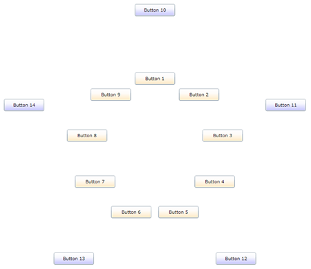
Figure 24.1 The OrbitPanel in action. The inner (first)
orbit has 9 buttons. The outer (second) orbit has 5
buttons.
The OrbitPanel control supports an arbitrary number (greater
than zero) of orbits. Each orbit is a concentric circle starting at
the center point. The amount of space allocated to an orbit is
function of the number of orbits and the size of the panel itself.
If there are many orbits, the space will be narrower.
The layout is done starting at angle 0 and equally dividing the
remaining degrees by the number of items in the specific orbit.
Items added to the panel may specify an orbit via the use of an
attached property.
In this section, we'll build out this panel, starting with
project creation, including the addition of a library project
specifically for this panel and for the custom control we'll build
later in the chapter. We'll create a dependency property as well as
an attached property, both because they are useful, and because
creating them is a necessary skill for panel and control builders.
From there, we'll spend most of the time looking at how to perform
the measure and arrange steps described in chapter 6 to layout the
control. We'll wrap up this section with a guide on some potential
enhancements should you desire to take the panel further on your
own.
24.1.1 Project Setup
For this example, create a new Silverlight project. I called
mine "Chapter24Controls". Once the solution is up with the
Silverlight application and test web site, add another project;
this second project will be a Silverlight class library named
"ControlsLib". While I could have put the custom panel into the
same project as the Silverlight application, that is almost never
the real-world scenario.
From the Silverlight application, add a project reference to the
ControlsLib project. Do this by right-clicking the Silverlight
application, selecting "Add Reference", navigating to the projects
tab, and selecting the project.
With the project structure in place, let's work on the
OrbitPanel class.
24.1.2 The OrbitPanel class
The implementation of our panel will be in a single class named
OrbitPanel. Inside the ControlsLib project, add a new class named
"OrbitPanel". This class will contain all the code for the custom
panel. Derive the class from the Panel base type as shown here:
namespace ControlsLib
{
    public class OrbitPanel : Panel
    {
    }
}
Panel is the base type for all layout panels in Silverlight,
including the Canvas, Grid and StackPanel. The class itself derives
directly from FrameworkElement, so it is a pretty low-level class,
lacking the extras you'd find in something like Control. What it
does include is very important to Panels: the Children
property.
The Children property is a UIElementCollection. That is, it's a
specialized collection of child elements placed inside this panel.
This is the key property that makes a Panel a Panel.
In addition to the Children property, the Panel class provides a
Background brush property and a boolean IsItemsHost which is used
in concert with the ItemsControl class. Deriving from Panel allows
you to substitute your panel in for the StackPanel in a ListBox,
for example.
The OrbitPanel class will have two dependency properties used to
control how it functions.
24.1.3 Properties
The OrbitPanel class will need to have two properties. The first
property, Orbits, will control the number of concentric circles, or
orbits, available for placing items. The second related property is
an attached property, Orbit, to be used on items placed into the
panel; it controls which circle the item is to be placed in.
Orbits Dependency Property
In general, controls and panels should expose properties as
dependency properties. If there's any possibility that they'll be
used in binding or animation, a dependency property is the way to
go. In fact, when the Silverlight team exposes properties as
straight CLR properties, more often than not, there's feedback that
it should have been a dependency property because a customer or
someone in the community tried to use it in binding or
animation.
Dependency properties are specified at the class level using a
static property and DependencyProperty.Register call. For use in
code and XAML, they are also wrapped with a standard CLR property
wrapper that internally uses the dependency property as the backing
store. Optionally, the dependency property may specify a callback
function to be used when the property changes.
Listing 24.1 shows the complete definition for the Orbits
property, with all three of these items in place.
Listing 24.1 The Orbits
Property
public int Orbits
{
    get { return (int)GetValue(OrbitsProperty); }
    set { SetValue(OrbitsProperty, value); }
}

public static readonly DependencyProperty OrbitsProperty =
    DependencyProperty.Register("Orbits", typeof(int), typeof(OrbitPanel), new PropertyMetadata(1, OnOrbitsChanged));

private static void OnOrbitsChanged(DependencyObject d, DependencyPropertyChangedEventArgs e)
{
    if ((int)e.NewValue < 1)
    {
        throw new ArgumentException("Orbits must be greater than or equal to 1.");
    }
}
The first thing you'll notice in this code is the Orbits CLR
property. This is a standard CLR wrapper, used for simple property
access in code, and required for property access in XAML. The
property code uses the GetValue and SetValue methods, provided by
DependencyObject, to access the backing dependency property. While
not required at a compiler or framework level (unless you want to
use the property in XAML), providing the CLR wrapper is a standard
practice when defining dependency properties.
TIP
Visual Studio 2010 includes a snippet for declaring dependency
properties for WPF. With a slight change to rename
UIPropertyMetadata to PropertyMetadata in the last parameter, this
works well for Silverlight applications, and saves remembering the
exact syntax.
The next chunk of code in this listing defines and registers the
dependency property. The single line both defines the property and
registers it with the property system. The first parameter is the
string name of the property. By convention, the name of the
dependency property variable is this string plus the word
"Property". The second parameter is the type of the property
itself, in this case, an int. The third parameter is the type
you're registering the property on. The fourth and final parameter
is a PropertyMetadata object.
The PropertyMetadata object can be used to specify a default
value, a property changed callback, or as seen here, both. When
providing the default property value, be very specific with the
type. For example, a property value of 1 will not work with a
double type; you must specify 1.0 or face the wrath of an obscure
runtime error.
The property changed callback function enables you to hook into
the process to perform actions when the dependency property
changes. Note that you'd never want to do this inside the CLR
wrapper, as that would only catch a few of the scenarios under
which the property could change. The callback function takes in an
instance of the object which owns the property, as well as an
EventArgs-derived class which has both the new and old values
available for inspection.
All three pieces: the CLR wrapper, the dependency property
definition and registration, and the callback function, make up the
implementation of a single dependency property in Silverlight.
While verbose, the benefits provided by dependency properties are
great, as seen throughout this book. When creating your own
properties for panels and controls, err on the side of implementing
them as dependency properties.
A specialized type of DependencyProperty, the attached property
is used when you want to provide a way to enhance the properties of
another object. That's exactly what we need to do with the Orbit
property.
Orbit Attached Property
Each item added to the OrbitPanel needs to be assigned to a
specific circle or orbit. This is similar in concept to how a Grid
needs items to specify which row and column, or how the Canvas
needs Left and Top for each element. The way those properties are
specified is to use the type name (Grid or Canvas) and the property
name together in the element, like this:
<TextBox Grid.Row="0" Grid.Column="1" />

<TextBox Canvas.Left="100" Canvas.Top="150" />
In these examples, the TextBox doesn't contain a Row, Column,
Left or Top property, instead it relies on another type (the Grid
or Canvas) to attach them. We'll do the same with the Orbit
property of the OrbitPanel. Listing 24.2 shows the implementation
of the Orbit attached property in the OrbitPanel class.
Listing 24.2 The Orbit attached property in the
OrbitPanel class
public static int GetOrbit(DependencyObject obj)
{
    return (int)obj.GetValue(OrbitProperty);
}

public static void SetOrbit(DependencyObject obj, int value)
{
    obj.SetValue(OrbitProperty, value);
}

public static readonly DependencyProperty OrbitProperty =
    DependencyProperty.RegisterAttached("Orbit", typeof(int), typeof(OrbitPanel), new PropertyMetadata(0));
Notice that attached properties do not use a CLR wrapper.
Instead, you provide a Get and Set method to allow the properties
to be used in code and XAML.
The RegisterAttached method is similar to the Register method
seen in listing 24.1, with the parameters being identical. In this
case, I did not use a callback method, but instead simply provided
a default value of zero.
With this property in place, we'll now be able to write markup
like this:
<TextBox x:Name="FirstNameField" clib:OrbitPanel.Orbit="1"
/>
(The namespace declaration "clib" is assumed to be valid in the
XAML file in which this bit of markup lives.) To inspect the value
of the attached property from code, use the Get function defined in
listing 24.2.
if (OrbitPanel.GetOrbit(FirstNameField) > 0) ...
In this way, we are now able to set and retrieve properties
associated with objects, without those objects having any provision
for the properties in the first place. This is a very powerful way
to augment types to track additional data.
Dependency properties, and the special type of dependency
property - the attached property, are essential and often used
parts of the property system in Silverlight. When creating your own
panels and controls, you'll almost certainly rely on them as the
primary means of providing knobs your users can use to control the
behavior of your custom classes.
In the case of the OrbitPanel, both of these properties will
come into play when performing our custom layout.
24.1.4 Custom Layout
The primary responsibility of a panel is the layout of its child
controls. In truth, this is what makes a panel a panel; a panel
that performed no custom layout would not be a particularly useful
panel.
As we learned in chapter 6, the layout pass involves two primary
steps: Measure and Arrange. The Measure step measures all the
children of the panel, and the overall panel itself. The Arrange
step performs final placement of the children and sizing of the
panel. As the authors of a custom panel, it is our responsibility
to provide this critical functionality. Listing 24.3 shows the
Measure step, implemented in the MeasureOverride method of the
OrbitPanel class.
Listing 24.3 The Measure Step
protected override Size MeasureOverride(Size availableSize)
{
    var sortedItems = SortElements();

    double max = 0.0;

    for (int i = 0; i < sortedItems.Length; i++)
    {
        var list = sortedItems[i];

        if (list.Count > 0)
        {
            foreach (UIElement element in list)
            {
                element.Measure(availableSize);

                if (element.DesiredSize.Width > max)
                    max = element.DesiredSize.Width;

                if (element.DesiredSize.Height > max)
                    max = element.DesiredSize.Height;
            }
        }
    }

    Size desiredSize = new Size(max * Orbits * 2, max * Orbits * 2);

    if (double.IsInfinity(availableSize.Height) ||
        double.IsInfinity(availableSize.Width))

        return desiredSize;
    else
        return availableSize;
}
The measure pass starts by getting a list of all items, grouped
by their orbit. The code for this function, SortElements, is
included in listing 24.5. I then loop through each orbit, and then
through each item in the orbit, and measure that item. I get the
largest dimension (either width or height) from that element and
compare it to the current max. This is admittedly a bit of a hack,
as the size allotted to each item is, in theory, a pie slice, not a
rectangle. In addition, due to the simplified nature of the orbit
sizing, I didn't need to group the children by orbit. Nevertheless,
it will work for this example.
Once I've looped through every child item, I then calculate the
desired size for this panel. That is calculated by taking the
number of orbits, multiplying by two to account for the circular
nature, then multiplying by the maximum item size. If the original
size passed in was unlimited, I return the desired size, otherwise,
I return the sized provided to the control.
The most important step in this function is the step which
measures each child. That is what sets the desired size for each
child in preparation for the arrange step shown in listing
24.4.
Listing 24.4 The Arrange Step
protected override Size ArrangeOverride(Size finalSize)
{
    var sortedItems = SortElements();

    double orbitSpacing = CalculateOrbitSpacing(finalSize);

    for (int i = 0; i < sortedItems.Length; i++)
    {
        var list = sortedItems[i];

        int count = list.Count;

        if (count > 0)
        {

            // calculate the max size for this orbit. This is a bit of a kludge
            double circumference = 2 * Math.PI * orbitSpacing * (i + 1);

            // divide each orbit up by number of items in that orbit
            double slotSize = Math.Min(orbitSpacing, circumference / count);

            // figure out the size of the square
            double maxSize = Math.Min(orbitSpacing, slotSize);

            double angleIncrement = 360 / count;

            double currentAngle = 0;

            Point centerPoint = new Point(finalSize.Width / 2, finalSize.Height / 2);

            foreach (UIElement element in list)
            {
                double angle = Math.PI / 180 * (currentAngle - 90);

                double left = orbitSpacing * (i + 1) * Math.Cos(angle);
                double top = orbitSpacing * (i + 1) * Math.Sin(angle);

                Rect finalRect = new Rect(centerPoint.X + left - element.DesiredSize.Width / 2,
                                            centerPoint.Y + top - element.DesiredSize.Height / 2,
                                            element.DesiredSize.Width,
                                            element.DesiredSize.Height);

                element.Arrange(finalRect);

                currentAngle += angleIncrement;
            }
        }
    }

    // this panel will always take up available size
    return base.ArrangeOverride(finalSize);
}
The arrange step is where the real layout happens. It is in this
function that the individual children are placed in their final
locations. This is the function that requires digging way back to
10th or 11th grade to remember that trigonometry.
This function, like the previous, starts by sorting the children
into their respective orbits. This is done via the SortElements
function, the body of which is shown in listing 24.5. I then run
through each orbit, calculating the size of the circle and the
angular offset of each item. The angle chosen is based on the
number of items in that orbit, being 360 degrees evenly divided by
the item count.
Then, I calculate the left and top position given the angle.
This left and top will actually be used for the center point of the
element being placed. With that calculated, I call Arrange on the
element to move it to its final location.
Both listing 24.3 and 24.4 relied on some common functions. The
code for both of those, CalculateOrbitSpacing and SortElements is
included in listing 24.5, wrapping up the code for the OrbitPanel
class.
Listing 24.5 Supporting
Functions
private double CalculateOrbitSpacing(Size availableSize)
{
    double constrainingSize = Math.Min(availableSize.Width, availableSize.Height);

    double space = constrainingSize / 2;

    return space / Orbits;
}

private List<UIElement>[] SortElements()
{
    var list = new List<UIElement>[Orbits];

    for (int i = 0; i < Orbits; i++)
    {
        if (i == Orbits - 1)
            list[i] = (from UIElement child in Children
                        where GetOrbit(child) >= i
                        select child).ToList<UIElement>();
        else
            list[i] = (from UIElement child in Children
                        where GetOrbit(child) == i
                        select child).ToList<UIElement>();
    }

    return list;
}
Test markup
To test the new panel, we'll use a simple bit of markup that
creates a number of button controls and places them into two
different orbits. A third orbit is defined, but not used. Listing
24.6 shows the markup to be placed in MainPage.xaml.
Listing 24.6 Using the OrbitPanel from
XAML
<Grid x:Name="LayoutRoot" Background="White">
    <Grid.Resources>
        <Style TargetType="Button">
            <Setter Property="Width"
                    Value="100" />
            <Setter Property="Height"
                    Value="30" />
        </Style>
    </Grid.Resources>
    <clib:OrbitPanel Orbits="3">
        <Button Content="Button 1" Background="Orange"
                clib:OrbitPanel.Orbit="0" />
        <Button Content="Button 2" Background="Orange"
                clib:OrbitPanel.Orbit="0" />
        <Button Content="Button 3" Background="Orange"
                clib:OrbitPanel.Orbit="0" />
        <Button Content="Button 4" Background="Orange"
                clib:OrbitPanel.Orbit="0" />
        <Button Content="Button 5" Background="Orange"
                clib:OrbitPanel.Orbit="0" />
        <Button Content="Button 6" Background="Orange"
                clib:OrbitPanel.Orbit="0" />
        <Button Content="Button 7" Background="Orange"
                clib:OrbitPanel.Orbit="0" />
        <Button Content="Button 8" Background="Orange"
                clib:OrbitPanel.Orbit="0" />
        <Button Content="Button 9" Background="Orange"
                clib:OrbitPanel.Orbit="0" />


        <Button Content="Button 10" Background="Blue"
                clib:OrbitPanel.Orbit="1" />
        <Button Content="Button 11" Background="Blue"
                clib:OrbitPanel.Orbit="1" />
        <Button Content="Button 12" Background="Blue"
                clib:OrbitPanel.Orbit="1" />
        <Button Content="Button 13" Background="Blue"
                clib:OrbitPanel.Orbit="1" />
        <Button Content="Button 14" Background="Blue"
                clib:OrbitPanel.Orbit="1" />
    </clib:OrbitPanel>
</Grid>
This listing produces the image from the opening of this
section, figure 24.1, with two orbits of buttons. In order for this
listing to work, you must define the following namespace:
xmlns:clib="clr-namespace:ControlsLib;assembly=ControlsLib"
Panels are all about measuring and arranging their children.
Measuring is used to ask each child what size it wants to be, and
to provide the overall size for the panel. Arranging is used to
calculate the final location of each of the child elements.
This panel has been a pretty simple implementation both for
space reasons and to keep to the essentials of what we need to
learn. If you wish to take it further, there are some enhancements
I'd recommend.
[ the recommended enhancements, as well as the next section on
building custom controls, can all be found in chapter 24 of Silverlight in
Action, Revised Edition by Pete Brown]