Welcome to Pete Brown's 10rem.net

First time here? If you are a developer or are interested in Microsoft tools and technology, please consider subscribing to the latest posts.

You may also be interested in my blog archives, the articles section, or some of my lab projects such as the C64 emulator written in Silverlight.

(hide this)

Announcing: The Redesigned MSDN Home Page and Hub Pages

Pete Brown - 29 June 2010

The larger group that I'm in, Server and Tools Online in the developer division, supports a large number of properties. One of our largest is MSDN. Scratch that. MSDN is enormous. It provides support for every single developer tool we offer. You'll find full documentation, samples, aggregated blog posts, articles, community content, forums, videos and more. I've never seen another learning resource that has the breadth of MSDN. Ok, maybe wikipedia has a few more pages; I haven't counted.

ddd

Over the past months, we've been working on making MSDN even easier to navigate. Specifically, we're working on making the "get started" experience go more smoothly. We knew we could do better. You spoke. We listened. We appreciate you telling us the places where we've fallen down in our support to you -- where we could do better.

From the redesign information page

Based on your feedback, developer research, and other customer data, we are driving towards general improvement of MSDN for anyone learning Microsoft technologies. Broadly, better organization, search, and curriculum-based learning are essential to supporting developer success. In this first release of the new MSDN Home & Hub pages, we are specifically focusing on building better developer on-ramps for each platform with several important realizations in mind.

  • Microsoft offers too many choices and making the right choice is daunting. Wherever possible, the new MSDN will simplify the process of making the right choice for our customers.
  • Fundamentally, the nature of development is shifting. Many developers are learning to code by editing, debugging, and modifying code. The new treatment for the MSDN sites will embrace both this iterative learning style and other styles so that we can support the broadest set of developers.
  • Developers have told us that they want more samples, more code, and more working applications that they can learn from or use in their own projects

This is a great day for launches. I'm proud to announce that we've released beta 1 of the new MSDN home page and hub pages, for you to try out and provide feedback. This is a real beta. That means when you try it, you can provide actionable feedback that we will fold into our planning.

New Home Page

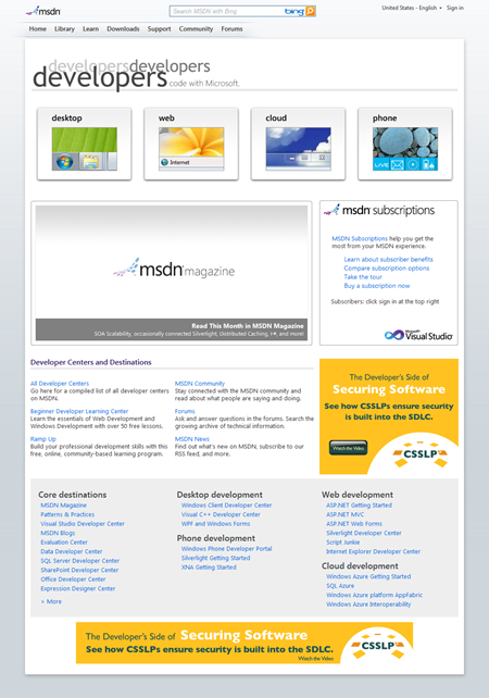
The pages are propagating across the tubes, and soon you'll see a new home page that looks like this:
image

I just love that clean design. The top buttons represent the hubs we've created to help you get started using those technologies. (Phone won't be up for the beta; we'll redirect to the current page for now.) Each button brings you to a hub page focused on that type of development.

Hub Pages

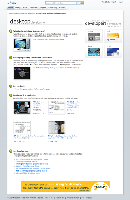
Each hub has progressively deeper learning content. The first video, Step 1, is a very high-level overview making no assumptions about your background in this space. Consider a web developer that has never done desktop development - they may want to learn more about how it works.

The Step 2 video is an overview of Microsoft's place in that type of development. It covers what technology stacks are available, what tools to use etc.

Step 3 is a link to the tools you'll need to work in this space.

Step 4 includes "Hello World" type videos for each of the different technologies. Source code is included as well.
 

image

On the desktop page, I did the #2 video as well as the Silverlight and WPF "first app" videos. On the web page, I did the #2 video as well as the Silverlight overview. I really tried to use my best NPR voice on the #2 videos. :)

If you find anything wrong, or something we could do better, tell me. Tell us. Comment here if you'd like, just make sure we get your feedback so your voice is heard.

               
posted by Pete Brown on Tuesday, June 29, 2010
filed under:                

11 comments for “Announcing: The Redesigned MSDN Home Page and Hub Pages”

  1. Kevin Majorsays:
    Not bad, but two things:

    1. There's no easy way to get to the C# section. It's not present under most pages' 'Development Tools and Languages' sub-category.

    2. Why hasn't the ASP.NET stuff been absorbed into MSDN? It looks out of place and, frankly, outdated compared to the rest of Microsoft's developer sites.
  2. Aaronsays:
    Nice looking -- not sure it's easier to navigate.

    Like the SteveB reference.

    It's having some issues currently on Chrome at least -- header is messed up and the contrast on some links is totally whack.
  3. Colin Pritchardsays:
    This looks promising.

    I just wondered where the best place to provide feedback is? As an old-time VB6 developer that's been moving to .NET-based web development over the last couple of years, there have been a few times when I (and my team) have floundered for information.

    I personally feel that too much "learning" content has become video these days. For one thing, it means finding the pair of company headphones that we have, making it an "inconvenient" source. And I can't imagine my colleagues think I look like I'm working very hard when I'm staring at the screen wearing headphones. For all they know, I'm killing time on YouTube. It doesn't "feel" professional.
    For another thing... It takes too much time. I don't have the time to spend minutes and minutes watching videos hoping that it might tell me what I need to know. If I'm searching for information on how to do something and see videos that look like they might include a section on what I want... I will ignore them and keep searching.
    I would love to be able to spend hours watching and learning, but we don't have that sort of free time available. I need to find something that tells me what I want to do. Maybe that's in the middle of a sixteen-page article, but it doesn't matter if it's written, because I can skim over the bits that aren't relevant or go back and read them later. In a video, it's much harder to identify whether it's really going to cover what I need to know, and to dig out the relevant parts from that.

    I hope that you are able to learn something constructive from these comments! Thank you sincerely for your efforts to make our lives easier :)

    Colin
  4. Jeremysays:
    Where's the WCF and service info? I'm responsible for service development, which doesn't fit neatly into any of the other groups (Cloud? maybe, but that appears to be just Azure). I really don't care whether my consumers are using web or desktop apps.
  5. Owen Pellegrinsays:
    I write a blog entry in response to this redesign. Here's a summary.

    * Newbies don't want to spend 30 minutes on a video titled "Write a WPF application". They want to watch "Write a Twitter client with WPF". Make your video titles sound like they're doing something fun!
    * Getting to useful documentation on MSDN takes lots of experience and honed search-fu. Videos are not documentation, they're just a band-aid.
    * The videos seem to appear in order from "most niche and advanced" to "most useful to newbies". That order should be reversed.
    * It'd also be nice if the videos were labled "beginner" to "advanced" so newbies could understand if it would be worth watching a random video.
    * MSDN forums would be the most useful part of MSDN if they were greatly simplified instead of following some "every product must have at least two forums" decree that likely came from marketing.
    * Microsoft's bloggers write content that's often better than anything on MSDN. Unfortunately, MSDN makes no attempts to keep links to the good stuff around. Stop lazily relying on RSS feeds, start archiving good blog posts (like many of your Silverlight articles.)
  6. Robertsays:
    Simply put, Microsoft tends to go from one ditch to the other. This seems to be the case as here as well. The new site is way too simplistic, where the old site could be overwhelming in information overload.

    I don't mind the opening page, but frankly, I find the hubs irritating. I've been developing for Windows since version 3.1, and I really don't need to see "What is client desktop development?" staring me in the face, at the very top of the page. I doubt very seriously I'll come back if I have to see this everytime.

    I understand there is number of new developers that need "handholding", but for people who have been programming for sometime you have to wade through all the newbie stuff to get to the real meat (although I've yet to find any in the new design).

    I appreciate all the hard work, but this is just too simplistic, and a real turn-off.
  7. Patricesays:
    I would second Robert. It feels I'm on the http://msdn.microsoft.com/en-us/beginner/default.aspx subsite.

    IMO the problem is that the content seems directed to newbies (while they already had a "Learn" link then the beginner center). But as they are moving away from being beginners the new site makes IMO harder to find your way (no direct access to most prominent developer centers, how can't we have this on the front page ?). So it is beneficial to new users for a short period of time. It is IMO worse for all those who have or will quit the beginner status..

    Time will tell if I change my mind as I'm getting used to the new site.
  8. Toddsays:
    I agreed with Robert; these lightweight home pages and hubs are annoying. asp.net did the same sort of thing, now it's home page is almost useless and I almost never bother to look at it.
  9. Emily Petruccisays:
    This is all great feedback! Thanks to all of you. I'm the site manager for the Home & Hub experience. If you have more feedback or if you would like to continue the exchange with me directly, you can reach me at emoon@microsoft.com. On any page on MSDN, you can also send mail to the site manager for that page by clicking the Site Feedback link at the bottom of the page. We reply to every message, and we consider all feedback good feedback!


    @Kevin Major: Check out the "All Developer Center" link on the MSDN home page: http://msdn.microsoft.com/aa937802.aspx. We're looking into site design and better aligning sites that MSDN manages, one of which is ASP.NET. We'll get there. Thanks for the feedback!

    @Aaron: Glad you like it! Yes, that SteveB reference was pretty funny. We hadn't thought of that. For the display issues, it was an issue with image caching. At 2PM PST today, the cached images expired, so you shouldn't see an issue now. Let me know if you still do!

    @Kelvin Li: Yes, there was an issue until 2PM PST today with image caching. You shouldn't see any funny display issues now though. The cached images expired. Before now, you could have cleared your browser cache (CTRL+F5) to fix the display. Let me know if you still see any issues in Chrome. I just tested the site in Chrome, and I'm not seeing anything odd. Thanks for your feedback!

    @Colin Pritchard: Fantastic feedback. All feedback is good feedback, so bring it on - even if you feel you're just rattling out what you've been thinking inwardly for a while. We can make the MSDN experience better only by sincerely considering what the people think who use the site: you. For learning content, we have been talking quite sincerely about also providing transcripts for videos, especially for those hub projects. Then, you'd be able to just read through what's said in the video or watch the video without sound. Please do feel free to ping me anytime with more feedback. We're listening!

    @Jeremy: You can find lots of WCF stuff here on the .NET Framework Developer Center: http://msdn.microsoft.com/en-us/netframework/aa663324.aspx. I just confirmed that a search on the MSDN site for "WCF" does bring up this page as the first result. Happy to hear more feedback from you too as you go through the WCF pages. Please use the Site Feedback link at the bottom of any page so the WCF site manager (Laurie) gets your feedback directly.

    @Owen Pellegrin: 1) Fantastic feedback about video names. That's a quick fix that I hope to roll out in the next week. Thank you for the suggestion.
    2) We're working on improving search in a big way, as well as taking in feedback about what you all want to see on MSDN. I'll certainly retain this feedback and bring it to the larger table. We meet at least weekly about the "content calendar" for MSDN.
    3) Interesting point about the order of the videos. It's a hard balance we're trying to strike on these hub pages. Newbies don't necessarily understand which videos on the hub pages are more advanced, but more experienced developers do. It's certainly an interesting idea, and I'll bring it to the table too.
    4) Another good point. This speaks to my #3 reply in that newbies don't always know the difference between how challenging each set of videos might be. Perhaps being a little more direct about it on the page itself would help! Very valuable.
    5) Good feedback about forums. I'll forward this to that team. Thanks for letting us know - agree that it's not easy to find a helpful forum when there are many for each technology.
    6) Also good feedback. We're trying to put together a better content strategy for MSDN, and this is a valid suggestion. I'll bring it to the table to discuss, for sure. Thank you.

    @Robert: Your feedback is very valid. It's not easy to strike a balance between newbies and experienced developers, and we're going to keep trying! Every bit of feedback from the experienced developer audience helps us get closer, so please keep the feedback and suggestions coming in. We value your help.

    @Patrice: You and I exchanged mail through the Site Feedback link earlier today. Thanks again for sharing your feedback. It's quite valuable. Please do keep in touch with us as you use the new design and let us know your thoughts.

    @Todd: Thanks for the feedback. In the experienced dev community, we're seeing a pattern of wanting more meat on the home page. Certainly, we will consider all this feedback as we look to iterate on the Home & Hub design. Have you checked out the Community page? It might be the meat you're looking for. http://msdn.microsoft.com/en-us/aa497440.aspx

Comment on this Post

Remember me