WPF 4
allows you to customize the caret (the blinking line in a textbox
that shows your current cursor position), as well as the selection
brushes. This is great to allow you to be able to fully incorporate
a custom color scheme.
Carets
The Custom Caret is especially helpful when you need to optimize
the contrast with the background, or fit it in with your own color
scheme.
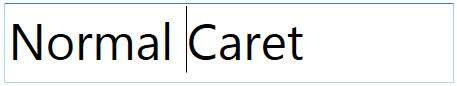
Normal Caret
Custom Caret

Xaml Markup to Change Caret Brush
<TextBox Text="Custom Caret"
         Width="450"
         Height="80"
         FontSize="50"
         Margin="10">
    <TextBox.CaretBrush>
        <LinearGradientBrush StartPoint="0,0"
                             EndPoint="0,1">
            <GradientStop Offset="0"
                          Color="Red" />
            <GradientStop Offset="0.5"
                          Color="Yellow" />
            <GradientStop Offset="1.0"
                          Color="Blue" />
        </LinearGradientBrush>
    </TextBox.CaretBrush>
</TextBox>
Selections
Customizing the selection brush is a huge boon for folks
creating their own branded experience.
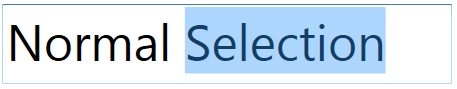
Normal Selection
Custom Selection
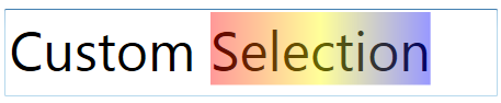
Xaml Markup to Change Selection Brush
<TextBox Text="Custom Selection"
         Width="450"
         Height="80"
         FontSize="50"
         Margin="10">
    <TextBox.SelectionBrush>
        <LinearGradientBrush StartPoint="0,0"
                             EndPoint="1,0">
            <GradientStop Offset="0"
                          Color="Red" />
            <GradientStop Offset="0.5"
                          Color="Yellow" />
            <GradientStop Offset="1.0"
                          Color="Blue" />
        </LinearGradientBrush>
    </TextBox.SelectionBrush>
</TextBox>
The new properties are on TextBoxBase, so they apply to any
control that derives from that, such as TextBox and RichTextBox.
The SelectionBrush was also added separately to the
FlowDocumentReader control.
