In my previous post about buttons and content controls, I explained how to do quite a bit of customization using just the content property of a button. That gets you pretty far, but you’re barely tapping into what WPF (and Silverlight) can do.
In this post, we’ll cover styling and and build up the background we’ll need to tackle templating, the backbone of what makes WPF and Silverlight so powerful.
Lookless Controls
In WPF and Silverlight, controls are “lookless”. That is, everything about how they appear is defined in the style and the control template. The code itself just counts on certain elements (Parts) existing in the template. Otherwise, it is ignorant of how the control is presented. The style contains many of the default values for the properties of the control.
That design is what allows you to create listboxes that look more like carousels or menus, and buttons that look completely unlike any normal button. As long as the behavior (the code) is the same, the appearance can be anything you want.
We’ll work our way up to control templates in our next post, but first, let’s jump into styling some buttons.
Styling
Styles in WPF and Silverlight are similar in concept to styles in CSS. They are more powerful in terms of what they can control, but overall the concept is the same.
Like HTML/CSS, the most basic way to set your control’s properties is to do it using regular property statements in the markup. We’ll start there.
Using Properties
The simplest way of setting values on elements is to do it directly in-line, using property assignment in xaml.
In this example, I have three buttons, all with foreground and margin settings.
<Window x:Class="WpfButtonStyling.MainWindow"
        xmlns="http://schemas.microsoft.com/winfx/2006/xaml/presentation"
        xmlns:x="http://schemas.microsoft.com/winfx/2006/xaml"
        Title="MainWindow" Height="250" Width="400">
    <Grid>
        <StackPanel>
            <Button x:Name="FirstButton"
                    Content="First!"
                    Foreground="Red"
                    Margin="10" />
            <Button x:Name="SecondButton"
                    Content="Second"
                    Foreground="Red"
                    Margin="10" />
            <Button x:Name="ThirdButton"
                    Content="Third"
                    Foreground="Blue"
                    Margin="10" />
        </StackPanel>
    </Grid>
</Window>
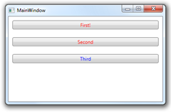
The resulting window looks like this:

All the buttons share the same margin size, and the first two also have the same foreground color. Rather than specify it each time, it would be better to set up a common style and refer to it from each button. Luckily, that’s really easy to do.
Styles are simply trees of property values for a specific type of control. You can have them inside any element (typically the outermost container like a Window or UserControl), at the application level, or loaded via resource dictionaries.
Local Explicit Styling
For this first look, let’s define our style locally. That means that only elements within the scope of the style can use it. Note that the style is used for all three buttons, but we override the Foreground property on the third button to set it to blue. Locally-provided property values have precedence over those set by a style.
The style itself is set up as a resource in the Window.Resources property of the Window. We provided the style with a key (StandardButton) which may be used in markup to reference it in the button controls. The style also has a TargetType which references the type of control it works on.
<Window x:Class="WpfButtonStyling.MainWindow"
        xmlns="http://schemas.microsoft.com/winfx/2006/xaml/presentation"
        xmlns:x="http://schemas.microsoft.com/winfx/2006/xaml"
        Title="MainWindow" Height="250" Width="400">
    <Window.Resources>
        <Style x:Key="StandardButton"
               TargetType="{x:Type Button}">
            <Setter Property="Foreground"
                    Value="Red" />
            <Setter Property="Margin"
                    Value="10" />
        </Style>
    </Window.Resources>

    <Grid>
        <StackPanel>
            <Button x:Name="FirstButton"
                    Content="First!"
                    Style="{StaticResource StandardButton}"/>
            <Button x:Name="SecondButton"
                    Content="Second"
                    Style="{StaticResource StandardButton}" />
            <Button x:Name="ThirdButton"
                    Content="Third"
                    Foreground="Blue"
                    Style="{StaticResource StandardButton}" />
        </StackPanel>
    </Grid>
</Window>
The way the style is applied to the buttons is via the StaticResource markup extension. The resulting window looks exactly like the previous one.
Local Implicit Styling
That’s pretty powerful, but it can get tedious to specify the style for each and every button in your application, especially if they’re all going to look exactly the same. Not only that, but it’s error-prone as you could forget to set the style on a button or two, and they’d stick out.
WPF (and Silverlight 4) support the concept of Implicit Styles. These are styles that are based on a type, not a key. Once set, all controls within scope that don’t have an explicit style set will automatically get the implicit style.
To make a style implicit, simply remove its key.
<Window x:Class="WpfButtonStyling.MainWindow"
        xmlns="http://schemas.microsoft.com/winfx/2006/xaml/presentation"
        xmlns:x="http://schemas.microsoft.com/winfx/2006/xaml"
        Title="MainWindow" Height="250" Width="400">
    <Window.Resources>
        <Style TargetType="{x:Type Button}">
            <Setter Property="Foreground"
                    Value="Red" />
            <Setter Property="Margin"
                    Value="10" />
        </Style>
    </Window.Resources>

    <Grid>
        <StackPanel>
            <Button x:Name="FirstButton"
                    Content="First!"/>
            <Button x:Name="SecondButton"
                    Content="Second"/>
            <Button x:Name="ThirdButton"
                    Content="Third"
                    Foreground="Blue"/>
        </StackPanel>
    </Grid>
</Window>
Note how the individual buttons picked up the new style without any additional markup.
Implicit styles are typically used application-wide. Let’s look at how that works.
Application-Wide Styling
So far, the styles we’ve used have been defined in the window’s resources section. To make styles work application-wide, simply include them in App.Xaml.
App.xaml
<Application x:Class="WpfButtonStyling.App"
             xmlns="http://schemas.microsoft.com/winfx/2006/xaml/presentation"
             xmlns:x="http://schemas.microsoft.com/winfx/2006/xaml"
             StartupUri="MainWindow.xaml">
    <Application.Resources>

        <Style TargetType="{x:Type Button}">
            <Setter Property="Foreground"
                    Value="Red" />
            <Setter Property="Margin"
                    Value="10" />
        </Style>

    </Application.Resources>
</Application>
Main Window
<Window x:Class="WpfButtonStyling.MainWindow"
        xmlns="http://schemas.microsoft.com/winfx/2006/xaml/presentation"
        xmlns:x="http://schemas.microsoft.com/winfx/2006/xaml"
        Title="MainWindow" Height="250" Width="400">

    <Grid>
        <StackPanel>
            <Button x:Name="FirstButton"
                    Content="First!"/>
            <Button x:Name="SecondButton"
                    Content="Second"/>
            <Button x:Name="ThirdButton"
                    Content="Third"
                    Foreground="Blue"/>
        </StackPanel>
    </Grid>
</Window>
You’ll see that the buttons in our main window still pick up the styles as before. Now, however, buttons in other windows or usercontrols in the project will also pick up the style.
That’s it for the basics of styling. You can also store styles in resource dictionaries that are loaded at runtime as well as use DynamicResource rather than StaticResource (WPF-only) to allow the styles to change during the application’s lifetime. Those techniques all build upon the basics discussed so far.
In our next post in this series, we’ll cover control templates, the bits of xaml that define the elements that make up a control.
