Another twitter question. As usual, I'm targeting WPF 4
here, but just about everything here works with Silverlight 4 as
well.
(read from bottom up)
Let's say you want to create a standardized "gadget" for your
application, from which anyone can derive and create their own
gadgets.
The desire:
- Provide a base gadget that has some sort of standardized chrome
and some behavior to be inherited by all derived controls.
The challenge:
- Regular derived controls won't be friendly for your users to
create controls
- Regular usercontrols don't enforce any control template
- Controls inherit functionality/behavior, but not template.
Well, technically you do inherit the style and template, but you
can't really override just a part of the template, you have to
modify the whole thing, which would let the users mess around with
the chrome you're trying to keep.
There are a bunch of ways to do that, depending on what part you
need to standardize, but one of the more interesting is to create
your own UserControl-like class deriving from ContentControl. Other
options include allowing other people to make their gadgets using
anything and you simply host them in a shim control that has the
behavior. In some cases, that's the better choice, but not in cases
where you want them to be able to call methods you provide.
The Base Gadget Control
Our base control is simple, but contained in two parts. The
first part is the code (the behavior and model of the control). The
second part is the visual representation, contained in its style
and template.
Control Behavior
Since we're not providing any other functionality at this point
(you can, but I didn't want to get into Dependency Properties
here), the code has only the static constructor required for
styling. The constructor says the default style is the one that
targets the Gadget type.
public class Gadget : ContentControl
{
    static Gadget()
    {
        DefaultStyleKeyProperty.OverrideMetadata(typeof(Gadget),
                   new FrameworkPropertyMetadata(typeof(Gadget)));
    }

}
All the other behavior is inherited from ContentControl.
ContentControl is a specialization of Control which allows for a
single element to be inserted as content. In a typical UserControl,
this single element is the root Grid.
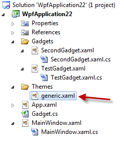
Control Template and generic.xaml
So from where does the Gadget pick up its style? In WPF and Silverlight,
there exists the concept of a generic or default style for a
control. That style is contained in the themes\generic.xaml
resource dictionary for the library inside which the control
exists. The name and location are special.
The contents of generic.xaml include styles for one or more
controls. The styles contain the control templates which define
what the UI of the control is made up of. Since this is a content
control, we need to have a ContentPresenter (or another
ContentControl) in there, bound to the Content property.
Truthfully, you can have anything bound to that property, but if
the types don't match, you'll get an exception at runtime.
<ResourceDictionary xmlns="http://schemas.microsoft.com/winfx/2006/xaml/presentation"
                    xmlns:local="clr-namespace:WpfApplication22"
                    xmlns:x="http://schemas.microsoft.com/winfx/2006/xaml">


    <Style TargetType="{x:Type local:Gadget}">
        <Setter Property="Padding"
                Value="10" />
        <Setter Property="Template">
            <Setter.Value>
                <ControlTemplate TargetType="{x:Type local:Gadget}">

                    <Border BorderBrush="Red"
                            BorderThickness="5"
                            CornerRadius="10">

                        <ContentPresenter Content="{TemplateBinding Content}"
                                          Margin="{TemplateBinding Padding}"/>
                    </Border>
                </ControlTemplate>
            </Setter.Value>
        </Setter>

    </Style>

</ResourceDictionary>
The TemplateBinding syntax is what you use to bind to properties
of the control that the template is applied to.
So, our custom gadget simply enforces a red 5px border around
all elements. You could also enforce a background, drag handles,
close buttons etc.
The Custom UserControls (Gadgets)
Here are the custom UserControls. I simply added a UserControl
to the project, and then changed the markup and codebehind to
reference Gadget rather than UserControl. To make it friendlier to
your users, I'd recommend creating a custom Visual Studio template
for your Gadget. The template would set the base class and
namespaces automatically.
First Gadget
There's also a related code-behind, but it's empty. In a real
app, it'll likely have code. Here's the Xaml:
<local:Gadget x:Class="WpfApplication22.Gadgets.TestGadget"
              xmlns="http://schemas.microsoft.com/winfx/2006/xaml/presentation"
              xmlns:x="http://schemas.microsoft.com/winfx/2006/xaml"
              xmlns:mc="http://schemas.openxmlformats.org/markup-compatibility/2006"
              xmlns:d="http://schemas.microsoft.com/expression/blend/2008"
              xmlns:local="clr-namespace:WpfApplication22"
              mc:Ignorable="d"
              d:DesignHeight="300"
              d:DesignWidth="300">
    <Grid>
        <TextBlock Text="My Custom Gadget Content"
                   FontSize="20"
                   TextWrapping="Wrap"
                   HorizontalAlignment="Center"
                   VerticalAlignment="Center" />
    </Grid>
</local:Gadget>
Second Gadget
Similarly, here's the second gadget's markup. This control
contains an ellipse.
<local:Gadget x:Class="WpfApplication22.Gadgets.SecondGadget"
              xmlns="http://schemas.microsoft.com/winfx/2006/xaml/presentation"
              xmlns:x="http://schemas.microsoft.com/winfx/2006/xaml"
              xmlns:mc="http://schemas.openxmlformats.org/markup-compatibility/2006"
              xmlns:d="http://schemas.microsoft.com/expression/blend/2008"
              xmlns:local="clr-namespace:WpfApplication22"
              mc:Ignorable="d"
              Padding="25"
              d:DesignHeight="300"
              d:DesignWidth="300">
    <Grid>
        <Ellipse x:Name="MyEllipse" Fill="Blue"/>
    </Grid>
</local:Gadget>
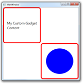
The Main Window
The main Window contains instances of both gadgets. The
highlighted areas of the Window xaml are what are needed to load in
our own gadgets.
<Window x:Class="WpfApplication22.MainWindow"
        xmlns="http://schemas.microsoft.com/winfx/2006/xaml/presentation"
        xmlns:x="http://schemas.microsoft.com/winfx/2006/xaml"
        xmlns:gadgets="clr-namespace:WpfApplication22.Gadgets"
        Title="MainWindow" Height="450" Width="450">
    <Grid>
        <Grid.RowDefinitions>
            <RowDefinition Height="*" />
            <RowDefinition Height="*" />
        </Grid.RowDefinitions>
        <Grid.ColumnDefinitions>
            <ColumnDefinition Width="*" />
            <ColumnDefinition Width="*" />
        </Grid.ColumnDefinitions>
        <gadgets:TestGadget Grid.Row="0" Grid.Column="0" />
        <gadgets:SecondGadget Grid.Row="1" Grid.Column="1" />
    </Grid>
</Window>
Here's how it looks at runtime:
That's all there is to it for the basics of creating your own
usercontrol stand-ins.
If you're building add-ins or runtime-resolved Gadgets for your
own app, take a look at MEF (Managed Extensibility Framework).
