I have an ongoing twitter search for topics of interest to me and
my position at Microsoft, so anything with words like "windows
forms", wpf,
windowsclient.net etc. all show up in my
search. Thought that, I often find folks who are struggling with
how to get started in WPF.
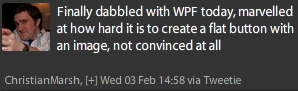
I've been meaning to do some beginning WPF tutorials for a bit.
Since the main focus of my job is to help people be successful with
windows client developer technologies, I figured that would be a
good idea. Scott Hanselman once described our job as "starting when
you hit File->New Project in Visual Studio"
The latest tweet conversation went like this (latest post at
top, starter at the bottom)
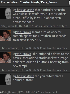
I show this not to single out Christian, but to show one
of the roadblocks folks new to WPF often hit: templating of
controls.
If you're used to Windows Forms or even ASP.NET, where
purpose-built controls exist for the common scenarios, doing
something as simple as creating a flat image button can be somewhat
daunting.
The reason is controls in other technologies focus on discrete
scenarios, and try to provide properties to handle every scenario
they support. WPF (and Silverlight) controls, however focus on the
model of the behavior of the control, not the look and feel. The
user interface/experience is completely separated from the behavior
and implementation.
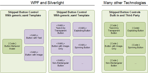
Even looking at the diagram, you can see that the xaml-based
approach looks more complex at first glance. However, once you
realize that all you need is markup to completely change the user
interface for the button (not just borders or shape, but everything
about its visual representation) you can see how this approach both
scales better and is generally easier to use long-term.
I'm not making a value judgment as to which approach is better,
but I personally prefer the template model used by Silverlight and
WPF over the purpose-built or partially-templatable, or
templatable-with-many-assumptions models used in other
technologies. I know many of those technologies have made headway
to get away from this model, but they weren't exactly designed with
it in mind.
Each of the button controls in the "Many other Technologies"
section could have completely different implementations. They may
or may not be based on a common base class, and they may or may not
expose similar events or commands. The fact that many do is based
more on a convention than something enforced in code. Maybe the
events are in a slightly different order, or maybe there is some
assumed margin or padding. Maybe you can't hook certain events like
a hover without resorting to Win32 calls, and you almost certainly
can't write a single strongly-typed function that will take in all
variants of buttons and do something with them. If you've ever
spent time getting a complex third-party button to behave just like
a customized built-in button, you know what I'm talking about.
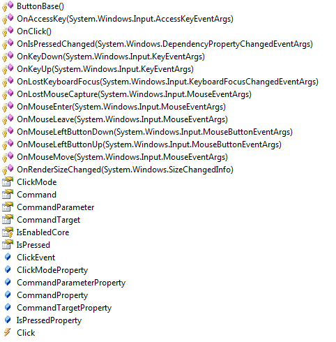
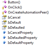
In WPF and Silverlight, everything which has normal button
behavior derives from the ButtonBase class. The most commonly used
derivative of that is the Button class.
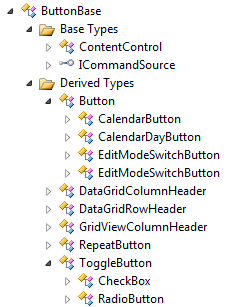
There are a number of classes in this tree. Looking at them,
though, you can see that new classes are created only when new
behavior is needed, not when you need a new user interface.
Here is ButtonBase
Here is all that Button adds to ButtonBase.
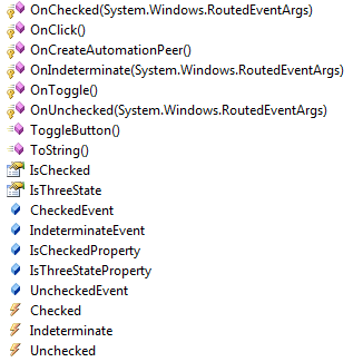
To throw in a different one, here's ToggleButton, the immediate
ancestor of CheckBox and RadioButton. Note that it adds new
behavior to manage checked and unchecked state.
Button is a Content Control
As you can see in the tree above, Button derives from
ContentControl. That means Button can contain pretty much anything.
We'll focus on content for most of the rest of this post.
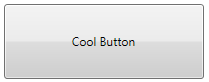
Here's a Window with a button that contains just some text:
<Window x:Class="WpfApplication19.MainWindow"
        xmlns="http://schemas.microsoft.com/winfx/2006/xaml/presentation"
        xmlns:x="http://schemas.microsoft.com/winfx/2006/xaml"
        Title="MainWindow" Height="350" Width="525">
    <Grid>

        <Button x:Name="MyCoolButton"
                Content="Cool Button"
                Width="200"
                Height="75" />

    </Grid>
</Window>
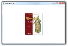
So, to create a button which looks like a normal button, but
contains an image, how much C#/VB code do we need to write? Answer:
None. Button is a content control, so we just assign it an image as
the content.
<Button x:Name="MyCoolButton"
Width="200"
Height="75">
<Button.Content>
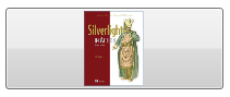
<Image Source="Pete-Brown-Silverlight-in-Action.png" />
</Button.Content>
</Button>
That's the long form, spelling out Button.Content. The more
common form, since Content is, well, the content property, is to
omit that and just nest the content directly in the button
declaration. The end result is exactly the same.
<Button x:Name="MyCoolButton"
        Width="200"
        Height="75">
    <Image Source="Pete-Brown-Silverlight-in-Action.png" />
</Button>
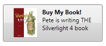
Similarly, we can assign something more complex, like a grid
with an image and multiple rows of text. The content property can
have only one element directly contained within it, so compound
elements must be contained in something like a grid or
StackPanel.
<Button x:Name="MyCoolButton"
        Width="200"
        Height="75">
    <Grid >
        <Grid.ColumnDefinitions>
            <ColumnDefinition Width="Auto" />
            <ColumnDefinition Width="*" />
        </Grid.ColumnDefinitions>

        <Image Source="Pete-Brown-Silverlight-in-Action.png"
               Margin="5"
               Grid.Column="0" />

        <StackPanel Grid.Column="1" Margin="5">
            <TextBlock Text="Buy My Book!" FontWeight="Bold" />
            <TextBlock Text="Pete is writing THE Silverlight 4 book"
                       TextWrapping="Wrap" />
        </StackPanel>
    </Grid>
</Button>
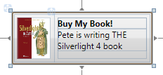
Design-Time in Visual Studio 2010
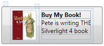
Runtime
Content Alignment
If you want to change the alignment of the content, you can use
the HorizontalContentAlignment and VerticalContentAlignment
properties inherited from ContentControl.
<Button x:Name="MyCoolButton"
        HorizontalContentAlignment="Right"
        Width="200"
        Height="75">
Left, Center and Right are pretty obvious. There is one more
value, Stretch.
Stretch
It looks like the Left-aligned version, but if you look closely
at the size of the content grid and stackpanel, you can see they
now stretch to fill up all available space inside the button, minus
the margins.
Similarly, changing the VerticalContentAlignment will, assuming
your content isn't already taking up all available vertical space,
affect it just like the horizontal settings.
Content can be Almost Anything, even other Controls
Just about anything can be used as content for a content
control, and the button is no exception. In fact, here's a really
crazy assortment of controls included in the button. (Bonus points
if you know the song that starts in the listbox - I'm listening to
about 20 remixes of it as I type this)
<Button x:Name="MyCoolButton"
        HorizontalContentAlignment="Stretch"
        Width="450"
        Height="155">
    <Grid >
        <Grid.ColumnDefinitions>
            <ColumnDefinition Width="Auto" />
            <ColumnDefinition Width="*" />
            <ColumnDefinition Width="Auto" />
        </Grid.ColumnDefinitions>

        <Image Source="Pete-Brown-Silverlight-in-Action.png"
               Margin="5"
               Grid.Column="0" />

        <StackPanel Grid.Column="1">
            <CheckBox Content="Check if you like turtles"
                      Margin="5" />
            <ListBox Margin="5">
                <ListBox.ItemsSource>
                    <sysCollections:ArrayList>
                        <sys:String>Now how old are you?</sys:String>
                        <sys:String>Where is your harbor?</sys:String>
                        <sys:String>Have many things to do</sys:String>
                    </sysCollections:ArrayList>
                </ListBox.ItemsSource>
            </ListBox>

            <Button Content="Open the Door"
                    Margin="5" />

            <TextBlock Text="Tell me if the sky is blue" />

        </StackPanel>

        <Image Source="CommodoreLogo_100x100.png"
               Stretch="None"
               Grid.Column="2" />

    </Grid>
</Button>
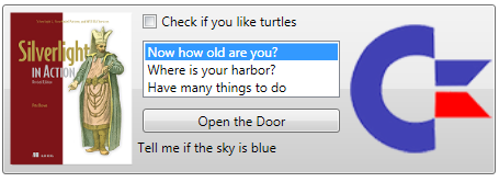
Sure, that's totally insane for a button, but it
can be done. Imagine what it would take to find
controls that natively support this type of content in another
technology. Heck, finding a button or other control that would
allow you to put in two images seems hard to find.
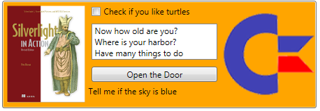
Changing Colors
Of course, you can change the colors of the button without
re-templating the control. Simply setting the Background to a color
will work:
<Button x:Name="MyCoolButton"
        HorizontalContentAlignment="Stretch"
        Background="Orange"
        Width="450"
        Height="155">
You can set it to a gradient if you want a highlight effect
similar to the original button. To do that, we break the Background
property out using the property element syntax. This allows us to
specify a complex property value, a LinearGradientBrush in this
instance.
<Button x:Name="MyCoolButton"
        HorizontalContentAlignment="Stretch"
        Width="450"
        Height="155">
    <Button.Background>
        <LinearGradientBrush StartPoint="0,0"
                             EndPoint="0,1">
            <GradientStop Offset="0" Color="#FFAA0000"/>
            <GradientStop Offset="0.49" Color="#FFCC0000"/>
            <GradientStop Offset="0.50" Color="#FF990000" />
            <GradientStop Offset="1" Color="#FF770000" />
        </LinearGradientBrush>
    </Button.Background>
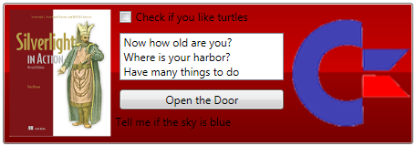
Ok, so that is one hideous button, but you get the idea. Note
that that doesn't change the hover effect, though. For that, you'll
need to modify the control template, the topic of our next
post.
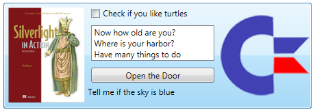
Now what if you want a basic flat button without any
re-templating? You can get pretty close by setting colors as well
as padding and making sure your button is sized to the image (or is
at least using the same aspect ratio.
<Button x:Name="MyCoolButton"
        HorizontalContentAlignment="Stretch"
        Padding="0"
        Background="Transparent"
        BorderBrush="Transparent"
        BorderThickness="0"
        Width="146"
        Height="183">
    <Grid >
        <Image Source="Pete-Brown-Silverlight-in-Action.png" />

    </Grid>
</Button>

Note that you'll still get the default hover effect, though.
Since there is some transparency in my png, I can see a bit of it.
The hover border will always show unless you have negative content
padding.
And yes, as I mentioned above, changing the padding to a
negative size will obscure the border. It's not the most elegant
solution, but it works, assuming your content is not set to a fixed
size.
<Button x:Name="MyCoolButton"
        HorizontalContentAlignment="Stretch"
        Padding="-4"
        Background="Transparent"
        BorderBrush="Transparent"
        BorderThickness="0"
        Width="146"
        Height="183">
    <Grid >
        <Image Source="Pete-Brown-Silverlight-in-Action.png" />

    </Grid>
</Button>
Be sure to check out Part 2 for information on how to template
the button control, including setting the handling for the various
visual states.
