The Windows 7 taskbar has tons of ways that applications can surface unique information or capabilities to make the experience just that much more awesome. The one I’ll cover in this post is Taskbar Thumbnail Buttons, sometimes called the Thumbnail Toolbar.
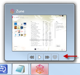
Chances are, more than a few applications that you use include this functionality. Here’s a shot of the Zune app, showing the four thumbnail buttons.
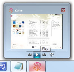
And here’s how the app looks with one of the buttons (the pay button) highlighted by the mouse.
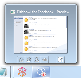
Here’s another example. This time, from Fishbowl
Let’s look at how to implement thumbnail buttons in our own WPF 4 applications.
Project Setup
Create a standard WPF Windows client application. In my example, I named it WpfTaskbarThumbnailButtons. Once you have that, crack open the xaml for the main window, as that’s where we’ll spend the majority of our time. Add in a resources section and the usual TaskbarItemInfo section, as we have in previous posts.
<Window x:Class="WpfTaskbarThumbnailButtons.MainWindow"
        xmlns="http://schemas.microsoft.com/winfx/2006/xaml/presentation"
        xmlns:x="http://schemas.microsoft.com/winfx/2006/xaml"
        Title="Thumbnail Button Application" Height="350" Width="525">
    <Window.Resources>
    </Window.Resources>

    <Window.TaskbarItemInfo>
    </Window.TaskbarItemInfo>

    <Grid>
    </Grid>
</Window>
The next step will be to create resources to serve as the images used by our buttons.
Button Images
Once you know what buttons you’ll want, it’s time to build graphics for them. The standard for the Windows 7 taskbar is a 16x16 graphic (24x24 for high DPI displays), typically in a white and gray color scheme. If you create larger resources, they’ll be scaled down to the appropriate size, so if you have to lean a particular way with your (especially vector) graphics, oversize.
For this example, I’m going to create three buttons, each a simple rounded rectangle in a different color.
<Window.Resources>
    <DrawingImage x:Key="Button1Image">
        <DrawingImage.Drawing>
            <DrawingGroup>
                <DrawingGroup.Children>
                    <GeometryDrawing Brush="Red">
                        <GeometryDrawing.Geometry>
                            <RectangleGeometry Rect="0 0 24 24"
                                               RadiusX="4"
                                               RadiusY="4" />
                        </GeometryDrawing.Geometry>
                    </GeometryDrawing>
                </DrawingGroup.Children>
            </DrawingGroup>
        </DrawingImage.Drawing>
    </DrawingImage>
    <DrawingImage x:Key="Button2Image">
        <DrawingImage.Drawing>
            <DrawingGroup>
                <DrawingGroup.Children>
                    <GeometryDrawing Brush="Green">
                        <GeometryDrawing.Geometry>
                            <RectangleGeometry Rect="0 0 24 24"
                                               RadiusX="4"
                                               RadiusY="4" />
                        </GeometryDrawing.Geometry>
                    </GeometryDrawing>
                </DrawingGroup.Children>
            </DrawingGroup>
        </DrawingImage.Drawing>
    </DrawingImage>
    <DrawingImage x:Key="Button3Image">
        <DrawingImage.Drawing>
            <DrawingGroup>
                <DrawingGroup.Children>
                    <GeometryDrawing Brush="Blue">
                        <GeometryDrawing.Geometry>
                            <RectangleGeometry Rect="0 0 24 24"
                                               RadiusX="4"
                                               RadiusY="4" />
                        </GeometryDrawing.Geometry>
                    </GeometryDrawing>
                </DrawingGroup.Children>
            </DrawingGroup>
        </DrawingImage.Drawing>
    </DrawingImage>
</Window.Resources>
I used vector graphics here, but as I mentioned in my taskbar icon overlay post, you can use bitmap graphics as well.
The next step is to actually add the buttons to the taskbar. This is done via the ThumButtonInfos collection on the TaskbarItemInfo class.
TaskbarItemInfo.ThumbButtonInfos
Once you have decided what buttons you want on your application’s thumbnail (you have space for up to seven in Windows 7), and you have your graphics built, you can either create them in code, or as I like, in xaml. The buttons are instances of the TaskbarItemInfo class, and are added to the collection in the uncomfortably pluralized (but understandably so) ThumbButtonInfos collection.
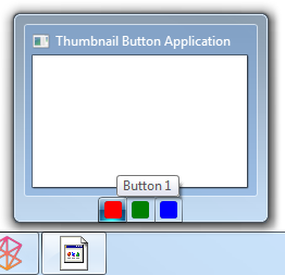
Here’s the TaskbarItemInfo window property with our three simple buttons. Note that all I’ve given them here is an image and a description (tooltip)
<Window.TaskbarItemInfo>
    <TaskbarItemInfo>
        <TaskbarItemInfo.ThumbButtonInfos>
            <ThumbButtonInfo ImageSource="{StaticResource Button1Image}"
                             Description="Button 1" />
            <ThumbButtonInfo ImageSource="{StaticResource Button2Image}"
                             Description="Button 2" />
            <ThumbButtonInfo ImageSource="{StaticResource Button3Image}"
                             Description="Button 3" />
        </TaskbarItemInfo.ThumbButtonInfos>
    </TaskbarItemInfo>
</Window.TaskbarItemInfo>
And here is the resulting thumbnail. Notice the order of the is order they were added to the collection. It’s a simple left to right, first to last add.
ThumbButtonInfo Class
The ThumbButtonInfo class describes a single button on the thumbnail popup on the taskbar. Because these need to conform to the Windows 7 API, they are not buttons quite like we’re used to in WPF. In other words, you can’t template them like you may be used to. However, you can set the image to be either a vector or a bitmap element.
Command, CommandParameter, CommandTarget
This is support for the commanding infrastructure in WPF. Nothing out of the ordinary here. If you don’t want to use commanding, you can wire up the Click event for the button.
Description
This is the tooltip text for the button. It’s a good practice to always provide this.
IsInteractive
This is to allow your button to act like a normal button, or to just convey information much like you would with the overlay icon. If True, it’s a button, if False, the image is displayed but cannot be clicked.
IsBackgroundVisible
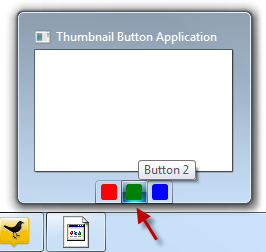
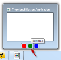
This controls whether or not you see a border and background highlight around the button. In both examples below, I took the screenshot while the mouse was hovered over the middle button “Button 2”.
Background Visible
<ThumbButtonInfo ImageSource="{StaticResource Button2Image}"
                 Description="Button 2"
                 IsBackgroundVisible="True"/>
Background Invisible
<ThumbButtonInfo ImageSource="{StaticResource Button2Image}"
                 Description="Button 2"
                 IsBackgroundVisible="False"/>
DismissWhenClicked
If true, clicking the button will close the thumbnail. A value of false will keep the window open (until they move off the thumbnail) so the user can click other buttons or view the changes in the thumbnail preview.
ImageSource
The ImageSource is anything that resolves down to a to a System.Windows.Media.ImageSource, typically a DrawingImage or a BitmapSource. In our example above, we used a DrawingImage that contained vector content.
Visibility
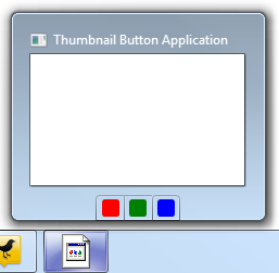
This works much as you would expect visibility in WPF applications to work. Visible buttons are displayed, Hidden buttons have space reserved but are not displayed, and Collapsed buttons are not displayed and have no space reserved.
Button 2 Visible
<ThumbButtonInfo ImageSource="{StaticResource Button2Image}"
                 Description="Button 2"
                 IsBackgroundVisible="True"
                 Visibility="Visible"/>
Button 2 Hidden
<ThumbButtonInfo ImageSource="{StaticResource Button2Image}"
                 Description="Button 2"
                 IsBackgroundVisible="True"
                 Visibility="Hidden"/>
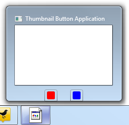
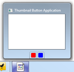
Note that space for the button was still reserved.
Button 2 Collapsed
<ThumbButtonInfo ImageSource="{StaticResource Button2Image}"
                 Description="Button 2"
                 IsBackgroundVisible="True"
                 Visibility="Collapsed"/>
IsEnabled
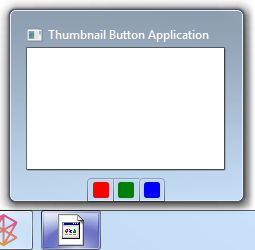
When Enabled, the button is active and drawn in its provided colors. When disabled (IsEnabled = False) the button is drawn in gray.
Button 2 Enabled
<ThumbButtonInfo ImageSource="{StaticResource Button2Image}"
                 Description="Button 2"
                 IsEnabled="True"
                 IsBackgroundVisible="True"
                 Visibility="Visible"/>
Button 2 Disabled
<ThumbButtonInfo ImageSource="{StaticResource Button2Image}"
                 Description="Button 2"
                 IsEnabled="False"
                 IsBackgroundVisible="True"
                 Visibility="Visible"/>
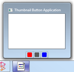
Notice how the button has turned gray, much like the zune fast-forward and rewind buttons shown at the beginning of this post.
Wiring up Behavior
There are a couple ways you can wire up the buttons in your thumbnail window. You can use commanding, or you can use event handlers. The method you choose will depend on the architecture of your application, and how you would normally wire these types of things up.
That said, given that these buttons are separated from the rest of your UI, commanding seems like a more natural approach.
Event Handling
For the purposes of this demo, we’ll go with event handling. You can wire the events up in code, or directly in xaml. I normally do this in code, but to show the other way of wiring it up, I let Visual Studio 2010 create the event handlers based on my xaml.
Here’s the appropriate xaml.
<Window.TaskbarItemInfo>
    <TaskbarItemInfo>
        <TaskbarItemInfo.ThumbButtonInfos>
            <ThumbButtonInfo ImageSource="{StaticResource Button1Image}"
                             Click="Button1_Click"
                             Description="Button 1" />
            <ThumbButtonInfo ImageSource="{StaticResource Button2Image}"
                             Click="Button2_Click"
                             Description="Button 2"
                             IsEnabled="False"
                             IsBackgroundVisible="True"
                             Visibility="Visible"/>
            <ThumbButtonInfo ImageSource="{StaticResource Button3Image}"
                             Click="Button3_Click"
                             Description="Button 3" />
        </TaskbarItemInfo.ThumbButtonInfos>
    </TaskbarItemInfo>
</Window.TaskbarItemInfo>
And here’s the code-behind
public partial class MainWindow : Window
{
    public MainWindow()
    {
        InitializeComponent();
    }

    private void Button1_Click(object sender, EventArgs e)
    {
        MessageBox.Show("Button 1");
    }

    private void Button2_Click(object sender, EventArgs e)
    {
        MessageBox.Show("Button 2");
    }

    private void Button3_Click(object sender, EventArgs e)
    {
        MessageBox.Show("Button 3");
    }
}
Now, let’s try the commanding approach
Commanding
This requires a little more setup, but is more representative of what a real-world application would do. Often times, the buttons in your thumbnail window are simply specialized duplicates of buttons on your toolbar. Using commanding lets you point these buttons to the same code used to implement your main toolbar buttons. In addition to better structure and code reuse, you also get extra benefits like automatic setting of the IsEnabled property.
Creating the Commands
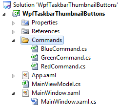
First, we’ll create three command classes in a Commands folder in our project. Our classes won’t do anything substantially different in this example, but we’ll still create three different command classes. In your own code, consider whether it would be better to create generic commands that have delegates, or whether you want to use more robust command implementations such as those introduced with Prism.
class RedCommand : ICommand
{
    public bool CanExecute(object parameter)
    {
        // do your checking here to see if the command can execute
        return true;
    }

    public event EventHandler CanExecuteChanged;

    public void Execute(object parameter)
    {
        // code to execute the function goes here
        MessageBox.Show("Red Command.");
    }
}


class GreenCommand : ICommand
{
    public bool CanExecute(object parameter)
    {
        // do your checking here to see if the command can execute
        return false;
    }

    public event EventHandler CanExecuteChanged;

    public void Execute(object parameter)
    {
        // code to execute the function goes here
        MessageBox.Show("Green Command.");
    }
}

class BlueCommand : ICommand
{
    public bool CanExecute(object parameter)
    {
        // do your checking here to see if the command can execute
        return true;
    }

    public event EventHandler CanExecuteChanged;

    public void Execute(object parameter)
    {
        // code to execute the function goes here
        MessageBox.Show("Blue Command.");
    }
}
This is not necessarily the best way to set up commands, or the best way to factor commands for your own applications. I encourage you to learn more about using commands before designing them into your own application. Here are two videos that will help
Creating the ViewModel
Next, we need a place to hang them from. The ViewModel is a good location for things like this. Create a new class called MainViewModel (yes, that’s a terrible name) and fill it out with properties holding our three commands.
class MainViewModel
{
    private RedCommand _redCommand = new RedCommand();
    public ICommand RedCommand
    {
        get { return _redCommand; }
    }

    private GreenCommand _greenCommand = new GreenCommand();
    public ICommand GreenCommand
    {
        get { return _greenCommand; }
    }

    private BlueCommand _blueCommand = new BlueCommand();
    public ICommand BlueCommand
    {
        get { return _blueCommand; }
    }

    // other VM stuff here

}
Linking the ViewModel and View
Next, we’ll provide an instance of the viewmodel to our view. There are tons of ways to do this including:
- Assigning the view as a resource in the window in xaml
- Instantiating the viewmodel as the DataContext for the view in xaml
- Assigning the viewmodel to the view in the code behind
- Using dependency injection to inject the viewmodel into the view (or the other way around if you prefer – I don’t)
We’re going to put the ViewModel right into our xaml as the DataContext for the window. From this, you gain on application structure, but you lose in testability. If you want to be about to fully decouple, you’ll need to go with an interface and DI based approach.
<Window x:Class="WpfTaskbarThumbnailButtons.MainWindow"
        xmlns="http://schemas.microsoft.com/winfx/2006/xaml/presentation"
        xmlns:x="http://schemas.microsoft.com/winfx/2006/xaml"
        xmlns:viewModels="clr-namespace:WpfTaskbarThumbnailButtons"
        Title="Thumbnail Button Application"
        Height="350"
        Width="525">
    <Window.DataContext>
        <viewModels:MainViewModel />
    </Window.DataContext>
Note that I also created the xmlns:viewModels to point to the location where I’m storing the viewmodel. In most applications, you’ll have separate viewmodel and view folders, sometimes separate assemblies.
There are more robust ways to use commands in WPF applications, especially ones that follow the ViewModel pattern to some of its more complete ends. The example here is a start, and I hope gives you a just little more than you would normally get from demo-quality code.
Wiring up the Buttons
This is the easiest part. Now that you have all the infrastructure set up, and we have our DataContext set to the ViewModel, all you need to do us use WPF’s binding system to bind to the properties on the VM
<TaskbarItemInfo>
    <TaskbarItemInfo.ThumbButtonInfos>
        <ThumbButtonInfo ImageSource="{StaticResource Button1Image}"
                         Command="{Binding RedCommand}"
                         Description="Button 1" />
        <ThumbButtonInfo ImageSource="{StaticResource Button2Image}"
                         Command="{Binding GreenCommand}"
                         Description="Button 2"
                         Visibility="Visible" />
        <ThumbButtonInfo ImageSource="{StaticResource Button3Image}"
                         Command="{Binding BlueCommand}"
                         Description="Button 3" />
    </TaskbarItemInfo.ThumbButtonInfos>
</TaskbarItemInfo>
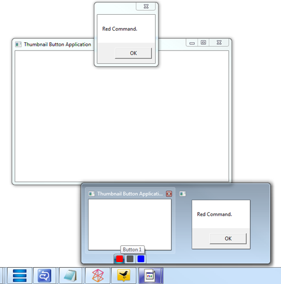
Once you have that in place, run the application and you’ll see the message boxes popup from the commands (again, not the usual thing a command would do, and definitely not what you’d normally do from a taskbar button, but good for this).
Guidelines for your own Applications
Much like taskbar icon overlays and taskbar progress reporting, you need to be judicious about how you use these buttons. They need to be part of your overall UX design for your application, not just something tacked on later just because you can. If there’s a capability your application provides that you want at the fingertips of your users, without requiring them to be looking at a full-size version of the application, the button approach shown here will likely fit your needs.
Don’t, however, treat it just like another application toolbar. Don’t put functions here that aren’t available elsewhere in the application. In addition, don’t put functions here that really require the application to be in focus or even visible on the screen.
A video and downloadable source code will be available on windowsclient.net shortly. I’ll update this post when the video is up.
