WPF 4 now includes, in the core runtime libraries, the calendar control. This control previously existed only in the WPF Toolkit, but has been promoted in the latest WPF release. Inclusion in the core runtime library makes it easier to develop with as there is no additional namespace declaration or reference required.
The Calendar control is located in the System.Windows.Controls namespace in the PresentationFramework DLL.
Let’s start with the key properties and then move on to a couple common tasks such as scaling and binding.
Key Properties
Note that all date properties use the DateTime Xaml Syntax for parsing. Not also that unless noted, the control is shown with FlowDirection set to LeftToRight and FirstDateOfWeek set to Sunday. Both may be overridden if desired.
DisplayDate, SelectedDate and SelectedDates
When the control is first displayed, a date is shown highlighted – the DisplayDate. By default, that date is Today’s date. But you may change it to whatever date you would like.
Use the SelectedDate scalar property when the calendar is in SingleDate selection mode. Use the SelectedDates collection property when the calendar is in any of the multi-select modes.
The DisplayDate is shown on the right, the SelectedDate is shown on the left
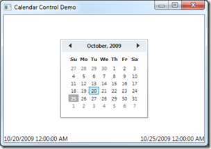
<Grid>
    <Calendar x:Name="CalendarControl"
              HorizontalAlignment="Center"
              VerticalAlignment="Center"

              SelectionMode="MultipleRange"
              DisplayMode="Month">
    </Calendar>

    <TextBlock Text="{Binding SelectedDate, ElementName=CalendarControl}"
               VerticalAlignment="Bottom"
               HorizontalAlignment="Left" />

    <TextBlock Text="{Binding DisplayDate, ElementName=CalendarControl}"
               VerticalAlignment="Bottom"
               HorizontalAlignment="Right" />
</Grid>
The above example also shows simple element binding using the SelectedDate (and DisplayDate) properties
DisplayMode
The DisplayMode property sets the calendar to display in one of three different modes: Decade, which shows the current decade and the year before and after, for three years total, Year which displays the months of the current year, and Month which displays the usual tabular calendar view of days in the month. At runtime, broader display modes drill-down into more specific display modes as described below.
Not that in all modes, Control + Up Arrow will drill back up the DisplayMode and Control + Down Arrow will drill down into the next mode. For example, if in Year Mode, Control + Up will show Decade and Control + Down will show Month.
Decade
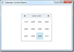
In decade mode, clicking on a year will drill down into Year display mode, and will not affect SelectedDate.
In decade mode, the arrow key changes the year of the DisplayDate, the Home key changes the DisplayDate to the first year of the decade, and the End key changes the DisplayDate to the last year of the decade. The spacebear drills into the selected year. In all cases, the SelectedDate is not changed.
Year
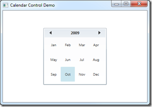
In year mode, clicking on a month will drill down into Month display mode, and will not affect SelectedDate
In year mode, the arrow key changes the month of the DisplayDate, the Home key changes the DisplayDate to the first month of the year, and the End key changes the DisplayDate to the last month of the year. The spacebar drills into the selected month. In all cases, the SelectedDate is not changed.
Month
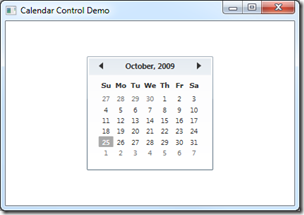
In month mode, clicking on a day sets the SelectedDate, or SelectedDates depending on the value for the SelectionMode property.
In month mode, the arrow key changes the SelectedDate property, Shift+Arrow will add/select an adjacent day if the SelectionMode allows multi-select. Home changes the selected date to the first day of the month, and End changes it to the last.
SelectionMode
Selection mode controls the selection behavior for the dates in the Month mode of the calendar.
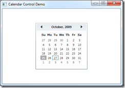
None
The calendar is effectively read-only. No dates may be selected. Clicking on a date changes the focus, but does not change the SelectedDate
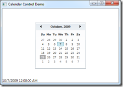
SingleDate
Allows selection of a single date. This is the default mode. Clicking on a date selects the date.
SingleRange
Allows selection of a single contiguous range of dates. Click on the start date, then shift-click on the end date.
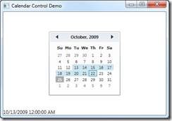
SelectedDate controls the first selected date, SelectedDates contains the full set of selected dates.
MultipleRange
Allows selection of multiple non-contiguous dates or ranges of dates. Click on one date, shift-click to set a range if desired, then control-click on other dates to add them.
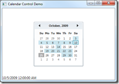
SelectedDate contains the first date selected (not necessarily the oldest date, just the first one selected), SelectedDates contains the full set of selected dates.
DisplayDateStart / DisplayDateEnd
If you wish to limit the date range that may be picked using the control, set the bounds using the DisplayDateStart and End properties. Those set a date window out of which the user may not navigate using the UI.
BlackoutDates
Another way to restrict date selection is to use the BlackoutDates property. This property allows you to mark specific date ranges as non-selectable in the UI. In the default control template, this is represented by an X over the date.
<Calendar x:Name="CalendarControl"
          HorizontalAlignment="Center"
          VerticalAlignment="Center"
          DisplayMode="Month">
    <Calendar.BlackoutDates>
        <CalendarDateRange Start="10/4/2009"
                           End="10/15/2009" />
        <CalendarDateRange Start="10/23/2009"
                           End="10/28/2009" />
    </Calendar.BlackoutDates>
</Calendar>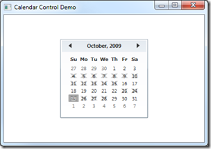
When the user clicks on a blackout date, the SelectedDate property is not changed.
FlowDirection
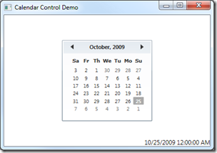
Like most other control, the Calendar control respects the FlowDirection property in order to support right-to-left or left-to-right text directions. Below is an example of the control with FlowDirection set to RightToLeft
Scaling the Control
The Calendar control includes no built-in scaling. If you set the size of the control, or put it in a grid, it will clip but it will not expand. To visually resize, you’ll need to scale it using a ScaleTransform or by putting the control into a ViewBox.
Scaling with a ScaleTransform
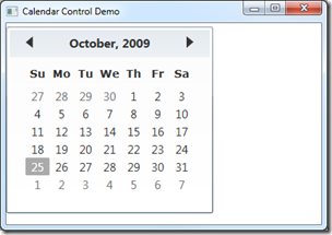
The Calendar control scales like any other WPF control, using a simple ScaleTransform.
<Calendar x:Name="CalendarControl"
          HorizontalAlignment="Left"
          VerticalAlignment="Top"
          DisplayMode="Month">
    <Calendar.RenderTransform>
        <ScaleTransform ScaleX="1.5"
                        ScaleY="1.5" />
    </Calendar.RenderTransform>
</Calendar>
The result looks like this:
Scaling with a ViewBox
A viewbox is simply a convenient way to abstract a ScaleTransform. It handles automatic centering and bounds checking for you, as well as dynamic resizing, so it’s a good way to handle scaling.
<Viewbox>
    <Calendar x:Name="CalendarControl"
              HorizontalAlignment="Left"
              VerticalAlignment="Top"
              DisplayMode="Month">
    </Calendar>
</Viewbox>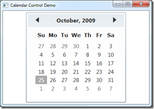
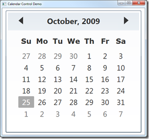

Binding to SelectedDate
When working in WPF and Silverlight, I write my code and structure my applications using variations on the ViewModel (or MVVM) pattern. I’ll use a very simple form of that pattern here to show how to bind to the SelectedDate property of the control.
First, add a folder named ViewModels and then an appropriately named ViewModel class in that folder. I typically name the VMs after their screen, so in this case it is simply MainWindowViewModel.
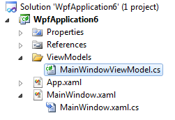
The ViewModel code itself is pretty simple. We have a class that implement INotifyPropertyChanged in order to inform the binding system that a value has changed, then we have a public property as our binding source.
class MainWindowViewModel : INotifyPropertyChanged
{
    private DateTime _dateOfBirth;
    public DateTime DateOfBirth
    {
        get { return _dateOfBirth; }
        set { _dateOfBirth = value; NotifyPropertyChanged("DateOfBirth"); }
    }

    public event PropertyChangedEventHandler  PropertyChanged;
    protected void NotifyPropertyChanged(string propertyName)
    {
        if (PropertyChanged != null)
            PropertyChanged(this, new PropertyChangedEventArgs(propertyName));
    }

}
The property changed event handler allows us to set the property value from code or from other controls and still ensure that all bound targets know the value changed.
Next we need to set the ViewModel as the datacontext for our window. You can do this a number of ways including newing up the VM in the code-behind and setting the DataContext there, or using dependency injection to create the relationship between the two. In this case, I’m going to set it right in the xaml as a resource. To do that, I need to add a namespace and a resource to the xaml
<Window x:Class="WpfApplication6.MainWindow"
        xmlns="http://schemas.microsoft.com/winfx/2006/xaml/presentation"
        xmlns:x="http://schemas.microsoft.com/winfx/2006/xaml"
        xmlns:viewModels="clr-namespace:WpfApplication6.ViewModels"
        Title="Calendar Control Demo" Height="300" Width="425">
    <Window.Resources>
        <viewModels:MainWindowViewModel x:Key="vm" />
    </Window.Resources>
You can see the viewModel namespace declaration tied to the window class, and the reference to the viewmodel itself right inside the Window.Resources section.
Next, I set the Grid’s DataContext property to be the static resource
<Grid DataContext="{StaticResource vm}">Finally, set the SelectedDate property of the calendar to bind to the DateOfBirth property of the view model.
<Calendar x:Name="CalendarControl"
          HorizontalAlignment="Center"
          VerticalAlignment="Center"
          SelectedDate="{Binding DateOfBirth}"
          DisplayMode="Month">
</Calendar>
If you now run the application and set a breakpoint on the property setter for DateOfBirth in the ViewModel, you’ll see the binding in action.
Working with SelectedDates
The SelectedDates property is a little trickier. Rather than a simple scalar property like SelectedDate, this is a read-only property that returns a collection which may be modified, but not bound to.
If you working from code-behind and using the control as the source of record for the data, then it is pretty easy. If you’re using a pattern like the VM pattern, you’ll need to have an adapter that sits between the control and the viewmodel and updates each end with the other changes. Essentially, your own custom mini binding system.
If you use the ViewModel/MVVM pattern and have a different or better approach to handling the binding, please share.
For more information, please visit www.windowsclient.net . I’ll have a video version of this article up there soon.
Update 11/25/2009 The video is located here.
