Since deregulation increased my electric bill by more than 100%, I’ve hated paying it. What makes it worse, though, is the really annoying workflow for the BGE online payment site. I’ve been meaning to take screenshots of the process for some time now, and just finally got around to it.
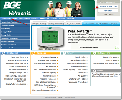
First, we start at the main page at www.bge.com . You might assume that you should click the “Pay Online” link to, well, pay online. Despite how big they made the buttons on the top right, your eye naturally scans left to right, so what you tend to see first is the “Pay Online” link. You might even be tempted to look for a payment link under “Residential” below, but you won’t find one. So let’s say you click on “Pay Online”
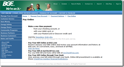
Nope. If you do that, you get a page with information on how to sign up for bill payment. There’s no link on this page that would bring you to the actual BGE bill payment site. There’s no “sign in if you already have an account” link or anything like that.
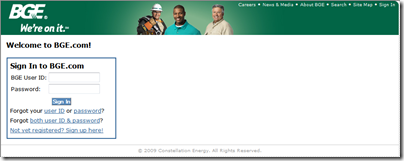
Instead, you have to click the standard “sign in” link up at the top right. This is not specific to this page – it’s on every page. Once you do that, you get the sign-in page.
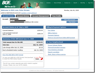
Signing in brings you to the page where you can see your current bill. Looking at the amount, you can see why I’m not a fan of deregulation. My pre-deregulation bills were well under $200 a month.
This page has two different links that both bring you to the payment page. One on the button and another 3/4 of an inch below it under “Billing and Payment Options”. I guess they’re trying to make up for the bad link on the home page.
Once you click on “Pay Online”, you get a form that display the current bill. Why do I need to select a bill? The system is not optimized for people like me who only ever have one outstanding bill. Fine, so I click “pay” next item to pick that bill.
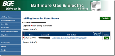
But wait, why am I being prompted yet again to pick a bill? I only have one, and it was pre-selected. Also, “Step 1”? I think not -- we’re a few pages into the process already.
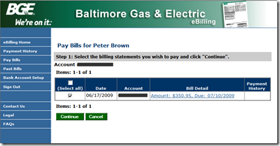
I click continue above, and get yet another page with the same info. Oh, but there’s a new step on this one that lets me pick my bank account. I only have one bank account registered with BGE, but it’s not selected by default. Again, the system is not optimized for what surely must be the typical case: one bill, one bank account. Presumably if I have multiple bills, I could select a bank account and dollar amount for each bill.
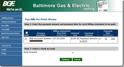
I select my bank account, and then click “continue”. I then get a confirmation screen to make sure that, even after 5 screens into the process, I’m sure I actually want to pay my bill. Note that I can change the payment and bank account from this page.
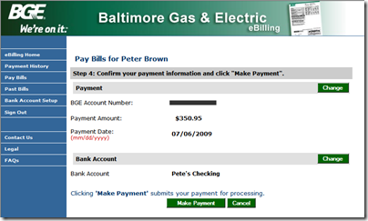
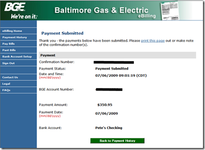
Once I click “make payment”, I get the “payment submitted” page that lets me know the payment has been submitted.
How would I change it?
What would I do to make it better? Let’s assume they don’t want to or can’t overhaul the current system.
BGE already has a page that lets me view the bill and make changes if necessary. Therefore I’d change the workflow to be like this, if there were only a single bge account, single bill and single bank account:
Main Page –> Sign In –> Account Home –> Pay –> Confirmation –> Submitted
Something like this:


Step 1: View Bill. Click “Pay Online”

Step 2: Confirm bill payment. Click “Make Payment”. If you need to change amount, date (which should default to today) or bank account, click the appropriate button.

Step 3: Verify. Done.

If they had the ability to change their pages around, I’d make some changes (like allow date, dollar amount and bank account to all be editable directly on the confirmation page, removing the need to navigate off for a large percentage of other scenarios), but I’m trying to keep things easy for them :)
Conclusion
This is yet another instance of some development team making an application cover a bunch of edge cases (multiple bills, multiple accounts) rather than concentrating on the work flow that 90% of the users will hit every month. It’s the choice of features over usability.
When you design your own systems, and you find that you have to make the system very flexible to account for a number of edge cases, ask yourself how you’re impacting your primary users. If edge cases cause even a single extra step in the primary users’ workflow, you’re doing it wrong.
The second problem here is one of competition. My phone company, which has at least a little competition, overhauls their payment system several times a year. In most cases, it has been for the better, streamlining the process.
BGE is effectively a monopoly, and this is their payment system, not a sales system. They have little to no incentive to make the user experience better. In fact, this crappy payment system has been the same since it was launched years ago.
