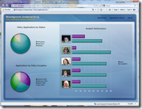
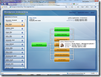
[ Note: this was written using Silverlight 3 Beta and the Silverlight 3 version of the Silverlight Toolkit , but the concepts should work with Silverlight 2 ]
First, a shout out to David Anson and Jafar Husain at Microsoft for helping me through a few sticky issues I ran into while working on this. Any time I’ve asked David for advice on how to do X with charting, he’s been able to come up with a way to do that. Not only is charting built in a really robust way that allows this, but David and his coworkers really know their stuff.
Over the past week, I’ve been working on the Silverlight 3 front end for a Microsoft IVC demo application. The whole app incorporates SharePoint, BizTalk and workflow – the Silverlight front end is just a small piece.
The request from Microsoft basically stated:
- Need to show policy applications in progress
- Need to show the state of the workflow for each policy application
- Want it to look like the Microsoft Field Manager demo, meaning similar color scheme and styling
- Will be hosted in SharePoint chrome later
Beyond that, I pretty much made things up both in terms of functionality and user experience. I did the bitmap graphics in photoshop, and the visuals in a combination of Blend 3 and hand-coded xaml (I tend to do a lot of xaml hand-coding for whatever reason – just can’t break that habit)
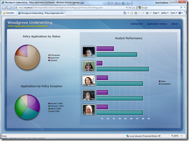
One thing I wanted to add to the spec is some simple charting to show off that capability in Silverlight. To do that, I created a dashboard page (I’m using the Silverlight 3 navigation framework, by the way) that had three charts.
Using a variation of my overlay approach for styling pie charts, I was able to make the pie charts look decent pretty quickly. However, I wanted to include a bar chart as well, and I hadn’t experimented with styling bar charts yet.
Here’s what the dashboard finally ended up looking like:
Here’s what an out-of-the-box bar chart looks like:
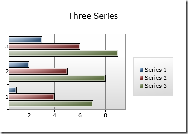
And here’s a detail of the bar chart I did. This is the same control as above, just with a different style and template.
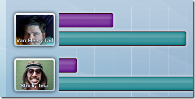
I used a number of Silverlight 3 features in there which can be simulated in Silverlight 2 either with gradients or pngs. Specifically: the drop shadows around the images, the glow (also a drop shadow) around the bars, the inner glow (a blurred rectangle) inside the bars and the drop shadow behind the analyst names to help them stick out from the photo a little.
Customizing the chart containers/panels is pretty straight-forward. You create a control template either via Blend or by using David Anson’s default style browser, and then work with the styles in there. David has a number of chart styling articles on his site that cover this.
Steps
- Decide on the chart approach, perhaps using something like the ChartBuilder.
- Customize the chart template to remove the backgrounds using the approach mentioned above
- Create custom control template for the bar styles
- Create or update the style palette to reference the new templates (and new colors)
- Create a style for the Y axis which references a control template for displaying the pictures and names rather than regular labels
- Hide the tick marks on both the X and Y axis
- Create a style for the X axis lines to change them from white to transparent black
Object Model
Since I snagged this example from a running application, it will help if you understand the object model just a little. The chart shows performance for analysts in terms of how many open applications vs. how many completed applications. The structures look like this:
public class UserPerformance
{
    public Account UserAccount { get; set; }

    public int OpenItems { get; set; }
    public int CompletedItems { get; set; }

    public int TotalAssignedItems
    {
        get { return OpenItems + CompletedItems; }
    }

}
public class Account
{
    public string LastName { get; set; }
    public string FirstName { get; set; }
    public string UserId { get; set; }
    public Uri AvatarUrl { get; set; }


    public string FullName
    {
        get { return LastName + ", " + FirstName; }
    }
}
I use the same object model in my WCF service and my Silverlight client. In order to allow using the same codebase, while being able to serialize all types (including the enumerations), I have two projects that use Linked Files in Visual Studio 2008. One project targets Silverlight, the other targets the full framework.
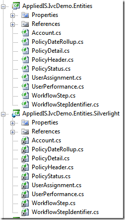
I then set the chart’s DataContext to an ObservableCollection of the performance objects.
ChartUserPerformance.DataContext = _viewModel.UserPerformance;
There are other ways of binding: for example, you could create a resource for your ViewModel (a pretty good approach) and bind your controls to that. In most cases, that results in less code.
Declare the Chart
The first charting-specific thing to do is to declare the chart. This chart has two custom Axes (X and Y) which I use for styling.
<chartingToolkit:Chart x:Name="ChartUserPerformance"
                       Title="Analyst Performance"
                       Margin="15"
                       BorderBrush="Transparent"
                       Style="{StaticResource PerfomanceBarChartStyle}">

    <chartingToolkit:Chart.Axes>
        <chartingToolkit:CategoryAxis Orientation="Y"
              Location="Left"
              MajorTickMarkStyle="{StaticResource PerformanceChartMajorTickMarkStyle}"
              AxisLabelStyle="{StaticResource PerformanceChartYAxisStyle}">
        </chartingToolkit:CategoryAxis>

        <chartingToolkit:LinearAxis Orientation="X"
            Location="Bottom"
            ShowGridLines="True"
            Foreground="White"
            MajorTickMarkStyle="{StaticResource PerformanceChartMajorTickMarkStyle}"
            GridLineStyle="{StaticResource PerformanceChartGridLineStyle}">
        </chartingToolkit:LinearAxis>


    </chartingToolkit:Chart.Axes>

    <chartingToolkit:Chart.Series>

        <chartingToolkit:BarSeries Title="Open"
           ItemsSource="{Binding}"
           IndependentValueBinding="{Binding}"
           DependentValueBinding="{Binding OpenItems}">

        </chartingToolkit:BarSeries>

        <chartingToolkit:BarSeries Title="Completed"
           ItemsSource="{Binding}"
           IndependentValueBinding="{Binding}"
           DependentValueBinding="{Binding CompletedItems}">

        </chartingToolkit:BarSeries>

    </chartingToolkit:Chart.Series>

</chartingToolkit:Chart>
Note that I declare two different series – one for Open and one for Completed. That’s the source of the two bars per row on the chart. Also note that in those, I bind the IndependentValue to the whole object {Binding}, not just a property. That means that those templates will have access to the everything in the UserPerformance object, including the Account object with its name and avatar properties. I could have bound to just the Account object, but I wasn’t sure what I’d need at the time.
Styles
The chart references a few styles which I’ll cover next
PerformanceBarChartStyle
This is a big honking style for the whole chart. Most of this is simply the template generated from Blend, but I did tweak a few things. I took the lazy route in a few cases and simply made things transparent instead of removing them from the visual tree. To be efficient, you’d want to generate a control template and remove anything which doesn’t belong.
<Style x:Key="PerfomanceBarChartStyle"
       TargetType="chartingToolkit:Chart">
    <Setter Property="BorderBrush"
            Value="Black" />
    <Setter Property="BorderThickness"
            Value="1" />
    <Setter Property="IsTabStop"
            Value="False" />

    <Setter Property="StylePalette">
        <Setter.Value>
            <dataVisualizationToolkit:StylePalette>

                <Style TargetType="chartingToolkit:BarDataPoint">
                    <Setter Property="Background"
                            Value="#FF57007f" />
                    <Setter Property="BorderBrush"
                            Value="#FF2e0007" />
                    <Setter Property="Template"
                            Value="{StaticResource PerformanceBarChartBarTemplate}" />
                </Style>

                <Style TargetType="chartingToolkit:BarDataPoint">
                    <Setter Property="Background"
                            Value="#FF00757f" />
                    <Setter Property="BorderBrush"
                            Value="#FF2e0007" />
                    <Setter Property="Template"
                            Value="{StaticResource PerformanceBarChartBarTemplate}" />
                </Style>

                <Style TargetType="chartingToolkit:BarDataPoint">
                    <Setter Property="Background"
                            Value="#FF007f0f" />
                    <Setter Property="BorderBrush"
                            Value="#FF2e0007" />
                    <Setter Property="Template"
                            Value="{StaticResource PerformanceBarChartBarTemplate}" />
                </Style>

                <Style TargetType="chartingToolkit:BarDataPoint">
                    <Setter Property="Background"
                            Value="#FF997f5f" />
                    <Setter Property="BorderBrush"
                            Value="#FF2e0007" />
                    <Setter Property="Template"
                            Value="{StaticResource PerformanceBarChartBarTemplate}" />
                </Style>

                <Style TargetType="chartingToolkit:BarDataPoint">
                    <Setter Property="Background"
                            Value="#FF7f2100" />
                    <Setter Property="BorderBrush"
                            Value="#FF2e0007" />
                    <Setter Property="Template"
                            Value="{StaticResource PerformanceBarChartBarTemplate}" />
                </Style>

            </dataVisualizationToolkit:StylePalette>
        </Setter.Value>
    </Setter>

    <!-- Style for the title at the top of the chart -->
    <Setter Property="TitleStyle">
        <Setter.Value>
            <Style TargetType="dataVisualizationToolkit:Title">
                <Setter Property="FontSize"
                        Value="16" />
                <Setter Property="HorizontalAlignment"
                        Value="Center" />
                <Setter Property="Margin"
                        Value="0,10,0,10" />
            </Style>
        </Setter.Value>
    </Setter>

    <!-- Style for the legend on the right, also transparent background -->
    <Setter Property="LegendStyle">
        <Setter.Value>
            <Style TargetType="dataVisualizationToolkit:Legend">
                <Setter Property="Margin"
                        Value="15,0,15,0" />
                <Setter Property="VerticalAlignment"
                        Value="Center" />
                <Setter Property="BorderBrush"
                        Value="Transparent" />
                <Setter Property="Background"
                        Value="Transparent" />
            </Style>
        </Setter.Value>
    </Setter>

    <Setter Property="ChartAreaStyle">
        <Setter.Value>
            <Style TargetType="Panel">
                <Setter Property="MinWidth" Value="100"/>
                <Setter Property="MinHeight" Value="75"/>
            </Style>
        </Setter.Value>
    </Setter>

    <!-- The background for the plot area. I simply made it transparent-->
    <Setter Property="PlotAreaStyle">
        <Setter.Value>
            <Style TargetType="Grid">
                <Setter Property="Background"
                        Value="Transparent">
                </Setter>
            </Style>
        </Setter.Value>
    </Setter>

    <Setter Property="Template">
        <Setter.Value>
            <ControlTemplate TargetType="chartingToolkit:Chart">
                <Border Background="{TemplateBinding Background}"
                        BorderBrush="{TemplateBinding BorderBrush}"
                        BorderThickness="{TemplateBinding BorderThickness}"
                        Padding="10">
                    <Grid>
                        <Grid.RowDefinitions>
                            <RowDefinition Height="Auto"/>
                            <RowDefinition Height="*"/>
                        </Grid.RowDefinitions>

                        <dataVisualizationToolkit:Title Style="{TemplateBinding TitleStyle}"
                                                  Content="{TemplateBinding Title}" />

                        <Grid Margin="0,15,0,15"
                              Grid.Row="1">
                            <Grid.ColumnDefinitions>
                                <ColumnDefinition Width="*" />
                                <ColumnDefinition Width="Auto" />
                            </Grid.ColumnDefinitions>
                            <dataVisualizationToolkit:Legend x:Name="Legend"
                                               Style="{TemplateBinding LegendStyle}"
                                               Grid.Column="1"
                                               Title="{TemplateBinding LegendTitle}" />
                            <toolkitChartingPrimitives:EdgePanel x:Name="ChartArea"
                                               Style="{TemplateBinding ChartAreaStyle}">
                                <Grid Style="{TemplateBinding PlotAreaStyle}"
                                      Canvas.ZIndex="-1" />

                                <!-- I removed the border-->
                                <!--<Border Canvas.ZIndex="10"
                                        BorderBrush="#FF919191"
                                        BorderThickness="1" />-->
                            </toolkitChartingPrimitives:EdgePanel>
                        </Grid>

                    </Grid>
                </Border>
            </ControlTemplate>
        </Setter.Value>
    </Setter>
</Style>
PerformanceBarChartTemplate
This control template is referenced from the StylePalette entries in the PerformanceBarChartStyle. This defines the look of each bar on the chart. My changes were primarily to the rectangles and borders used to make the bar.
<ControlTemplate x:Key="PerformanceBarChartBarTemplate"
                 TargetType="chartingToolkit:BarDataPoint">
    <Border BorderThickness="0"
            Opacity="0"
            x:Name="Root">
        <VisualStateManager.VisualStateGroups>
            <VisualStateGroup x:Name="CommonStates">
                <VisualStateGroup.Transitions>
                    <VisualTransition GeneratedDuration="0:0:0.1" />
                </VisualStateGroup.Transitions>
                <VisualState x:Name="Normal" />
                <VisualState x:Name="MouseOver">
                    <Storyboard>
                        <DoubleAnimation Storyboard.TargetName="MouseOverHighlight"
                                         Storyboard.TargetProperty="Opacity"
                                         To="0.6"
                                         Duration="0" />
                    </Storyboard>
                </VisualState>
            </VisualStateGroup>
            <VisualStateGroup x:Name="SelectionStates">
                <VisualStateGroup.Transitions>
                    <VisualTransition GeneratedDuration="0:0:0.1" />
                </VisualStateGroup.Transitions>
                <VisualState x:Name="Unselected" />
                <VisualState x:Name="Selected">
                    <Storyboard>
                        <DoubleAnimation Storyboard.TargetName="SelectionHighlight"
                                         Storyboard.TargetProperty="Opacity"
                                         To="0.6"
                                         Duration="0" />
                    </Storyboard>
                </VisualState>
            </VisualStateGroup>
            <VisualStateGroup x:Name="RevealStates">
                <VisualStateGroup.Transitions>
                    <VisualTransition GeneratedDuration="0:0:0.5" />
                </VisualStateGroup.Transitions>
                <VisualState x:Name="Shown">
                    <Storyboard>
                        <DoubleAnimation Storyboard.TargetName="Root"
                                         Storyboard.TargetProperty="Opacity"
                                         To="1"
                                         Duration="0" />
                    </Storyboard>
                </VisualState>
                <VisualState x:Name="Hidden">
                    <Storyboard>
                        <DoubleAnimation Storyboard.TargetName="Root"
                                         Storyboard.TargetProperty="Opacity"
                                         To="0"
                                         Duration="0" />
                    </Storyboard>
                </VisualState>
            </VisualStateGroup>
        </VisualStateManager.VisualStateGroups>

        <Grid Margin="0 4 0 4">
            <Grid.RowDefinitions>
                <RowDefinition Height="*" />
                <RowDefinition Height="*" />
            </Grid.RowDefinitions>

            <!-- Main bar shape -->
            <Rectangle Fill="{TemplateBinding Background}"
                       Stroke="{TemplateBinding BorderBrush}"
                       StrokeThickness="{TemplateBinding BorderThickness}"
                       RadiusX="3"
                       RadiusY="3"
                       Grid.Row="0"
                       Grid.RowSpan="2">
                <Rectangle.Effect>
                    <DropShadowEffect BlurRadius="10"
                                      Direction="0"
                                      Color="#FFFFFFFF"
                                      ShadowDepth="0" />
                </Rectangle.Effect>
            </Rectangle>


            <!-- Diffuse Glow -->
            <Rectangle RadiusX="3"
                       RadiusY="3"
                       Margin="4"
                       Grid.Row="0"
                       Grid.RowSpan="2"
                       Opacity=".25"
                       Fill="White"
                       >
                <Rectangle.Effect>
                    <BlurEffect Radius="8" />
                </Rectangle.Effect>

            </Rectangle>


            <!-- Specular Highlight -->
            <Rectangle RadiusX="3"
                       RadiusY="3"
                       Margin="2"
                       Grid.Row="0">

                <Rectangle.Fill>
                    <LinearGradientBrush>
                        <GradientStop Color="#99ffffff"
                                      Offset="0" />
                        <GradientStop Color="#22ffffff"
                                      Offset="1" />
                    </LinearGradientBrush>
                </Rectangle.Fill>
            </Rectangle>

            <!--<Border BorderBrush="#ccffffff"
                    BorderThickness="1">
                <Border BorderBrush="#77ffffff"
                        BorderThickness="1" />
            </Border>-->

            <Rectangle x:Name="SelectionHighlight"
                       Fill="Red"
                       Opacity="0" />

            <Rectangle x:Name="MouseOverHighlight"
                       RadiusX="3"
                       RadiusY="3"
                       Fill="White"
                       Opacity="0" />

        </Grid>
        <ToolTipService.ToolTip>
            <ContentControl Content="{TemplateBinding FormattedDependentValue}" />
        </ToolTipService.ToolTip>
    </Border>
</ControlTemplate>
PerformanceChartMajorTickMarkStyle
I use this style simply to hide the tick marks. The tic marks are the little lines that appear outside the plot area to show which value goes with which line. I didn’t think they’d look good in this chart.
<Style x:Key ="PerformanceChartMajorTickMarkStyle" TargetType="Line">
    <Setter Property="Visibility"
            Value="Collapsed" />

</Style>
PerformanceChartYAxisStyle
This is the style that gives us the custom template for each item on the Y axis. It consists of a background rectangle with a shadow effect, an image, and a label.
<Style x:Key="PerformanceChartYAxisStyle"
       TargetType="chartingToolkit:AxisLabel">
    <Setter Property="Template">
        <Setter.Value>
            <ControlTemplate TargetType="chartingToolkit:AxisLabel">
                <Grid Margin="0 0 8 0" Width="80" Height="65">

                    <!-- Background rectangle for the photo -->
                    <Rectangle Grid.RowSpan="2"
                               RadiusX="5"
                               RadiusY="5">
                        <Rectangle.Fill>
                            <LinearGradientBrush StartPoint="0,0"
                                                 EndPoint="0,1">
                                <GradientStop Offset="0"
                                              Color="#FFFFFFFF" />
                                <GradientStop Offset="1"
                                              Color="#FFb6d4e4" />
                            </LinearGradientBrush>
                        </Rectangle.Fill>

                        <Rectangle.Effect>
                            <DropShadowEffect BlurRadius="10"
                                              Direction="0"
                                              Color="#FF000000"
                                              ShadowDepth="0" />
                        </Rectangle.Effect>
                    </Rectangle>

                    <!-- Photo -->
                    <Image Margin="3"
                           Stretch="UniformToFill"
 Source="{Binding UserAccount.AvatarUrl, Converter={StaticResource UriToImageSourceConverter}}"
                           ImageFailed="Image_ImageFailed">
                        <Image.Clip>
                            <RectangleGeometry RadiusX="3"
                                               RadiusY="3"
                                               Rect="0 0 74 59" />
                        </Image.Clip>
                    </Image>

                    <!-- Analyst Name -->
                    <TextBlock HorizontalAlignment="Center"
                               VerticalAlignment="Bottom"
                               FontSize="10"
                               FontWeight="Normal"
                               Foreground="#FFDDEEFF"
                               Margin="4"
                               Text="{Binding UserAccount.FullName}">
                        <TextBlock.Effect>
                            <DropShadowEffect BlurRadius="4"
                                              Direction="0"
                                              Color="#FF000000"
                                              ShadowDepth="0" />
                        </TextBlock.Effect>
                    </TextBlock>
                </Grid>
            </ControlTemplate>
        </Setter.Value>
    </Setter>
</Style>
PerformanceChartGridLineStyle
This style sets up the ghosted vertical white lines on the bar chart. It’s a really simple style, just setting the stroke property of the line.
<Style x:Key="PerformanceChartGridLineStyle"
       TargetType="Line">
    <Setter Property="Stroke"
            Value="#55FFFFFF" />

</Style>
And that’s it for the styles. I love how Silverlight and WPF lets us dig deeply into the representation of a control and really change around how it looks.
Image Value Converter
"{Binding UserAccount.AvatarUrl, Converter={StaticResource UriToImageSourceConverter}}"
You may have noticed the Url to Image Source value converter. That’s a helper that makes binding Images to Uris possible. I hope this will not be needed in future versions of Silverlight. In case it is, here’s the source for that converter:
public class UriToImageSourceConverter : IValueConverter
{
    #region IValueConverter Members

    public object Convert(object value, Type targetType,
                            object parameter, CultureInfo culture)
    {

        if (value == null)
        {
            return null;
        }

        if (value.GetType() != typeof(Uri))
        {
            throw new ArgumentException("Expected a Uri type", "value");
        }

        return new BitmapImage((Uri)value);

    }

    public object ConvertBack(object value, Type targetType,
                                object parameter, CultureInfo culture)
    {
        throw new NotImplementedException();
    }

    #endregion
}
There you have it, a highly customized bar chart built using the Silverlight Toolkit, without altering any toolkit code.
Hopefully the demo application will be up on a public site some time in the near future. In case it isn’t, here are a few screen shots of the Silverlight portion.
