Among the many enhancements in Silverlight 3 is the addition of Pixel Shaders. One of the shaders that is likely to be used most is the simple drop shadow. Like all Silverlight Pixel Shaders, the drop shadow has some little things you need to be aware of before you go and apply it to your controls.
First, if you’re going to be animating the thing you’re applying the shader to, do some performance tests. While the shaders are very efficient (much more so than BitmapEffects were in early versions of WPF), you don’t necessarily want to have shaded content zooming all around the screen.
Second: Evaluate whether or not you need to use a shader. Sometimes you can get the same effect or better by using a transparent PNG. If you want scaling or need to apply the effect at runtime, then a shader is a good choice. If the effect is pretty static, however, you can use one of more PNGs to create the same effect and likely see some performance gains in the process.
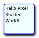
Third: keep in mind is you don’t want to apply the drop shadow to something that has other content. If you do, you’ll get some blurriness for the whole content. Let me demonstrate:
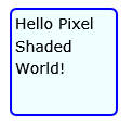
Version 1
No Shader Effects
<Grid x:Name="LayoutRoot" Background="White">

    <Grid Width="100"
          Height="100"
          HorizontalAlignment="Center"
          VerticalAlignment="Center">

        <Rectangle RadiusX="5"
                   RadiusY="5"
                   Fill="Azure"
                   Stroke="Blue"
                   StrokeThickness="2"
                   />

        <TextBlock Text="Hello Pixel Shaded World!"
                   TextWrapping="Wrap"
                   Margin="5"
                   FontSize="14" />
    </Grid>
</Grid>
Version 2
Drop-Shadow on Containing Grid. Notice that the text became blurry.
<Grid Width="100"
      Height="100"
      HorizontalAlignment="Center"
      VerticalAlignment="Center">

    <Rectangle RadiusX="5"
               RadiusY="5"
               Fill="Azure"
               Stroke="Blue"
               StrokeThickness="2"
               />

    <TextBlock Text="Hello Pixel Shaded World!"
               TextWrapping="Wrap"
               Margin="5"
               FontSize="14" />
    <Grid.Effect>
        <DropShadowEffect BlurRadius="10"
                          Opacity="1"
                          Direction="300"/>
    </Grid.Effect>
</Grid>

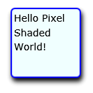
Version 3
Drop-Shadow on Background Rectangle. Notice that the text is now fine.
<Grid Width="100"
      Height="100"
      HorizontalAlignment="Center"
      VerticalAlignment="Center">

    <Rectangle RadiusX="5"
               RadiusY="5"
               Fill="Azure"
               Stroke="Blue"
               StrokeThickness="2">

        <Rectangle.Effect>
            <DropShadowEffect BlurRadius="10"
                              Opacity="1"
                              Direction="300" />
        </Rectangle.Effect>
    </Rectangle>

        <TextBlock Text="Hello Pixel Shaded World!"
               TextWrapping="Wrap"
               Margin="5"
               FontSize="14" />
</Grid>
That’s something to be aware of when using Pixel Shaders – add the effect to a shape, not to a panel or a content control unless you want the contents blurred or otherwise altered. I understand WPF does the same thing.
Creating a Glow Effect
Of course, drop-shadows can also be used as a glow. Here’s some markup that adds a glowing effect to a lit button:
<Grid Width="30"
      Height="30"
      Margin="5">

    <Rectangle RadiusX="5"
               RadiusY="5"
               Fill="LightBlue"
               Stroke="LightBlue"
               StrokeThickness="2">

        <Rectangle.Effect>
            <DropShadowEffect BlurRadius="20"
                              Color="LightBlue"
                              Opacity="1"
                              ShadowDepth="0"
                              Direction="0" />
        </Rectangle.Effect>
    </Rectangle>

    <TextBlock Text="2"
               TextWrapping="Wrap"
               Margin="5"
               FontSize="14" />
</Grid>

I use that in my Silverlight 3 Synthesizer project to make buttons glow like this:

You can see that creating a realistic glowing effect is more than just adding a colored drop shadow, however without the drop shadow, the effect simply isn’t complete. Note of course that I could have done that with a PNG, but given that I am not animating the buttons and don’t have a thousand of them on the screen, the shader effect works just fine.
