Welcome to Pete Brown's 10rem.net

First time here? If you are a developer or are interested in Microsoft tools and technology, please consider subscribing to the latest posts.

You may also be interested in my blog archives, the articles section, or some of my lab projects such as the C64 emulator written in Silverlight.

(hide this)

Dazzling Silverlight Toolkit Pie Charts with Overlays

Pete Brown - 09 January 2009

I'm not sure why I concentrate on Pie Charts. Maybe circles are just more attractive to me than bars or points :)

For the January 2009 Expression Newsletter (which will be out in a week or two), I put together a rather deep article on styling pie charts in the Silverlight Toolkit. At the end, I mentioned to check here for info on overlays.

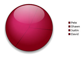
One effect you can achieve with an overlay, is a glassy effect:

image 

Now, overlays aren't something built into the control, you have to do a little playing around with them to achieve this.

First, you'll need to modify the control template. Basically you want to end up with a sandwich with the SeriesContainer in between 
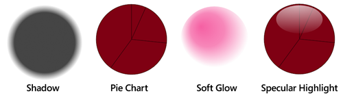
the shadow and the glossy elements, all inside the PlotAreaContainer.

Here's what it looks like (the specular is shown with the pie as a background because you wouldn't be able to see it otherwise)

image

If you want your chart to be pretty color agnostic, or to support having multiple colors for the slices, you will want to change your soft glow to various opacities of white. However, you get a warmer glow if you use a color that is related to the base color of your chart. For example, here's the same chart, but with a white glow:

image

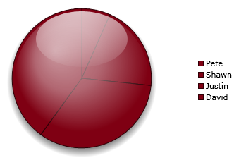
As you can see, it really lacks that healthy glow :) That said, a template using only white for the highlights is far more flexible in terms of allowing you to color the various slices. Here's the same white highlighting with some different slice colors:

image

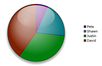
The final appearance, while lacking a little life, definitely makes for a more usable pie chart. Due to the straight lines between the slices, it reminds me of one of those half-round glass paperweights that have a picture on the bottom.

Here's what the style looks like (if anything is cut off to the right, just download the attached project, linked at the end of this post)

<Style x:Key="GlassPieChartPlotAreaStyle"
       TargetType="Grid">
    <Setter Property="Background"
            Value="Transparent" />
</Style>

 
<ControlTemplate x:Key="GlassPieChartTemplate"
                 TargetType="charting:Chart">
    
<Border Background="{TemplateBinding Background}"
        BorderThickness="{TemplateBinding BorderThickness}"
        Padding="10">
    <Grid>
        <Grid.RowDefinitions>
            <RowDefinition Height="Auto" />
            <RowDefinition Height="*" />
        </Grid.RowDefinitions>

        <!-- Title -->
        <datavis:Title Style="{TemplateBinding TitleStyle}"
                       Content="{TemplateBinding Title}"
                       Grid.Row="0"/>


        <Grid Margin="0,15,0,15"
              Grid.Row="1">
            <Grid.ColumnDefinitions>
                <ColumnDefinition Width="*" />
                <ColumnDefinition Width="Auto" />
            </Grid.ColumnDefinitions>

            <!-- Legend -->
            <datavis:Legend x:Name="Legend"
                            Style="{TemplateBinding LegendStyle}"
                            Grid.Column="1"
                            Title="{TemplateBinding LegendTitle}"
                            BorderBrush="{x:Null}"
                            Background="{x:Null}" />

            <!-- Chart Area -->
            <Grid x:Name="ChartArea"
                  Grid.Column="0"
                  Style="{TemplateBinding ChartAreaStyle}">


                    <!-- Plot Area -->
                    <Grid x:Name="PlotArea"
                          Style="{TemplateBinding PlotAreaStyle}"
                          >
                        
                        <!-- Underlay Area, for shadows etc -->

                        <local:SquareContainer VerticalAlignment="Center"
                                               HorizontalAlignment="Center"
                                               Margin="10 14 10 2"
                                               IsHitTestVisible="False"
                                               Visibility="Visible">
                            <Ellipse Stretch="Uniform"
                                     Margin="0">
                                <Ellipse.Fill>
                                    <RadialGradientBrush Center=".5,.5"
                                                         GradientOrigin=".5,.5">
                                        <GradientStop Offset="0"
                                                      Color="#CC000000" />
                                        <GradientStop Offset=".8"
                                                      Color="#CC000000" />
                                        <GradientStop Offset="1"
                                                      Color="#00000000" />
                                    </RadialGradientBrush>
                                </Ellipse.Fill>
                            </Ellipse>
                        </local:SquareContainer>

                        
                        <!-- Required containers -->
                        <Grid x:Name="GridLinesContainer" />
                        <Grid x:Name="SeriesContainer" Visibility="Visible" />
                        
                        <Border BorderBrush="{x:Null}"
                                BorderThickness="1" />

                        <!-- Overlays for highlights and similar go after this line -->


                        <!-- Primary Soft Glow -->
                        <local:SquareContainer VerticalAlignment="Center"
                                               HorizontalAlignment="Center"
                                               Margin="14"
                                               IsHitTestVisible="False"
                                               Visibility="Visible">
                            <Ellipse Stretch="Uniform" Margin="5">
                                <Ellipse.Fill>
                                    <RadialGradientBrush Center=".5,.4"
                                                         GradientOrigin=".3,.3">
                                        
                                        <!-- White Highlight -->
                                        
                                        <GradientStop Offset="0"
                                                      Color="#99ffffff" />
                                        <GradientStop Offset=".5"
                                                      Color="#66ffffff" />
                                        <GradientStop Offset="1"
                                                      Color="#00ffffff" />
                                        
                                        <!-- Ruby Colored Highlight -->
                                        
                                        <!--<GradientStop Offset="0"
                                                      Color="#CCf5398e" />
                                        <GradientStop Offset=".5"
                                                      Color="#99f5398e" />
                                        <GradientStop Offset="1"
                                                      Color="#00f5398e" />-->
                                    </RadialGradientBrush>
                                </Ellipse.Fill>
                            </Ellipse>
                        </local:SquareContainer>

                        
                        <!-- Glass Specular Highlight -->
                        <local:SquareContainer VerticalAlignment="Center"
                                               HorizontalAlignment="Center"
                                               Margin="14"
                                               IsHitTestVisible="False"
                                               Visibility="Visible">

                            <Grid>
                                <Grid.RowDefinitions>
                                    <RowDefinition Height="0.06*" />
                                    <RowDefinition Height="0.8*" />
                                    <RowDefinition Height="*" />
                                </Grid.RowDefinitions>
                                
                                <Grid.ColumnDefinitions>
                                    <ColumnDefinition Width="0.25*" />
                                    <ColumnDefinition Width="*" />
                                    <ColumnDefinition Width="0.25*" />
                                </Grid.ColumnDefinitions>


                                <Ellipse Stretch="Fill"
                                         Grid.Row="1"
                                         Grid.Column="1"
                                         Opacity=".75"
                                         >
                                    <Ellipse.Fill>
                                        <RadialGradientBrush Center=".45,0"
                                                             GradientOrigin=".45,0"
                                                             RadiusX="2"
                                                             RadiusY="1">
                                            <GradientStop Offset="0.0"
                                                          Color="#EEFFFFFF" />
                                            <GradientStop Offset="1"
                                                          Color="#11FFFFFF" />
                                        </RadialGradientBrush>
                                    </Ellipse.Fill>
                                </Ellipse>
                            </Grid>
                            
                            
                        </local:SquareContainer>

                    </Grid>
                
            </Grid>

        </Grid>
    </Grid>
</Border>
</ControlTemplate>


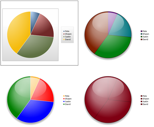
Here's a set of four charts. The default chart appearance is on the upper left. The remaining three all use the same template, but different StylePalettes.

image

Here's the xaml for the four charts (without the control template)

<Grid Margin="5">
    <Grid.RowDefinitions>
        <RowDefinition Height="*" />
        <RowDefinition Height="*" />
    </Grid.RowDefinitions>

    <Grid.ColumnDefinitions>
        <ColumnDefinition Width="*" />
        <ColumnDefinition Width="*" />
    </Grid.ColumnDefinitions>

    <charting:Chart x:Name="DefaultPieChart"
                    Grid.Row="0"
                    Grid.Column="0"
                    >
        <charting:Chart.Series>
            <charting:PieSeries IndependentValueBinding="{Binding Label}"
                                DependentValueBinding="{Binding Value}">
            </charting:PieSeries>
        </charting:Chart.Series>
    </charting:Chart>


    <charting:Chart x:Name="MulticolorGlassPieChart"
                    Grid.Row="0"
                    Grid.Column="1"
                    Template="{StaticResource GlassPieChartTemplate}"
                    PlotAreaStyle="{StaticResource GlassPieChartPlotAreaStyle}">
        <charting:Chart.Series>
            <charting:PieSeries IndependentValueBinding="{Binding Label}"
                                DependentValueBinding="{Binding Value}">
                <charting:PieSeries.StylePalette>
                    <datavis:StylePalette>
                        <Style TargetType="charting:PieDataPoint">
                            <Setter Property="Background"
                                    Value="#FF57007f" />
                            <Setter Property="BorderBrush"
                                    Value="#FF2e0007" />
                        </Style>
                        <Style TargetType="charting:PieDataPoint">
                            <Setter Property="Background"
                                    Value="#FF00757f" />
                            <Setter Property="BorderBrush"
                                    Value="#FF2e0007" />
                        </Style>
                        <Style TargetType="charting:PieDataPoint">
                            <Setter Property="Background"
                                    Value="#FF007f0f" />
                            <Setter Property="BorderBrush"
                                    Value="#FF2e0007" />
                        </Style>
                        <Style TargetType="charting:PieDataPoint">
                            <Setter Property="Background"
                                    Value="#FF7f2100" />
                            <Setter Property="BorderBrush"
                                    Value="#FF2e0007" />
                        </Style>
                    </datavis:StylePalette>
                </charting:PieSeries.StylePalette>
            </charting:PieSeries>
        </charting:Chart.Series>
    </charting:Chart>


    <charting:Chart x:Name="RubyGlassPieChart"
                    Grid.Row="1"
                    Grid.Column="1"
                    Template="{StaticResource GlassPieChartTemplate}"
                    PlotAreaStyle="{StaticResource GlassPieChartPlotAreaStyle}">
        <charting:Chart.Series>
            <charting:PieSeries IndependentValueBinding="{Binding Label}"
                                DependentValueBinding="{Binding Value}">
                <charting:PieSeries.StylePalette>
                    <datavis:StylePalette>
                        <Style TargetType="charting:PieDataPoint">
                            <Setter Property="Background"
                                    Value="#FF7f0013" />
                            <Setter Property="BorderBrush"
                                    Value="#FF2e0007" />
                        </Style>
                    </datavis:StylePalette>
                </charting:PieSeries.StylePalette>
            </charting:PieSeries>
        </charting:Chart.Series>
    </charting:Chart>


    <charting:Chart x:Name="BrightMulticolorGlassPieChart"
                    Grid.Row="1"
                    Grid.Column="0"
                    Template="{StaticResource GlassPieChartTemplate}"
                    PlotAreaStyle="{StaticResource GlassPieChartPlotAreaStyle}">
        <charting:Chart.Series>
            <charting:PieSeries IndependentValueBinding="{Binding Label}"
                                DependentValueBinding="{Binding Value}">
                <charting:PieSeries.StylePalette>
                    <datavis:StylePalette>
                        <Style TargetType="charting:PieDataPoint">
                            <Setter Property="Background"
                                    Value="Orange" />
                            <Setter Property="BorderBrush"
                                    Value="White" />
                        </Style>
                        <Style TargetType="charting:PieDataPoint">
                            <Setter Property="Background"
                                    Value="Red" />
                            <Setter Property="BorderBrush"
                                    Value="White" />
                        </Style>
                        <Style TargetType="charting:PieDataPoint">
                            <Setter Property="Background"
                                    Value="Blue" />
                            <Setter Property="BorderBrush"
                                    Value="White" />
                        </Style>
                        <Style TargetType="charting:PieDataPoint">
                            <Setter Property="Background"
                                    Value="Green" />
                            <Setter Property="BorderBrush"
                                    Value="White" />
                        </Style>
                    </datavis:StylePalette>
                </charting:PieSeries.StylePalette>
            </charting:PieSeries>
        </charting:Chart.Series>
    </charting:Chart>


</Grid>

While I did these examples 100% in xaml in Visual Studio, using the techniques presented here and in previous posts, a talented designer with Blend will be able to create all sorts of interesting designs for the charts.

I hope that gives you some idea of what you can do with a control template, and specifically with something like the Pie Charts from the Silverlight Toolkit.

You can download the full project here.

     
posted by Pete Brown on Friday, January 9, 2009
filed under:      

31 comments for “Dazzling Silverlight Toolkit Pie Charts with Overlays”

  1. Pete Brownsays:
    Forgot to mention that a key part of these chart templates is the SquareContainer from my previous post:

    http://community.irritatedvowel.com/blogs/pete_browns_blog/archive/2009/01/09/Creating-a-Silverlight-Control-that-Stays-Square.aspx

    Pete
  2. Tusharsays:
    Thanks Pete.

    I had one question.
    When I use the chart as follows:
    <charting:Chart x:Name="pieChart" Width="850" Height="750"
    Template="{StaticResource GlassPieChartTemplate}"
    PlotAreaStyle="{StaticResource GlassPieChartPlotAreaStyle}">
    <charting:PieSeries SelectionChanged="ChartSelectionChanged" DependentValueBinding="{Binding Path=Value}" IndependentValueBinding="{Binding Path=Key}">

    </charting:PieSeries>
    </charting:Chart>

    I get my glassy effect and the regular colors. This is fine and what I want. Then I go on to try to customize the tooltip by extracting the template of a PieDataPoint out, and changing its tooltip, saving this template this way:

    <charting:Chart x:Name="pieChart" Width="850" Height="750"
    Template="{StaticResource GlassPieChartTemplate}"
    PlotAreaStyle="{StaticResource GlassPieChartPlotAreaStyle}">
    <charting:PieSeries SelectionChanged="ChartSelectionChanged" DependentValueBinding="{Binding Path=Value}" IndependentValueBinding="{Binding Path=Key}">
    <charting:PieSeries.StylePalette>
    <datavis:StylePalette>
    <Style TargetType="charting:PieDataPoint">
    <Setter Property="Template" Value="{StaticResource CustomPieDataPointTemplate}"/>
    </Style>
    </datavis:StylePalette>
    </charting:PieSeries.StylePalette>
    </charting:PieSeries>
    </charting:Chart>

    This time, all the slices appear yellow. Nothing in the PieDataPointTemplate makes them yellow by themselves, I checked.

    Something is being overridden.

    I'll appreciate any help on this.

    Thanks a lot!

  3. Pete Brownsays:
    @Daniel

    In your usercontrol/page defintion, add an xmlns for the System.Windows.Controls.DataVisualization.Toolkit dll. Make sure you have that referenced before you do it.

    In vs2008, when you type xmlns:datavis=" it will give you intellisense to help you figure out the rest.

    Pete
  4. Melinda Marshsays:
    Does 'StylePalette' only work within the xaml page and not the app.xaml. Ideally if multiple charts were being used throughout an application and they all used the same styling, I'd like to put all styling info in app.xaml. Can this be done? I've tried but it never recognises 'StylePalette'. If I've misunderstood how this should be working please let me know.
  5. Pete Brownsays:
    @Gareth

    The chart source is on http://silverlight.codeplex.com I'm not sure that they have WPF versions out yet, but worst-case, you could use the existing source code and port to WPF.

    The port should be easy:
    http://blogs.msdn.com/delay/archive/2009/03/26/if-they-can-build-it-they-will-come-enabling-anyone-to-compile-wpf-charting-from-the-silverlight-charting-sources.aspx

    Pete
  6. Ryansays:
    Silverlight 3 seems to use an EdgePanel as the container for the ChartArea instead of a Grid. I've been trying to stack the containers use the Canvas.ZIndex, but without much success.

    I'm new to Silverlight ... is there a quick fix to allow EdgePanel to behave the same way as the Grid was in your example (naturally stacking)?
  7. Ryansays:
    Hey Pete,

    Managed to figure it out. I created a template for PieSeries and turned the Canvas container into a Grid instead. Then I put in the three container for shadow, soft glow and highlights and was able to stack them (zindex) properly there.

    Whatever works. Ha.

    Thanks for the article though. Good stuff.
  8. Eliesays:
    Hi,

    Like Ryan, I am having problems getting the Glassy effect since the Nov Toolkit uses EdgePanel. But unlike Ryan I was not able to resolve it. Any help will be gretaly appreciated.
  9. Petesays:
    Hi All

    I'll try and take a look at this again, but it will be a little bit. I haven't done anything with the charts since last year.

    @Elie

    If you're blocked, you can do the same thing Ryan did: create a control template and change the EdgePanels into grids.

    Pete
  10. Eliesays:
    Thanks Pete,

    If you get the chance will be great. I have tried to change the EdgePanel to Grid, but the ChartArea returned empty no matter what I did. Some research online and I discovered some for SL3 November Toolkit, if the ChartArea container is a Grid and not EdgePanel then it will always return empty.


    Thx
  11. Duncan Wattssays:
    I had a go at changing the Grid to an EdgePanel which works, however the highlights are now displayed behind the pie slices - you can see them if you make the pie charts semi-transparent. Any ideas?

    Thanks
  12. Quintonsays:
    Hi Duncan

    I think you need to change the zIndex of the canvas to -1 to get your highlights to display ontop of the EdgePanel. (look at the zindex it created in the style when doing so in blend).

    Could you please post your xaml somewhere as I am struggling to get the solution working in the latest toolkit and SL4.

    Thanks
    Q
  13. Zachary Bauersays:
    Same here, I open in Blend 4 and CRASH! Not sure what is up with that. Wish MS and the expression team would just make these charts a bit more designer friendly. After all, only a developer would use the default charts included with the toolkit. :)
  14. Zachary Bauersays:
    The reason its not working in the latest Blend release is because there was a bunch of changes in the toolkit that took place since he posted this. Even the names have changed inside the references of the toolkit. So because I'm not a developer, this is basically useless. C'mon expression team. "Designer Friendly"
  15. PiCMatesays:
    Hi Aravind, this is a very late reply for your question. But for everybody's information there is no StylePalette anymore (in WPF toolkit and as far as I know). It should be "Palette"
  16. Srikanthsays:
    Here is the article that explains about getting glass effect for bar charts.

    http://codingforpassion.blogspot.com/2011/08/glass-effect-silverlight-charts.html

Comment on this Post

Remember me

13 trackbacks for “Dazzling Silverlight Toolkit Pie Charts with Overlays”

  1. Christopher Steensays:
    Code Camps First New Hampshire Code Camp on February 28th [Via: cbowen ] Link Collections Interesting...
  2. Community Blogssays:
    In this issue: Michael Washington, Pete Brown(2), Shawn Wildermuth(2), Jesse Liberty, Mike Snow, Terence
  3. POKE 53280,0: Pete Brown's Blogsays:
    The Expression Newsletter is out. In the current issue , you’ll find my article about styling charts
  4. Delay's Blogsays:
    It's been a couple of months since I shared my semi-comprehensive page of Charting resources on the web
  5. Microsoft Weblogssays:
    It's been a couple of months since I shared my semi-comprehensive page of Charting resources on the web
  6. Felix Wang | Evangelizing the Next Websays:
    Overviews ( 100 level ) Silverlight Toolkit Released – More controls! - Tim Heuer 's during the PDC keynote
  7. DotNetClub Complutense Madridsays:
    En el blog de Felix Wang , he encontrado este artículo donde se agrupan una colección de
  8. Delay's Blogsays:
    It's been a while since the March 09 release of the Silverlight Toolkit - and even longer since I last
  9. Microsoft Weblogssays:
    It's been a while since the March 09 release of the Silverlight Toolkit - and even longer since I last
  10. Microsoft Weblogssays:
    In the time since posting my last collection of Silverlight/WPF Charting links , there's been some great
  11. Microsoft Weblogssays:
    In the time since sharing my last collection of Silverlight/WPF Charting links , there have been some
  12. Microsoft Weblogssays:
    In the time since sharing my last collection of Silverlight/WPF Charting links , there have been some