First, hats off to Mehdi for digging up the root solution to this and to Jafar Husain for bringing it to my attention.
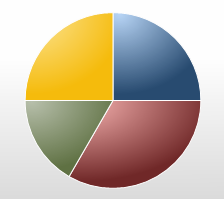
The default styles for the charts in Silverlight look pretty good. However, one thing that was driving me nuts is the way the gradients are per-slice in the pie chart. Because of that, you end up with some really odd highlighting effects:

It doesn’t look bad, but it’s not quite what I was looking for. In the default styles, each slice looks like it pillows up from the overall pie. What I want, is a pie that looks like it has a smooth top and slightly rounded outside edges.
I was looking for a good way to create a chart where the pie slices all have different colors, but the overall gradient is unified across them to create a beveled/rounded look.
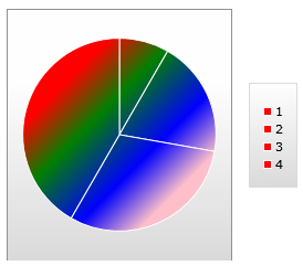
The example Mehdi sent me looks like this:

Unless you’re developing a BI dashboard for Rainbow Brite, you probably won’t use those colors. However, it proves you can have a gradient unified across all the pie slices. Here’s the Xaml:
<charting:Chart Width="300" Height="300">
    <charting:Chart.Series>
        <charting:PieSeries>
            <charting:PieSeries.StylePalette>
                <datavis:StylePalette>
                    <Style TargetType="charting:PieDataPoint">
                        <Setter Property="Background">
                            <Setter.Value>
                                <LinearGradientBrush MappingMode="Absolute"
                                                     StartPoint="50,50"
                                                     EndPoint="150,150">
                                    <GradientStop Color="Red" Offset="0"/>
                                    <GradientStop Color="Green" Offset="0.3"/>
                                    <GradientStop Color="Blue" Offset="0.7"/>
                                    <GradientStop Color="Pink" Offset="1"/>
                                </LinearGradientBrush>
                            </Setter.Value>
                        </Setter>
                    </Style>
                </datavis:StylePalette>
            </charting:PieSeries.StylePalette>
            <charting:PieSeries.ItemsSource>
                <controls:ObjectCollection>
                    <sys:Double>1</sys:Double>
                    <sys:Double>2.33333325386047</sys:Double>
                    <sys:Double>3.66666674613953</sys:Double>
                    <sys:Double>5</sys:Double>
                </controls:ObjectCollection>
            </charting:PieSeries.ItemsSource>
        </charting:PieSeries>
    </charting:Chart.Series>
</charting:Chart>
The key is the MappingMode of Absolute. That changes how the StartPoint and EndPoint (and later the Center and Radius) are interpreted. Instead of being between 0 and 1 and treated as a percentage of the whole, they are pixel positions.
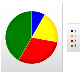
Given his start, it’s pretty easy to take that and work with the gradients to do this:

The colors are a little on the bright side, but you can apply your own pallet and create some nice subtle shading effects.
Here’s the markup
<charting:Chart Width="300" Height="300">
    <charting:Chart.Series>
        <charting:PieSeries>
            <charting:PieSeries.StylePalette>
                <datavis:StylePalette>
                    <Style TargetType="charting:PieDataPoint">
                        <Setter Property="Background">
                            <Setter.Value>
                                <RadialGradientBrush MappingMode="Absolute"
                                                     GradientOrigin="92,102"
                                                     Center="92,102"
                                                     RadiusX="102"
                                                     RadiusY="102"
                                                     >

                                    <GradientStop Color="Blue" Offset="0.0"/>
                                    <GradientStop Color="Blue" Offset="0.7"/>
                                    <GradientStop Color="DarkBlue" Offset="1.0"/>
                                </RadialGradientBrush>
                            </Setter.Value>
                        </Setter>
                    </Style>
                    <Style TargetType="charting:PieDataPoint">
                        <Setter Property="Background">
                            <Setter.Value>
                                <RadialGradientBrush MappingMode="Absolute"
                                                     GradientOrigin="92,102"
                                                     Center="92,102"
                                                     RadiusX="102"
                                                     RadiusY="102"
                                                     >

                                    <GradientStop Color="Yellow" Offset="0.0"/>
                                    <GradientStop Color="Yellow" Offset="0.7"/>
                                    <GradientStop Color="Orange" Offset="1.0"/>
                                </RadialGradientBrush>
                            </Setter.Value>
                        </Setter>
                    </Style>
                    <Style TargetType="charting:PieDataPoint">
                        <Setter Property="Background">
                            <Setter.Value>
                                <RadialGradientBrush MappingMode="Absolute"
                                                     GradientOrigin="92,102"
                                                     Center="92,102"
                                                     RadiusX="102"
                                                     RadiusY="102"
                                                     >

                                    <GradientStop Color="Red" Offset="0.0"/>
                                    <GradientStop Color="Red" Offset="0.7"/>
                                    <GradientStop Color="DarkRed" Offset="1.0"/>
                                </RadialGradientBrush>
                            </Setter.Value>
                        </Setter>
                    </Style>
                    <Style TargetType="charting:PieDataPoint">
                        <Setter Property="Background">
                            <Setter.Value>
                                <RadialGradientBrush MappingMode="Absolute"
                                                     GradientOrigin="92,102"
                                                     Center="92,102"
                                                     RadiusX="102"
                                                     RadiusY="102"
                                                     >

                                    <GradientStop Color="Green" Offset="0.0"/>
                                    <GradientStop Color="Green" Offset="0.7"/>
                                    <GradientStop Color="DarkGreen" Offset="1.0"/>
                                </RadialGradientBrush>
                            </Setter.Value>
                        </Setter>
                    </Style>
                </datavis:StylePalette>
            </charting:PieSeries.StylePalette>
            <charting:PieSeries.ItemsSource>
                <controls:ObjectCollection>
                    <sys:Double>1</sys:Double>
                    <sys:Double>2.33333325386047</sys:Double>
                    <sys:Double>3.66666674613953</sys:Double>
                    <sys:Double>5</sys:Double>
                </controls:ObjectCollection>
            </charting:PieSeries.ItemsSource>
        </charting:PieSeries>
    </charting:Chart.Series>
</charting:Chart>
The downside to that, though, is the set of magic numbers in there, repeated several times. Since we’re using Absolute MappingMode, the Origin and Center are no longer treated as percentages of the container. Instead, they are pixel positions.
Those magic numbers make me ill. They just smell bad. Silverlight doesn’t support UI->UI binding, so we’ll need to provide another mechanism to get us the info. I’ll post the details in the next post on this topic.
