I was snagging some icons to go into a comp of a Silverlight LOB
application today when I realized that some of the metaphors used
in the software we're refacing (Silverlight front-end to an
existing LOB application), just don't hold anymore.
While it is instantly recognized by folks who have been with
computers for a while, I think the 3 1/2" floppy save icon needs to
die.
Back when we had 5 1/4 disks, the save icon (for GUIs) was often
a 5 1/4 disk. When 3 1/2 disks came out, folks switched to
that as the icon. Now that we generally use internal or network
storage for everything, why does the 3 1/2" disk persist (no pun
intended, really!). My last several laptops at work had no internal
or external 3 1/2" drive. My last couple home-built desktops have
no floppy drive. In fact, if you go to a retail store and look at
all the laptops and desktops for sale, you'll be hard-pressed to
find one with a floppy drive.
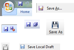
Here are some snags just from applications on my own machine
And before anyone runs out and says it is just Windows, take a
look at apps on the Mac:

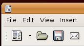
and Linux…
Even online applications like Google Docs fall victim to the
classic imagery:

Before everyone started emulating the exact look of Microsoft
office, the save icon for some applications was a stack of
platters, like a hard drive. I recall PowerBuilder and perhaps some
other apps from the early days of Windows. It made for a pretty
ugly and unrecognizable icon, but it worked. Some database
applications had an icon like a little arrow pointing to a large
barrel-like drum (a reference to early storage devices). Of course,
that was even uglier and less recognizable than the platters.
That said, I'm willing to bet that a fair number of kids in
school these days have never seen a 3 1/2 floppy disk and therefore
would not intuitively make the connection that the disk is a form
of storage and therefore the icon might mean "save". It has no more
meaning to them than a splat of color or that old drum with the
arrow. Instead, it is something they have to memorize based on a
pure on-screen message with no real-life analog.
What do you think would be an appropriate save icon
these days? (well, after all us old farts stop using toolbars
anyway)