In a previous post, I introduced the Chart control from the Silverlight Toolkit. In this post, let’s cover how to make the charts look more interesting.
First, we’re going to create a simple label/value class to hold the data for the chart. In the previous example, we just used a collection of doubles, but that didn’t provide any labels.
namespace PeteBrown.SilverlightToolkitExamples
{
    public class ChartDataElement
    {
        public double Value { get; set; }
        public string Label { get; set; }
    }
}
Once we have that, we can use it in the xaml with a little hard-coded data:
<UserControl x:Class="PeteBrown.SilverlightToolkitExamples.Page"
    xmlns="http://schemas.microsoft.com/winfx/2006/xaml/presentation"
    xmlns:x="http://schemas.microsoft.com/winfx/2006/xaml"
    xmlns:sys="clr-namespace:System;assembly=mscorlib"
    xmlns:controls="clr-namespace:Microsoft.Windows.Controls;assembly=Microsoft.Windows.Controls"
    xmlns:charting="clr-namespace:Microsoft.Windows.Controls.DataVisualization.Charting;assembly=Microsoft.Windows.Controls.DataVisualization"
    xmlns:local="clr-namespace:PeteBrown.SilverlightToolkitExamples"
    Width="500" Height="300">
    <Grid x:Name="LayoutRoot" Background="White">
     <charting:Chart>
      <charting:Chart.Series>
       <charting:PieSeries AnimationSequence="FirstToLast"
                         IndependentValueBinding="{Binding Label}"
                         DependentValueBinding="{Binding Value}">
         <charting:PieSeries.ItemsSource>
          <controls:ObjectCollection>
           <local:ChartDataElement Label="Test 1" Value="2.0" />
           <local:ChartDataElement Label="Test 2" Value="15.0" />
           <local:ChartDataElement Label="Test 3" Value="1.0" />
           <local:ChartDataElement Label="Test 4" Value="3.5" />
           <local:ChartDataElement Label="Test 5" Value="5.8" />
          </controls:ObjectCollection>
        </charting:PieSeries.ItemsSource>
       </charting:PieSeries>
      </charting:Chart.Series>
     </charting:Chart>
    </Grid>
</UserControl>
The xaml above produces a chart that looks like this:
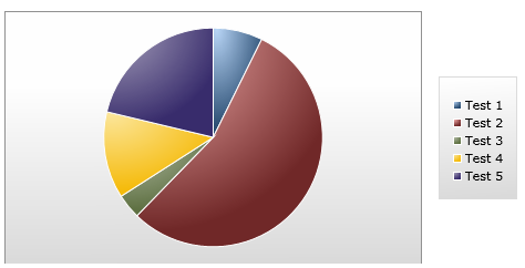
Now, while the default styles look pretty good, the power of Silverlight and WPF is the ability to change the UI to fit your design view. Let’s see what we can do to style it up to better match our own application.
Your first inclination might be to go into Blend, select the chart and then choose Edit Control Parts (Template). Unfortunately, that doesn’t really get you anywhere. You get this:
<Style x:Key="PieSeriesStyle2" TargetType="charting:PieSeries">
    <Setter Property="IsTabStop" Value="False"/>
    <Setter Property="Margin" Value="10,10,10,10"/>
    <Setter Property="Template">
        <Setter.Value>
            <ControlTemplate TargetType="charting:PieSeries">
                <Canvas x:Name="PlotArea"/>
            </ControlTemplate>
        </Setter.Value>
    </Setter>
</Style>
Not terribly helpful for many cases, but useful if you want to change the macro aspects of the chart control itself.
Instead, you need to concern yourself with the following set of properties for the chart (all under “Miscellaneous” in Blend:
- ChartAreaStyle
- LegendStyle
- PlotAreaStyle
- StylePalette
Of those, the StylePalette is the most interesting. This is the property you use to provide a set of styles which can be selected for the individual chart columns (or pie slices). Let’s try a really simple one first.
StylePalette
Add a namespace declaration pointing to the root namespace in the DataVisualization dll (I called it “vis”) and then add the following directly after the <charts:Chart> tag:
<charting:Chart.StylePalette>
    <vis:StylePalette>
        <Style TargetType="Control">
            <Setter Property="Background" Value="Gray"/>
        </Style>
        <Style TargetType="Control">
            <Setter Property="Background" Value="Black"/>
        </Style>
    </vis:StylePalette>
</charting:Chart.StylePalette>
What we’ve done here is provide two colors that that chart can use when building the chart. The resulting chart looks like this:
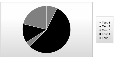
The more values you put in the style palette, the more variation you’ll get in the chart.
Now, if you want to make the styles a little more interesting, you need to go in and play with the style using VisualStateManager (VSM).
Styles for Data Points
So, you may wonder how on earth you can go about creating the styles via vsm. There are a couple options. 1. You could open the generic.xaml from the source (or via one of the tools that pull that for you) or 2. you can plug a PieDataPoint into your markup and then use Blend to gen the VSM style for you. I chose the latter.
<charting:PieDataPoint />
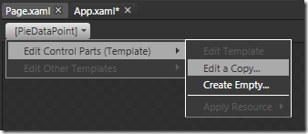
When you do that, you’ll get a display that looks like this:
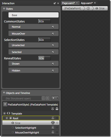
For now, if you want to modify the highlight paths themselves, you’ll want to go into the VSM style and change the Opacity of the SelectionHighlight and MouseOverHighlight to a non-zero value so that you can style them up. Be sure to change them back to 0 afterwards:
<Path x:Name="Slice"
      Fill="{TemplateBinding Background}"
      Stroke="{TemplateBinding BorderBrush}"
      Data="{TemplateBinding Geometry}">
    <ToolTipService.ToolTip>
        <StackPanel>
            <ContentControl Content="{TemplateBinding FormattedDependentValue}"/>
            <ContentControl Content="{TemplateBinding FormattedRatio}"/>
        </StackPanel>
    </ToolTipService.ToolTip>
</Path>
<Path x:Name="SelectionHighlight"
      IsHitTestVisible="False"
      Opacity="0"
      Fill="Red"
      Data="{TemplateBinding GeometrySelection}"/>
<Path x:Name="MouseOverHighlight"
      IsHitTestVisible="False"
      Opacity="0"
      Fill="White"
      Data="{TemplateBinding GeometryHighlight}"/>
I fully expect the design-time story to get better as the toolkit progresses. Remember, the charts are considered “Preview” quality at the current time.
Why would you mess with VSM? Well, the individual pie slices have states that you’re interested in. You may want to call them out (enlarge, for example) when the mouse hovers over so you can indicate drill-down capability. The default behavior produces a tooltip with the value and the percentage.
Let’s skip that, however, and play with the animation a bit. Looking at the Xaml, you can see that the Shown and Hidden states are simple opacity animations:
<vsm:VisualStateGroup x:Name="RevealStates">
    <vsm:VisualStateGroup.Transitions>
        <vsm:VisualTransition GeneratedDuration="0:0:0.5"/>
    </vsm:VisualStateGroup.Transitions>
    <vsm:VisualState x:Name="Shown">
        <Storyboard>
            <DoubleAnimation Duration="0"
                             Storyboard.TargetName="Root"
                             Storyboard.TargetProperty="Opacity"
                             To="1"/>
        </Storyboard>
    </vsm:VisualState>
    <vsm:VisualState x:Name="Hidden">
        <Storyboard>
            <DoubleAnimation Duration="0"
                             Storyboard.TargetName="Root"
                             Storyboard.TargetProperty="Opacity"
                             To="0"/>
        </Storyboard>
    </vsm:VisualState>
</vsm:VisualStateGroup>
I edited the Shown state in Blend to have X and Y scale transform values of 1.0, and the Hidden state to have X and Y scale transform values of 0.5. No easing or interesting curves yet. This is the resulting part of the style in VSM:
<vsm:VisualStateGroup x:Name="RevealStates">
    <vsm:VisualStateGroup.Transitions>
        <vsm:VisualTransition GeneratedDuration="0:0:0.5"/>
    </vsm:VisualStateGroup.Transitions>
    <vsm:VisualState x:Name="Shown">
        <Storyboard>
            <DoubleAnimation Duration="0"
                             Storyboard.TargetName="Root"
                             Storyboard.TargetProperty="Opacity"
                             To="1"/>
            <DoubleAnimation
                Storyboard.TargetName="Slice"
                Storyboard.TargetProperty="(UIElement.RenderTransform).(TransformGroup.Children)[0].(ScaleTransform.ScaleX)"
                To="1" />
            <DoubleAnimation
                Storyboard.TargetName="Slice"
                Storyboard.TargetProperty="(UIElement.RenderTransform).(TransformGroup.Children)[0].(ScaleTransform.ScaleY)"
                To="1" />
        </Storyboard>
    </vsm:VisualState>
    <vsm:VisualState x:Name="Hidden">
        <Storyboard>
            <DoubleAnimation Duration="0"
                             Storyboard.TargetName="Root"
                             Storyboard.TargetProperty="Opacity"
                             To="0"/>
            <DoubleAnimation
                Storyboard.TargetName="Slice"
                Storyboard.TargetProperty="(UIElement.RenderTransform).(TransformGroup.Children)[0].(ScaleTransform.ScaleX)"
                To="0" />
            <DoubleAnimation
                Storyboard.TargetName="Slice"
                Storyboard.TargetProperty="(UIElement.RenderTransform).(TransformGroup.Children)[0].(ScaleTransform.ScaleY)"
                To="0" />
        </Storyboard>
    </vsm:VisualState>
</vsm:VisualStateGroup>
(on my blog the stuff to the right will probably cut off a little. It’s just setting X and Y values like this:
(...RenderTransform).(TransformGroup.Children)[0].(ScaleTransform.ScaleX)
Isolate the Control Template
Once I have the PieDataPoint styled up, we need to just a little cleanup. You will need to remove the style and keep just the inner template, assigning it an x:Key in the process. That is because in the StylePalette, we need to provide different styles, but base them all on the same template.
Remove all this gunk from the style:
<Style x:Key="PieDataPointStyle1" TargetType="charting:PieDataPoint">
    <Setter Property="Background" Value="Orange"/>
    <Setter Property="BorderBrush" Value="White"/>
    <Setter Property="BorderThickness" Value="1"/>
    <Setter Property="IsTabStop" Value="False"/>
    <Setter Property="RatioStringFormat" Value="{}{0:p2}"/>
    <Setter Property="Template">
        <Setter.Value>
(and the related closing style, Setter and Setter.Value tags)
You’ll end up with a template that looks like this:
<ControlTemplate x:Key="PieDataPointTemplate"  TargetType="charting:PieDataPoint">
    <Grid x:Name="Root" Opacity="0">
        <vsm:VisualStateManager.VisualStateGroups>
            <vsm:VisualStateGroup x:Name="CommonStates">
                <vsm:VisualStateGroup.Transitions>
                    <vsm:VisualTransition GeneratedDuration="0:0:0.1"/>
                </vsm:VisualStateGroup.Transitions>
                <vsm:VisualState x:Name="Normal"/>
                <vsm:VisualState x:Name="MouseOver">
                    <Storyboard>
                        <DoubleAnimation Duration="0"
                                         Storyboard.TargetName="MouseOverHighlight"
                                         Storyboard.TargetProperty="Opacity" To="0.6"/>
                    </Storyboard>
                </vsm:VisualState>
            </vsm:VisualStateGroup>
            <vsm:VisualStateGroup x:Name="SelectionStates">
                <vsm:VisualStateGroup.Transitions>
                    <vsm:VisualTransition GeneratedDuration="0:0:0.1"/>
                </vsm:VisualStateGroup.Transitions>
                <vsm:VisualState x:Name="Unselected"/>
                <vsm:VisualState x:Name="Selected">
                    <Storyboard>
                        <DoubleAnimation Duration="0"
                                         Storyboard.TargetName="SelectionHighlight"
                                         Storyboard.TargetProperty="Opacity" To="0.6"/>
                    </Storyboard>
                </vsm:VisualState>
            </vsm:VisualStateGroup>
            <vsm:VisualStateGroup x:Name="RevealStates">
                <vsm:VisualStateGroup.Transitions>
                    <vsm:VisualTransition GeneratedDuration="0:0:0.5"/>
                </vsm:VisualStateGroup.Transitions>
                <vsm:VisualState x:Name="Shown">
                    <Storyboard>
                        <DoubleAnimation Duration="0"
                                         Storyboard.TargetName="Root"
                                         Storyboard.TargetProperty="Opacity"
                                         To="1"/>
                        <DoubleAnimation
                            Storyboard.TargetName="Slice"
                            Storyboard.TargetProperty="(UIElement.RenderTransform).(TransformGroup.Children)[0].(ScaleTransform.ScaleX)"
                            To="1" />
                        <DoubleAnimation
                            Storyboard.TargetName="Slice"
                            Storyboard.TargetProperty="(UIElement.RenderTransform).(TransformGroup.Children)[0].(ScaleTransform.ScaleY)"
                            To="1" />
                    </Storyboard>
                </vsm:VisualState>
                <vsm:VisualState x:Name="Hidden">
                    <Storyboard>
                        <DoubleAnimation Duration="0"
                                         Storyboard.TargetName="Root"
                                         Storyboard.TargetProperty="Opacity"
                                         To="0"/>
                        <DoubleAnimation
                            Storyboard.TargetName="Slice"
                            Storyboard.TargetProperty="(UIElement.RenderTransform).(TransformGroup.Children)[0].(ScaleTransform.ScaleX)"
                            To="0" />
                        <DoubleAnimation
                            Storyboard.TargetName="Slice"
                            Storyboard.TargetProperty="(UIElement.RenderTransform).(TransformGroup.Children)[0].(ScaleTransform.ScaleY)"
                            To="0" />
                    </Storyboard>
                </vsm:VisualState>
            </vsm:VisualStateGroup>
        </vsm:VisualStateManager.VisualStateGroups>
        <Path x:Name="Slice"
              Fill="{TemplateBinding Background}"
              Stroke="{TemplateBinding BorderBrush}"
              Data="{TemplateBinding Geometry}" RenderTransformOrigin="0.5,0.5">
            <Path.RenderTransform>
                <TransformGroup>
                    <ScaleTransform ScaleX="0" ScaleY="0"/>
                    <SkewTransform/>
                    <RotateTransform/>
                    <TranslateTransform/>
                </TransformGroup>
            </Path.RenderTransform>
            <ToolTipService.ToolTip>
                <StackPanel>
                    <ContentControl Content="{TemplateBinding FormattedDependentValue}"/>
                    <ContentControl Content="{TemplateBinding FormattedRatio}"/>
                </StackPanel>
            </ToolTipService.ToolTip>
        </Path>
        <Path x:Name="SelectionHighlight"
              IsHitTestVisible="False"
              Opacity="0"
              Fill="Red"
              Data="{TemplateBinding GeometrySelection}"/>
        <Path x:Name="MouseOverHighlight"
              IsHitTestVisible="False"
              Opacity="0"
              Fill="White"
              Data="{TemplateBinding GeometryHighlight}"/>
    </Grid>
</ControlTemplate>
Make sure you set the ScaleX and ScaleY to 0 in the ScaleTransform so that you have something to start from.
The end result will be a chart that has slices that expand as well as fade in. There’s no good bounce or other physics-type motion to it, but you can add that to the VSM control template easily enough.
Now that you have it cleaned up, you can copy/paste this one to create other templates for your chart if you so wish.
ChartAreaStyle
Another styling endpoint is ChartAreaStyle. This is the style for the Grid that houses the plot area and legend.

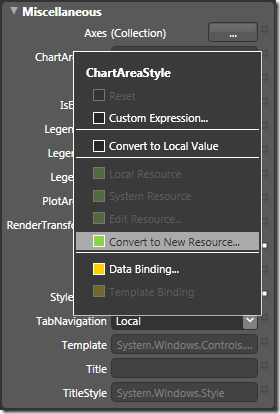
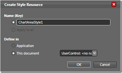
That will produce a bare style you can work with:
<Style x:Key="ChartAreaStyle1" TargetType="Grid"/>
The Plot Area is styled up in the same way, so let’s continue on using PlotAreaStyle as an example
PlotAreaStyle
Start by creating a copy of the style the same way you did above for the ChartAreaStyle, and then editing it via the resources tab:
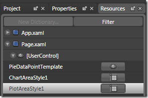
I did a very quick and dirty background radial gradient
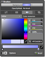
The resulting style Xaml is:
<Style x:Key="PlotAreaStyle1" TargetType="Grid">
    <Setter Property="Background">
        <Setter.Value>
            <RadialGradientBrush>
                <GradientStop Color="#FFDADBFA"/>
                <GradientStop Color="#FF8A90FF" Offset="1"/>
            </RadialGradientBrush>
        </Setter.Value>
    </Setter>
</Style>
and the resulting chart looks like this:
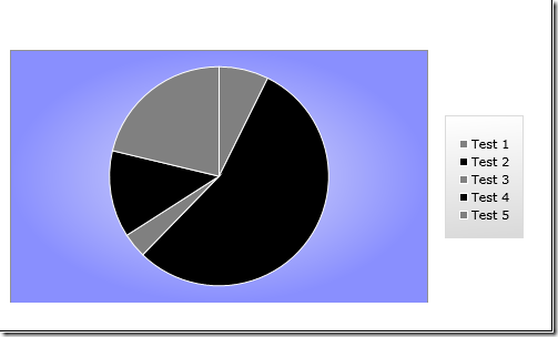
Not very pretty, but you get the idea. The radial gradient gives the chart a bit of a glow, which is just plain odd visually since the chart itself is in grayscale :)
I also hope that in a future rev, one can remove the gray border that surrounds 3/4 of the plot area. I haven’t figured out how to do that with this release.
LegendStyle
The LegendStyle is changed the same way as the others. However, it is a bit more complex. Also, Blend 2 SP1 currently generates bogus setters when you create the style resource:
<Style x:Key="LegendStyle1" TargetType="vis:Legend">
    <Setter Value="{x:Null}"/>
    <Setter Value="{x:Null}"/>
    <Setter Value="{x:Null}"/>
</Style>
If you clear those setters out, you will be fine. In this case, I simply cleared the BorderBrush and set the alignment to the top and left:
<Style x:Key="LegendStyle1" TargetType="vis:Legend">
    <Setter Property="BorderBrush" Value="{x:Null}"/>
    <Setter Property="VerticalAlignment" Value="Top"/>
    <Setter Property="HorizontalAlignment" Value="Left"/>
    <Setter Property="FontFamily" Value="Verdana"/>
    <Setter Property="FontSize" Value="12"/>
    <Setter Property="HorizontalContentAlignment" Value="Left"/>
    <Setter Property="VerticalContentAlignment" Value="Top"/>
</Style>
The resulting chart looks like this:
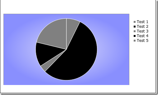
As you can see by the properties, I was trying to get rid of some of that padding above the first item. However, without digging deeper (a follow-up article) I can’t see where that space is coming from. My hope was to align it with the top of the plot area. As it is, it is almost aligned with the top of the chart itself, but not quite.
Conclusion
So, after all that, I decided to show that not every chart I develop is going to be butt ugly :) Here’s a styled version. The associated styles and templates are available in a VS2008 project here (You’ll need to reset the paths to your reference DLLs).
Ok, so it still ended up ugly (especially that border I can’t seem to remove) :)
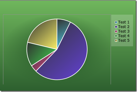
I’ve definitely run into some Preview-Bits difficulties while styling the chart up, but nothing that can’t be overcome by reporting it to the team (or finding out I did something dumb). I’ll be sure to post a follow-up once I get past some of the styling issues/difficulties.
