The Silverlight Toolkit is now available! Here’s a rundown of what’s included:
- Chart
- TreeView
- AutoCompleteBox
- DockPanel
- WrapPanel
- Label
- Expander
- HeaderedItemControl
- HeaderedContentControl
- NumericUpDown
- ViewBox
- ButtonSpinner
- ImplicitStyleManager (Yay!)
- Theming
All of this goodness is contained in just in three libraries all named Microsoft.Windows.Controls.*
Let’s dig into the charting in this first post. I’ll have some additional posts later covering styling of charts, and some of the more interesting bits of the other controls.
The charting example Xap that comes with the toolkit does a great job of showing off the different types of graphs and charts you can create. The screenshots are about a week or two out of date, but the November release is very similar.
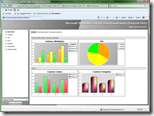
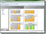
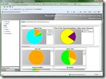
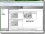
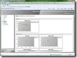
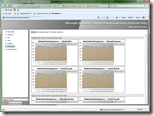
If you look at the controls, all you’ll see is <Chart>. You’ll probably find yourself wondering how on earth you use that to get pie and scatter and other types of charts.
The trick is the series:
- ColumnSeries
- DynamicSeries
- DynamicSeriesWithAxes
- DynamicSingleSeriesWithAxes
- LineSeries
- PieSeries
- ScatterSeries
Let’s take PieSeries for an example. PieSeries has an ItemsSource courtesy of the inheritance from ->DynamicSeries->Series.
<UserControl x:Class="PeteBrown.SilverlightToolkitExamples.Page"
    xmlns="http://schemas.microsoft.com/winfx/2006/xaml/presentation"
    xmlns:x="http://schemas.microsoft.com/winfx/2006/xaml"
    xmlns:sys="clr-namespace:System;assembly=mscorlib"
    xmlns:controls="clr-namespace:Microsoft.Windows.Controls;assembly=Microsoft.Windows.Controls"
    xmlns:charts="clr-namespace:Microsoft.Windows.Controls.DataVisualization.Charting;assembly=Microsoft.Windows.Controls.DataVisualization"
    Width="500" Height="300">
    <Grid x:Name="LayoutRoot" Background="White">
        <charts:Chart>
            <charts:Chart.Series>
                <charts:PieSeries>
                    <charts:PieSeries.ItemsSource>
                        <controls:ObjectCollection>
                            <sys:Double>1.0</sys:Double>
                            <sys:Double>2.0</sys:Double>
                            <sys:Double>0.5</sys:Double>
                            <sys:Double>0.3</sys:Double>
                            <sys:Double>1.2</sys:Double>
                            <sys:Double>1.8</sys:Double>
                        </controls:ObjectCollection>
                    </charts:PieSeries.ItemsSource>
                </charts:PieSeries>
            </charts:Chart.Series>
        </charts:Chart>
    </Grid>
</UserControl>
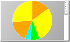
That Xaml creates a pie chart that (in the CTPs) looks like this:
To change it to a bar chart, I simply change the Series type to ColumnSeries:
            <charts:Chart.Series>
                <charts:ColumnSeries>
                    <charts:ColumnSeries.ItemsSource>
                        <controls:ObjectCollection>
                            <sys:Double>1.0</sys:Double>
                            <sys:Double>2.0</sys:Double>
                            <sys:Double>0.5</sys:Double>
                            <sys:Double>0.3</sys:Double>
                            <sys:Double>1.2</sys:Double>
                            <sys:Double>1.8</sys:Double>
                        </controls:ObjectCollection>
                    </charts:ColumnSeries.ItemsSource>
                </charts:ColumnSeries>
            </charts:Chart.Series>
and I get this:
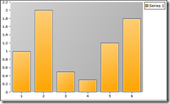
I didn’t provide any labels or do any styling yet. Also, when you look at the markup in VS, you will see a blank chart due to the way the animation is set to fade in.
Note also that a designer can hard-code values into the chart at design time, allowing for rapid prototyping and for styling against something semi-real with zero code. You can load the itemsource from code, of course.
Back to the pie chart now. Let’s look at one of the more interesting style-related properties: AnimationSequence. That Series property provides options for FirstToLast, LastToFirst and Simultaneous.
<charts:PieSeries AnimationSequence="FirstToLast">
In the case of the default animation, it makes the individual items fade in in First-to-last order.
The remaining visual properties are those you’d expect to find on any control.
Shortly, I’ll put up a post about styling these controls and get a little more in-depth on the charting. Until then, explore and have fun with all the new goodies :)
You’ll find the full toolkit published on Codeplex here.
