"He Chose Poorly" was the first thing I thought
when I saw the font rendering in a metro-themed WPF4
application I looked at the other day. (Metro is the name of the
Zune/Windows Phone 7 user experience style). The application was
really sweet, but suffered from some crummy font rendering.
Ok, maybe not the first thought. My first thought was actually
"This is WPF 4, there's no excuse for bad font rendering", and I
was half right. Folks were looking at the application and blaming
WPF for the text quality when it was really an combination of bad
font selection and lack of appropriate text options.
WPF 4 has vastly improved font rendering over WPF 3.5. In fact,
when you want it to be, it is completely indistinguishable from straight old
native Windows GDI font rendering. Something else had to be going
on here, so I pulled out Snoop and took a look at the fonts being
used.
The font being used was Segoe WP, the Windows Phone 7 Segoe
font. This is a font designed for 260+ DPI displays, like you might
find on a handheld device, so there's no real hinting included with
the font. The net result is horrible rendering on our 96 dpi
displays. A font of pixel size 48 on a hand-held device appears at
approximately the same physical size as a font of pixel size 18 on
our desktop machines.
Here's Segoe WP in Microsoft Word at a number of different
sizes. Notice how the characters are poorly formed.
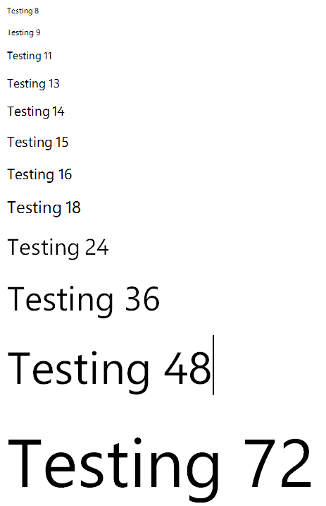
You can see that the higher sizes, which would rely less on
hinting, have better shape and clarity, while anything under about
36 is of questionable quality, and anything under 24 is pretty much
unusable. That 36px font would be representative of the quality and
clarity of regular text on the phone due to the DPI difference.
Stuff like this is why I ranted that I wanted higher DPI displays for our
own PCs. If the DPI gets high enough, you no longer need
anti-aliasing of graphics or tricks like ClearType and grayscale
smoothing of text. Anyway, I've beat that one to death.
Now, here's Segoe UI, a font specifically designed for 96dpi
displays, at the same sizes:
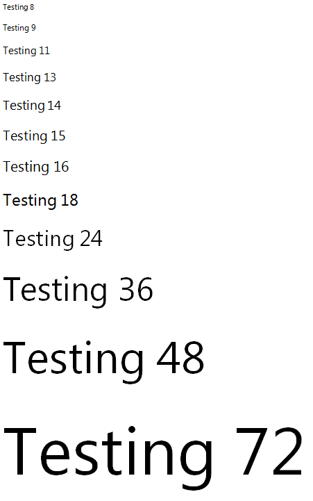
You can see the results are quite different in the lower point
sizes. The font itself is not identical to Segoe WP (in fact, Segoe
was born from different roots than the Microsoft brand Segoe fonts)
but it is a reasonable stand-in.
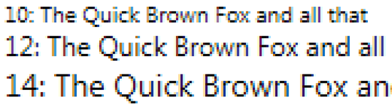
For grins, I even tried using Segoe WP in Notepad:

As you can see, it didn't go over well. There are a fair number
of horizontal lines that are just missing.
Picking the right font makes all the difference for both WPF and
Silverlight.
Just because a font is available, doesn't mean it's a font that
will render well in your specific scenario.
In addition to picking the right font, WPF has some text
rendering tweaks you can make to help further clarify text
on-screen.
What about WPF Text Options?
Ok, so what if you pick a good font, but still don't see great
results? The next step is to try out some of the different text
rendering options. In the examples below, I'm using Segoe UI, a
font with decent, but not excellent, rendering at smaller point
sizes.
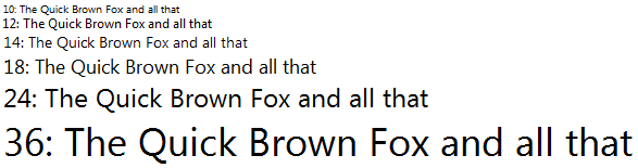
TextOptions.TextFormattingMode
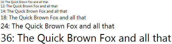
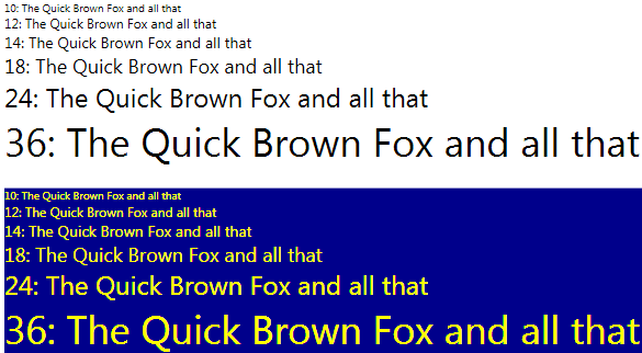
TextOptions.TextFormattingMode = Display
Here is a zoomed-in version (click for much larger version).
Note that when using Display, the verticals (most obvious in the
word "all") are identical. This mode takes display resolution into
account when laying out the type. The sacrifice made is font
fidelity: if you want to see the font exactly as intended, with
shapes exactly as designed, this mode is not for you. However, if
clarity of smaller sizes is more important, the Display formatting
mode will often get you there.
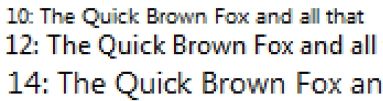
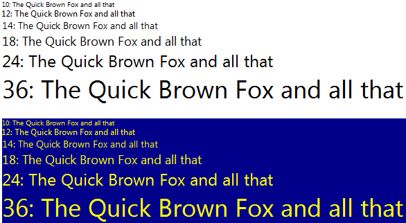
TextOptions.TextFormattingMode = Ideal
Here is a zoomed-in version (click for much larger version)
The Ideal mode, which is the default, works harder to preserve
the shapes of the characters. For example, look at the 12pt "Q" in
"Quick" here vs the Display mode. The Ideal mode preserves the
rounder shape of the Q whereas the Display mode squishes it a
little. The Display model also appears a little more aliased when
compared to the ideal mode.
TextOptions.TextRenderingMode
Let's take a look at combining the formatting model with the
various TextRenderingMode options. TextRenderingMode supports four
different values:
- Aliased - bilevel rendering, aliased
- Auto - pick automatically based on layout mode
- ClearType - pick appropriate ClearType algorithm based on
layout mode
- GrayScale - grayscale anti-aliasing
I decided to try out two of the TextRenderingMode settings:
Aliased and ClearType. This is a really large image (a little
larger than full-screen on my 30" display), but gives you an idea
of what each of the combinations looks like.
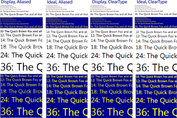
NOTE:
ClearType settings on my PC are a little off. I didn't update
them when I upgraded my display, so I get more color fringing than
most folks.
Here are the four 100% sized captures:
Display, Aliased
Ideal, Aliased
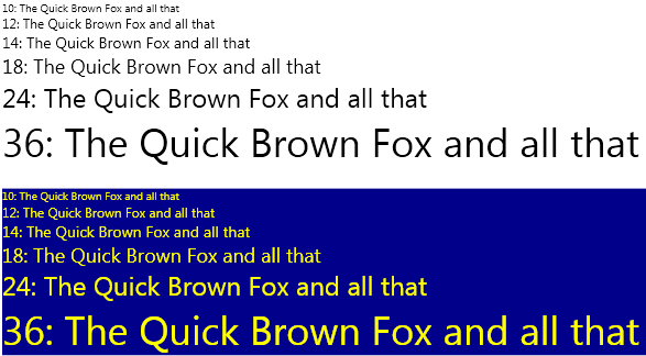
Display, ClearType
Ideal, ClearType
Here's the XAML I used to test (I changed the properties in the
two styles to create the different scenarios, used Snag-It for
screen captures, then composited in PhotoShop. Yes, I could have
done it all in WPF without anything else but a print screen
<g>)
<Grid Margin="10">
    <StackPanel Orientation="Vertical">
        <StackPanel.Resources>
            <Style TargetType="{x:Type TextBlock}">
                <Setter Property="FontFamily"
                        Value="Segoe UI" />
                <Setter Property="TextOptions.TextFormattingMode"
                        Value="Display" />
                <Setter Property="TextOptions.TextRenderingMode"
                        Value="ClearType" />
            </Style>
        </StackPanel.Resources>
        <StackPanel Orientation="Vertical" Margin="10">
            <TextBlock Text="10: The Quick Brown Fox and all that"
                        FontSize="10" />
            <TextBlock Text="12: The Quick Brown Fox and all that"
                        FontSize="12" />
            <TextBlock Text="14: The Quick Brown Fox and all that"
                        FontSize="14" />
            <TextBlock Text="18: The Quick Brown Fox and all that"
                        FontSize="18" />
            <TextBlock Text="24: The Quick Brown Fox and all that"
                        FontSize="24" />
            <TextBlock Text="36: The Quick Brown Fox and all that"
                        FontSize="36" />
        </StackPanel>
        <StackPanel Orientation="Vertical" Background="DarkBlue" Margin="10">
            <StackPanel.Resources>
                <Style TargetType="{x:Type TextBlock}">
                    <Setter Property="FontFamily"
                            Value="Segoe UI" />
                    <Setter Property="Foreground"
                            Value="Yellow" />
                    <Setter Property="TextOptions.TextFormattingMode"
                            Value="Display" />
                    <Setter Property="TextOptions.TextRenderingMode"
                            Value="ClearType" />
                </Style>
            </StackPanel.Resources>
            <TextBlock Text="10: The Quick Brown Fox and all that"
                        FontSize="10" />
            <TextBlock Text="12: The Quick Brown Fox and all that"
                        FontSize="12" />
            <TextBlock Text="14: The Quick Brown Fox and all that"
                        FontSize="14" />
            <TextBlock Text="18: The Quick Brown Fox and all that"
                        FontSize="18" />
            <TextBlock Text="24: The Quick Brown Fox and all that"
                        FontSize="24" />
            <TextBlock Text="36: The Quick Brown Fox and all that"
                        FontSize="36" />
        </StackPanel>
    </StackPanel>
</Grid>
How does it Compare to Windows Forms?
Windows Forms is the gold standard for font rendering in
business applications. It's what WPF is compared to whenever
someone mentions fuzzy or blurry text.
For grins, here's the same text using Windows
Forms. The font sizes aren't exactly the same (off
by a few thousandths), as different measurement units are used
(pixels in WPF vs. Points in Windows Forms), but it's close enough
to compare.
TIP
To convert WPF pixel font sizes to Windows Forms Point font
sizes, divide the WPF font size by 1.3333 (or 96/72 : WPF Screen
DPI / Point DPI).
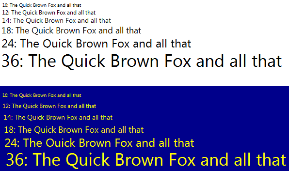
Compare that to the Display, Cleartype WPF rendering above. They
are almost identical. (the clipping of the Q is my fault: forgot
that Windows Forms labels are opaque by default)The actual Windows
Forms point sizes used were 7.5, 9, 10.5, 13.5, 18, 27.
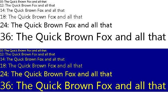
How about seeing them side by side?
Windows Forms and WPF, Side by Side
WPF on the left, Windows Forms on the right. WPF is using the
Display, ClearType settings.
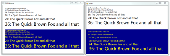
Windows Forms
WPF (Display, ClearType)
You'd need to pull out specialized measuring instruments to tell
if there were any differences here. To my eye, they are identical.
You can tell they're not the same screen shot because the spacing
between the lines is a little different.
Summary
WPF 4 has Great Font Rendering. So, what are
you waiting for? There are so many great WPF applications out there
that just need these simple text options changes (which can be put
into global styles) in order to go from awesome to truly friggin
awesome.
WPF has gotten a lot of abuse about its font rendering over the
years. While I understand why the rendering was the way it was, I'm
one of the people who complained about it. WPF 4 totally changes
that. It has font rendering that is as good as any native Windows
application, and better than most every other developer platform.
Pick good fonts (a must in any case) and set the right options to
take the fuzz out of your WPF applications.
